HTC is in a difficult position. Last year, the company completely rebooted its Android range with the One series, an initial trio of handsets that looked beautiful, offered impressive hardware specs and hit the low, middle and high-end markets respectively.
It wasn’t successful though. HTC’s flagship device, the One X, went head-to-head with the Samsung Galaxy S III and lost. The smartphone was lovely to look at, had fantastic build quality and a more bearable version of its custom Android skin, HTC Sense. It couldn’t compete with Samsung’s collossal marketing budget though. Backed by an almost endless deluge of TV, magazine and billboard advertisements, the Galaxy S III persevered as the dominant handset.
The launch of the HTC One represents round two. The stakes couldn’t be higher; earlier this month, the company reported revenue of just $384 million, a frightening 44 percent drop on the year before. Last night, Samsung unveiled the new Galaxy S4. There’s no room for error.
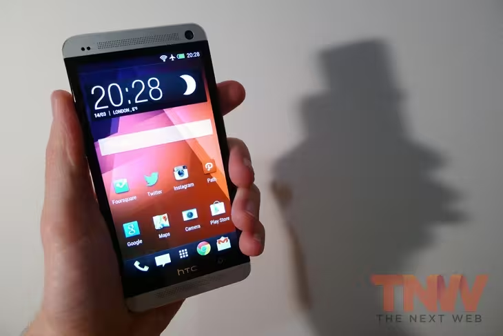
The game plan this year appears to be the same as last time though. The new HTC One has a gorgeous industrial design, coupled with competitive specs and a new iteration of its Sense skin. Fearing that a spec bump won’t be enough to topple the Samsung Galaxy S4, HTC has opted to differentiate itself with two peculiar design decisions too; a new 4-megapixel camera and a home screen resembling Flipboard.
It’s a looker
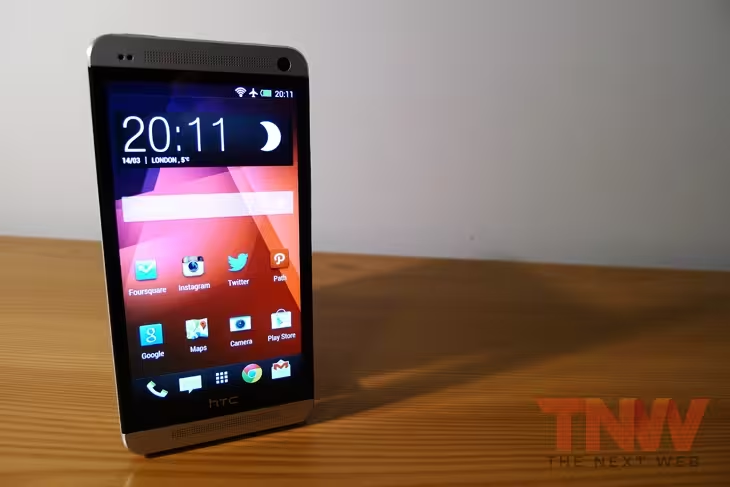
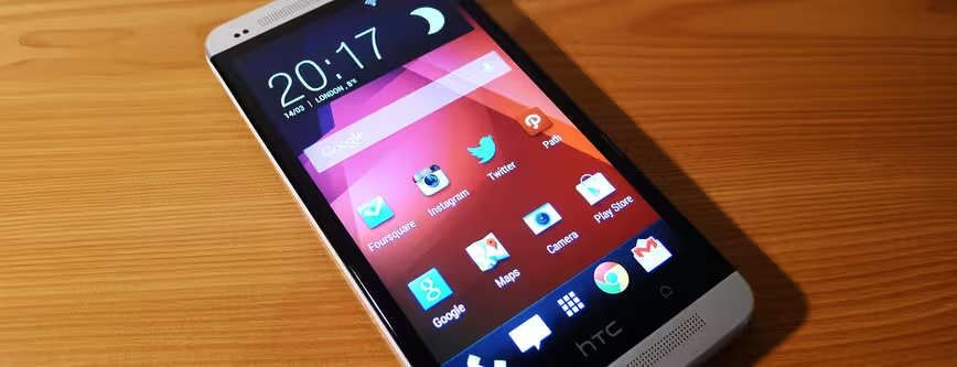
HTC has an impressive track record of building smartphones with impeccable hardware aesthetics. The HTC One is no different, sporting two slick aluminium plates and a white plastic ridge running around the side. The 4.7-inch display has a noticeably thin black border which stretches to either side of the device, imitating an edge-to-edge screen when it’s asleep or turned off.
Two speaker grills sit at the top and bottom of the device, giving the HTC One a unique but somehow familiar look. In the run-up to its reveal, plenty of people were comparing HTC’s device to the iPhone 5, and although those thoughts aren’t unfounded, it does feel markedly different.
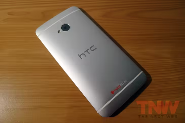
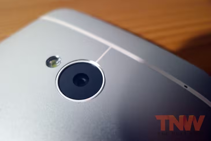
HTC’s own design cues are accentuated on the back, for example, where the body arcs ever-so slightly. Two white strips of plastic top and tail the device, with the higher one trailing down to the new camera. The HTC and Beats Audio logos are ever present, but they feel subtle and not at all overbearing.
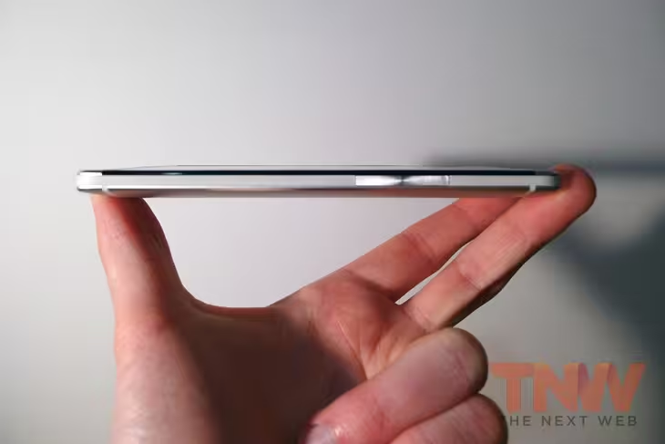
As with the One X, the HTC One is a fairly large smartphone. Anyone with small hands will struggle to tap the top-right corner of the screen without readjusting their grip or switching to a two-handed setup. Having said that, the device is astoundingly comfortable to hold. The curved back and aluminium materials give it a near-perfect feel that has been missing from recent handsets.
The power button is a little too flush with the top of the devices; there’s very little feedback and if you’re not looking at it directly, it can be difficult to know if the handset has actually switched on. Likewise, the volume rocker on the right-hand side feels too inconspicuous and can be difficult to locate by feel.
Better screen, better sound
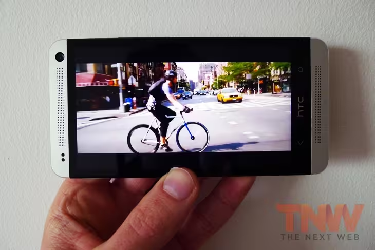
The One X had a brilliant display but the One surpasses it in almost every way. The 4.7-inch, 1920×1080 screen is sublime, particularly with the screen brightness set to maximum.
Color representation is fantastic, with deep blacks and super sharp text. Viewing angles are excellent indoors, although be warned that like every other smartphone in existence, it can be difficult to look at in direct sunlight. One day the industry will figure out how to solve this problem (e-ink aside) but for now we all just have to make do.
The 1080p screen is particularly impressive for watching movies and playing high-resolution video games such as Real Racing 3.
The speakers are also very impressive – some of the best I’ve found on a smartphone actually – and benefit from the Beats Audio integration. HTC has coined this new setup BoomSound, which is a terrible name but a sensible approach to audio. The impact that the twin speakers have, particularly in their ability to handle stereo sound, simply can’t be underestimated. Tinny and distant music is no longer an issue – this is audio you can truly appreciate without headphones.
Unprecedented speed
HTC has opted for Qualcomm’s 1.7GHz quad-core Snapdragon 600 processor, coupled with 2GB of DDR2 RAM and 32GB of internal storage.
The result is staggering. Moving around the various menus and switching between multiple apps is near-instantaneous. Regardless of what you throw at it – be it high-end video games or advanced photo-editing software – the HTC One can handle it with ease.
It’s also worth noting that the handset is LTE-enabled, so unlike the Nexus 4, it can handle 4G Internet connectivity no problem.
All of this takes a hit on the 2,300 mAh Li-Po battery though. It’s hardly uncommon for smartphones, but all that power means that the HTC One can just about manage a full day on a single charge.
Mileage will vary, of course, depending on how much you use the device on any given day, as well as what you’re doing with it. In day-to-day use though, I found myself putting the charger in my backpack just in case. Ultimately, this is the trade-off consumers will have to deal with as the industry pursues increasingly thinner and more powerful smartphones. C’est la vie.
Let’s talk BlinkFeed
Every year, consumers yearn for a better version of Sense, the company’s custom skin for Android. Ever since the Nexus line was introduced, the general consensus has been that if OEMs can leave stock Android alone, they should.
The new iteration, Sense 5, runs on Android 4.1.2 and takes this to heart. It’s a shame that HTC wasn’t able to develop on version 4.2, although the few absent features are soon forgotten among HTC’s more jarring additions.
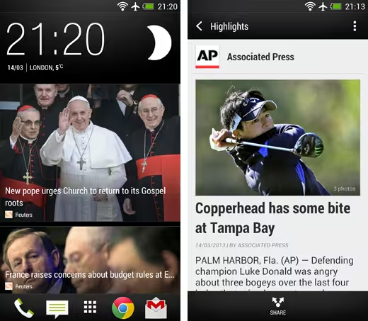
The biggest change by far is BlinkFeed. It’s an entirely new experience for the home screen which swaps out the usual app icons and widgets in favour of tiled content pulled from the Web.
The premise is sound. Windows Phone 8, for example, does a great job of making the home screen feel more relative and interactive, thanks to its abundance of differently sized live tiles. Rather like Flipboard, already available on Android, HTC has tried to mimic this with its own news reader.
The execution is poor though. To start with, there’s only a limited number of publications that you can feature in the feed; The Guardian, The Independent and Reuters make an appearance in the UK, as well as Clash and Mobo for music, but otherwise it’s pretty barren.
Users can subscribe to other news categories, such as Business, Design and Travel, but there’s no way of choosing custom RSS feeds, blogs or news outlets.
The caveat is that updates from Facebook, Twitter, Flickr and LinkedIn can be pulled in to occupy the remaining tiles. So a custom RSS feed, of sorts, could be created using a dedicated Twitter feed, but that would be avoiding the bigger problem; BlinkFeed is restrictive and underdeveloped.
Scrolling through the home screen is pleasant enough and the articles themselves are displayed with a clean, but basic design. Another issue is that many of the photographs appear pixellated or out-of-focus. It’s unclear whether this is a problem with the service, or the content it’s pulling in, but it means that BlinkFeed fails to achieve the glossy, magazine-style finish it so desperately strives for.
Thankfully, HTC has given users the option to choose another panel as the home screen. In this manner BlinkFeed can be ignored entirely, but it’s just a shame to see a feature that HTC has clearly spent some time on go to waste.
A little more Sense
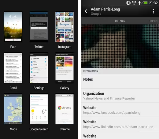
In general, Sense 5 is a nice skin for Android. The app switcher, which is accessed now by double-tapping the home button, is a huge improvement over the 3D monstrosity featured in the One XL. The screen now shows nine tiles in a flat, 2D environment which involves next to no swiping or additional navigation.
In other places though, Sense still feels like a burden. The People app, for example, applies a filter made up of large, circular dots for almost every profile image. It looks positively bizarre, as if the person in your phonebook is actually a wanted criminal. There’s also a plethora of different ways to navigate through the app, including swipes, taps and long-presses, which ultimately just feels tiring and overbearing.
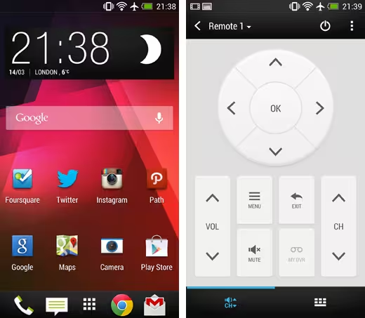
The TV app, meanwhile, is a nice idea that ultimately lacks the functionality needed to succeed. The LG television in my apartment, for example, requires a “Guide” button to navigate through the various channels. Despite multiple attempts to remap the control scheme, HTC’s app was unable to replicate this.
It’s not all bad though. HTC’s pre-installed music app feels much cleaner than Play Music, with a simple charcoal background and large, easy-to-use controls.
The Gallery app has also been greatly improved, adopting HTC’s BlinkFeed layout for a better spaced and dynamic viewing experience. None of it is bad, per se, but you always have the feeling that there’s a better third-party alternative waiting in the Play Store.
An unorthodox snapper
In recent years, smartphones have opted for image sensors with an increasingly large number of megapixels. The reason being that when an average consumer walks into a store, they’re far more likely to pick the device with a higher number.
Speak to anyone with a passion for photography though, and they’ll tell you that this isn’t always the case. A range of different factors come into play, including image sensor size and lens quality.
HTC has opted for a 4-megapixel shooter this time around, although to compensate it’s been branded an “UltraPixel” camera (again, a pretty terrible marketing term).
The choice sounds like suicide for in-store sales, but HTC is desperately trying to hammer home the message that this is a superior offering for smartphone photographers. The idea is that with less pixels on the sensor, they can be larger and attract a greater amount of light, improving low-light images and overall noise.
The results, however, are mixed. Night-time shots benefit from better exposures, and in general have better contrast and color representation. Unfortunately, almost every photo looks a little dull and out-of-focus. The detail is there, but nothing looks as sharp or crisp as it should, resulting in photos that just don’t stack up against the competition.
HTC’s new Zoe feature is worth mentioning, although in all honesty, it’s not going to revolutionize smartphone photography. In a nutshell, it records four seconds of video – one before you press the shutter and three after – as well as a series of stills simultaneously. As with Time Shift on the BlackBerry Z10, this allows you to go back and forth through the video and pick out any moment as a fully-realized photograph.
Zoes can also be uploaded to social networks such as Facebook, as well as the company’s own HTC Share service. It’s a little like Vine, although the four second restriction makes it incredibly difficult to do anything artistic or interesting.
Photo samples
Video sample
The bottom line
The HTC One is arguably the best Android smartphone on the market. The industrial design is stunning to look at and the 4.7-inch display is one of the best in the business.
For the most part, Sense has been toned down and it’s possible to take that approach even further through the various tweaks available in the settings menus.
It’s not a breakthrough device though. There’s nothing that the HTC One offers that makes it the “must-have” option for an upgrade or Android enthusiast. Sure, it has an incredible processor and the RAM to match, but all of that feels a bit superfluous compared to the One X before it.
HTC’s attempts at innovating on the software side, meanwhile, have had mixed results. BlinkFeed is just a gimmick and doesn’t change the way that you use a smartphone. The camera, while commendable for resisting the megapixel war, doesn’t deliver on the promise of better images.
The HTC One is a great smartphone. History has proven, however, that being “great” isn’t enough to combat Samsung’s overpowering influence in the Android market. Until the Taiwanese manufacturer can produce a truly flawless or groundbreaking proposition, it will continue to struggle as it has for the last 12 months.
Get the TNW newsletter
Get the most important tech news in your inbox each week.
