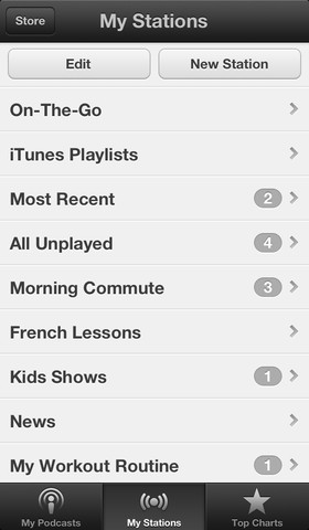
Apple has updated its much-maligned Podcasts app for iOS with custom iCloud-synced stations that update automatically when new episodes of those podcasts are posted. The new app also allows you to create an on-the-go playlist of podcast episodes, just like iTunes does.
The new stations and on-the-go playlists are just a part of the app’s revamp of syncing though. The new stations are also stored in iCloud and will sync across all of your devices, staying up to date. Any playlists that you sync from iTunes will also now appear in Podcasts, fixing a major problem that heavy podcasts listeners had with the app.

The new design of the app is also a bit trimmed down from the skeuomorphic exuberance of the original. The playback window, for instance, is now of a simpler bent, with a trim, minimal interface. Gone are the fat tape-machine style buttons and the reel-to-reel imitation scrubber. Apple says that these controls are ‘easier to use’ than the old ones.
Here’s a before and after comparison of the two designs:
Apple says that it has also fixed a bug that caused playback not to resume when you returned to the app. A smattering of other performance and stability improvements are also included in this release. When Apple appointed Jony Ive as head of its design language across products, this is exactly the kind of thing that many people hoped would happen in iOS. A trimming out of the skeuomorphic design details that characterize many of the apps that Apple produces. I’m not so sure it’s a fantastic idea unilaterally, as I discussed in this piece about what I call ‘skeuomorphobia‘.
But, in the end, some users felt that the tape deck actually inhibited usefulness. That’s where the design line must be drawn. Whether it looks like a ‘real thing’ or not isn’t the point. It’s whether its both delightful and usable. At this point it seems that Apple felt that it needed to step back when it came to Podcasts, but we’ll have to wait to see if it does so across iOS.
H/t Preshit, Image Credit: Mike
Disclosure: This article contains an affiliate link. While we only ever write about products we think deserve to be on the pages of our site, The Next Web may earn a small commission if you click through and buy the product in question. For more information, please see our Terms of Service.
Get the TNW newsletter
Get the most important tech news in your inbox each week.


