Most people who’ve been using the word skeuomorphic lately aren’t exactly clear about what it actually means. Over the past year or so it has gained a lot of attention because it’s one of the techniques used by designers at Apple, but most of the discussion about it has been far from productive.
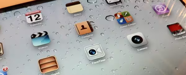
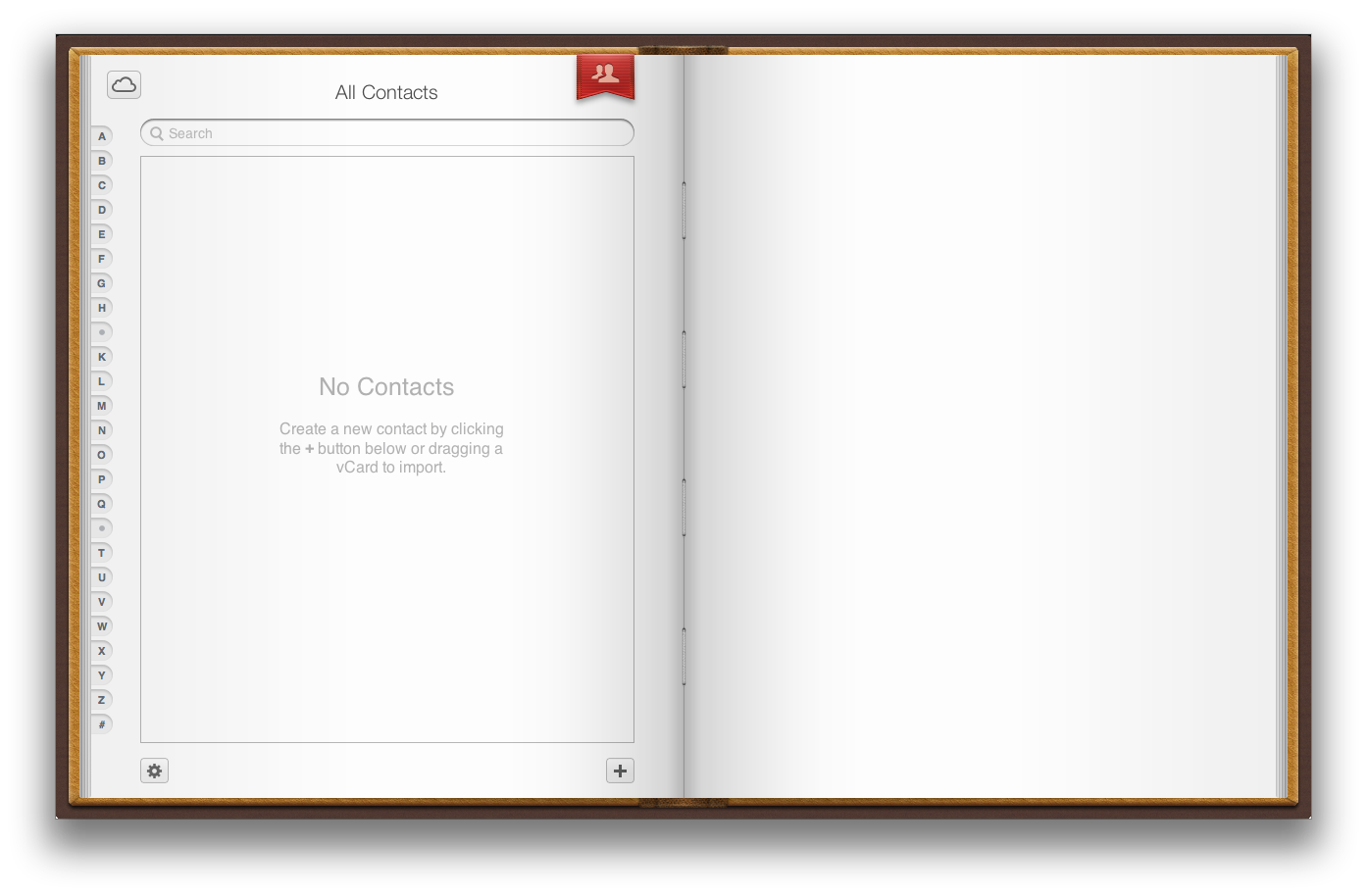
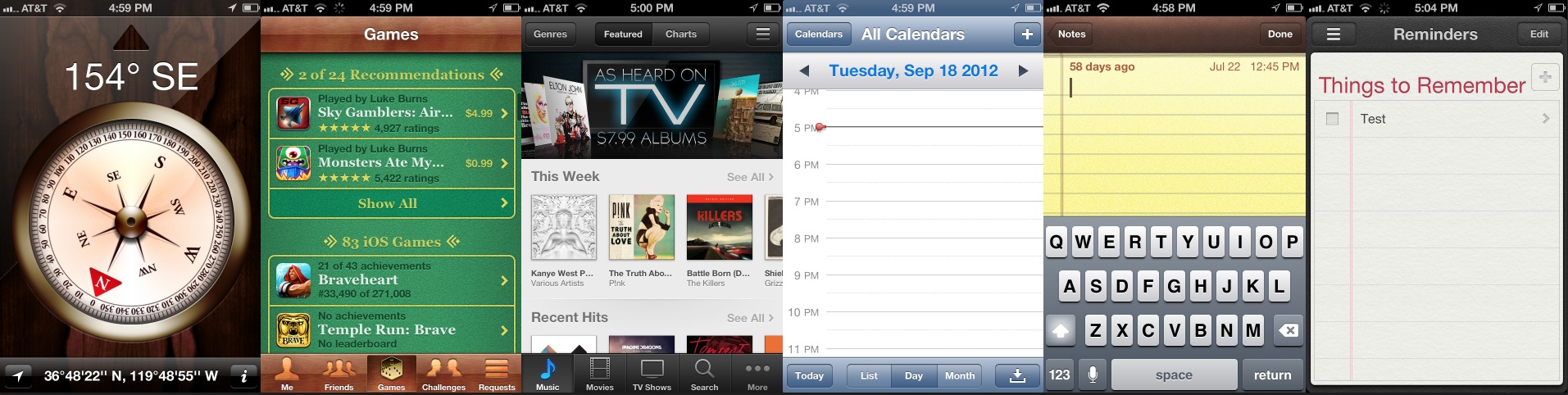
First of all, skeuomorphism is actually a sharply defined and angular phrase that describes a very specific design technique. On a basic level, it’s designing an object that mimics, both in appearance and use, a real-world counterpart. This kind of technique is evident in apps on iOS like Contacts, which uses a leather-bound contacts book with flippable pages to represent a ‘real’ book of contacts.
We won’t get granular here about how much it does or does not work (there are issues with Contacts, let’s be honest), as that’s not really the point. But for more in-depth discussion, I suggest this great breakdown by RealMac’s Christopher Downer.

The 💜 of EU tech
The latest rumblings from the EU tech scene, a story from our wise ol' founder Boris, and some questionable AI art. It's free, every week, in your inbox. Sign up now!
But the fact remains that skeuomorphism is a technical term, used almost completely by industrial designers or digital artists until recently, when arguments about where Apple’s design are headed dragged it out of the dungeons of semantic obscurity and into the harsh light of ignorance.
So many things about design on iOS are mistaken for skeuomorphism. A ‘leather’ texture, for instance, is not skeuomophic in and of itself. If it’s applied to an object that is leather in its original form, and then that object has interaction design and function applied to it that also mimics the original’s purpose, then it becomes skeuomorphic. The Contacts app is, for instance, but the Find My Friends app is not.
People are getting so hung up on this phrase, blaming it for the perceived problems that Apple has with building crisp, functional apps for the iPhone and the iPad. But it’s such a narrow and specific term that it’s cast a pall over the whole discussion.
Imagine if, when critiquing a photograph, someone complained about a photographer using, or not using, hyperfocal techniques. Don’t know what I’m talking about? Exactly. Hyperfocal distance is a property that is incredibly useful in certain situations, and not just landscapes where it originated. But it’s obscure enough that, while students of photography have heard of it, not a lot of people who aren’t have. And it’s also an artistic choice of technique made by the photographer.
Which is exactly what skeuomorphism is, it’s a choice of technique, a style. It’s not a ‘movement’, it’s not a ‘trend’. It’s a technique that you either use or do not use based on what you’d like the effect to be for the user.
Making a choice to ‘make things skeuomorphic’ or ‘make things less skeuomorphic’ in a unilateral fashion, across iOS and maybe OS X, makes as much sense as deciding to stop using the color blue.
You either use blue or you don’t use blue, you don’t decide ahead of time to outlaw blue for life.
But that’s exactly what some folks are hoping that Apple’s new head of Human Interface, Jony Ive, will do. People began imagining iOS scrubbed clean of skeuomorphic and textured elements, following the trend of a newer, flatter design language exemplified in apps like the wonderful Letterpress and Twitterrific.
I’m not so sure that this is what’s going to happen. It’s certainly possible that Apple’s designs will be stripped of both real-world allegory and textures like felt, leather and more. Perhaps they will be boiled to their bones and stripped down to minimal panes and buttons that serve to convey their function and nothing more.
But this is not, historically, how Apple has worked with software. Consistently, the company’s design direction has been to delight users and to have them enjoy using their products. Too often simplicity is conflated with sterility, and that’s never been the point of Apple’s industrial or interface designs.
There are certainly ways to go minimal without removing delight. Take Twitterrific as an example. The current version for iOS had been in development for 9 months when it was released, and the great designers at Iconfactory clearly worked to think about what the ‘next’ version of its interface should look like. It’s definitely stripped down and ‘flatter’ looking than the Game Center app, for instance.
But it’s also not a decision that was made arbitrarily. It was done in service of pushing the content, the text and images contained in tweets, forward to the user. And this is where so many people who get caught up in skeuomorphobia miss the point.
Good software design should be done in service of the user, period. Arbitrarily deciding whether to use or not use a technique with no thought to whether it’s the best way to serve and delight the user is just bad design.
And that’s why I wouldn’t expect textures, allegory and yes, full-on skeumorphism to disappear entirely from Apple’s design language overnight. I’ve talked before about the diaspora of design styles in iOS, something that is easy to read as a fracturing of camps within the company and a problem that has to be corrected. But, if you look more carefully you’ll see that the choices (whether you agree with them or not, which is a totally different thing) have been made in order to specifically complement the functions of the app, on a case-by-case basis.
Arbitrarily dictating that textures or skeuomorphism are off the table is effectively removing a portion of a designer’s ability to design to solve a problem and to provide the best experiences for users.
So, will Jony Ive remove all textures and ‘designs that look and work like real things’ from iOS? I highly doubt it. There’s simply no reason to make unilateral design decisions like that outside of frustrating designers and making things worse for users. Will software designs coming out of Apple change under Ive’s leadership? Almost certainly. You don’t put someone with a strong, precise vision like Ive in charge of company-wide design without expecting him to have an effect. But Ive is also well aware that the best design serves the user, and he’s a big proponent of using the proper materials for physical designs.
Here’s a pertinent quote from an Jony Ive interview with Core77:
A big part of the experience of a physical object has to do with the materials. [At Apple] we experiment with and explore materials, processing them, learning about the inherent properties of the material–and the process of transforming it from raw material to finished product; for example, understanding exactly how the processes of machining it or grinding it affect it. That understanding, that preoccupation with the materials and processes, is [very] essential to the way we work.
Maybe it’s just me, but that doesn’t sound like someone who doesn’t realize the importance of materials (virtual or otherwise).
If I had to make a bet about Apple’s design in the future, it wouldn’t include any specifics about whether we’ll see textures used less. But it would be safe to expect its designers to continue using whatever techniques necessary to create inviting and delightful experiences for users.
There will be big changes this year in iOS, but from what I hear a lot of those will be under the hood. Sweeping alterations to its look are coming (most likely, I don’t have any info on this) down the road, if they’re coming at all. Beyond that, there is always what happens once iOS grows past its puberty, but that’s a discussion for another time.
For more interesting writing on this topic, check out these pieces:
Get the TNW newsletter
Get the most important tech news in your inbox each week.