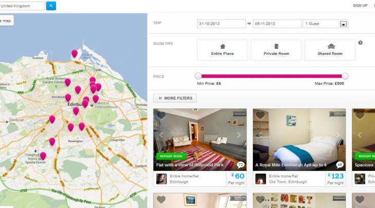

Despite ongoing legal issues in New York, Airbnb has announced a refresh of its search portal as it looks to make it easier for would-be guests to find the ideal place to stay around the world.
As TechCrunch reports, Airbnb is rolling out the update today, and it’s already live for many users. The new search layout features a huge map of the relevant properties on the left, with dates, filters and property details on the right.
Today’s refresh is all about putting everything on a single page, while helping users visualize where exactly the properties are in a given city, as well as what they look like thanks to bigger snapshots in the search results page. Moreover, the most popular filters have been made more prominent – ‘travel dates’, ‘room type’, and ‘cost’ are now front and center.
Get the TNW newsletter
Get the most important tech news in your inbox each week.


