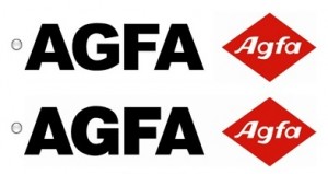
 It’s no secret that Helvetica is considered the darling of typography, admired by designers the world over. Arial on the other hand is frequently looked at as Helvetica’s distant ugly sister, but in truth, to the naked eye, the differences are very subtle as this illustration shows.
On a quest to prove this, font site IronicSans has put together this nifty quiz that takes twenty popular helvetica based logos, and replaces them with Arial. “Sacrilege!” some might say…
Can you spot which is which? It’s no where near as easy as you’d think.
Click here to take the test.
Get the TNW newsletter
Get the most important tech news in your inbox each week.


