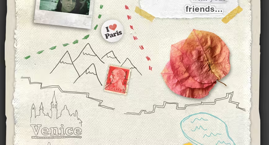
Landing pages have long been an excellent way to draw people into your site, app or service, without bombarding them with too much information. In fact, the very point of a splash page is to show your essence, while teasing what you have to offer.
No matter if you’ve built one before or not, landing pages are powerful tools and checking out some of the best out there is a great way to get started. Plus, if you’re planning on actually releasing something soon, it’s likely you could use a little inspiration to help you think outside the box.
Check out TNW’s list of 11 awesome splash page designs below:
1. Minute Race
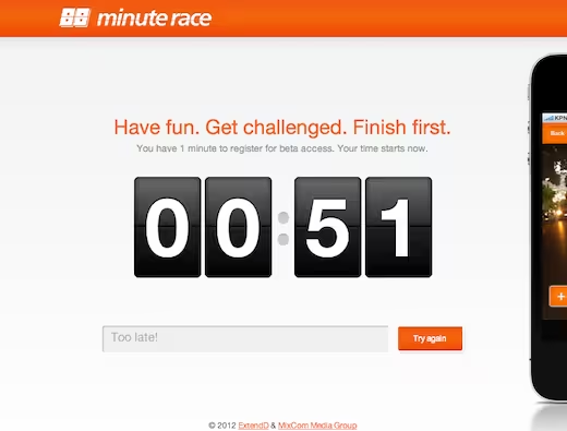 Minute Race does two things really well. They have a countdown that gives you 60 seconds to sign-up for their beta, or you are out. It made us feel nervous enough to sign up before we knew exactly what was going on. Second, showing off the edge of their app was just enough to make me want more.
2. Shipment
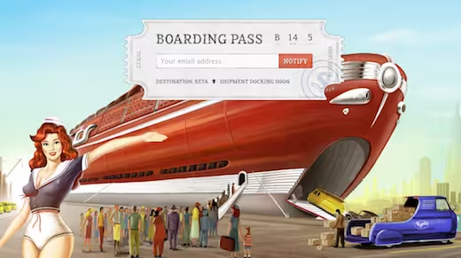 Shipment’s site doesn’t put much information out there, but what they do show off is enough to make potential users curious while it’s in private beta. I particularly like the vintage/futuristic feel. Read our review here.
➤ Shipment
3. ChoreMonster
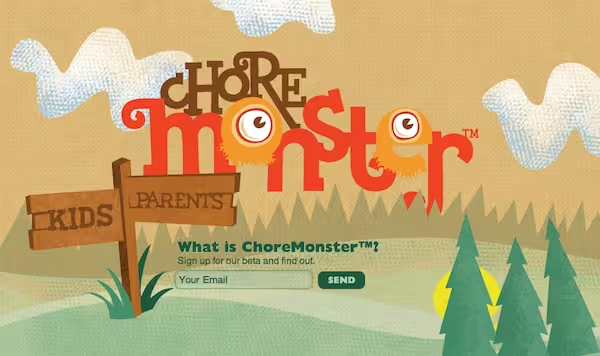 ChoreMonster’s design fits right into its purpose: It’s whimsical, playful and illustrative. It’s clearly kid friendly, but with tons of personality. You can read our review of ChoreMonster here.
4. Evertale
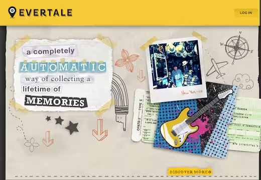 Evertale embraces a strong parallax design, with a little trail that follows you down the page to where you sign up. It’s like going on a micro-journey.
➤ Evertale
5. Local Uncle
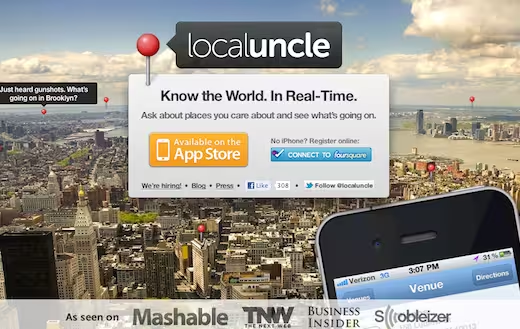 Local Uncle gets it right by dropping us right into a map. It’s short, sweet and well-organized.
6. Sipp
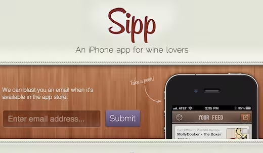 Sipp’s realistic textures feel just right and the wine-red logo and grape submit button are nice touches. The message statements are also concise and clear.
➤ Sipp
7. Nest
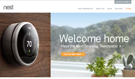 Not so much a landing page as it is a wonderfully simple and direct homepage, Nest has managed to find a perfect balance between clarity and detail. The massive, beautiful photographs only make everything better.
➤ Nest
8. Puma
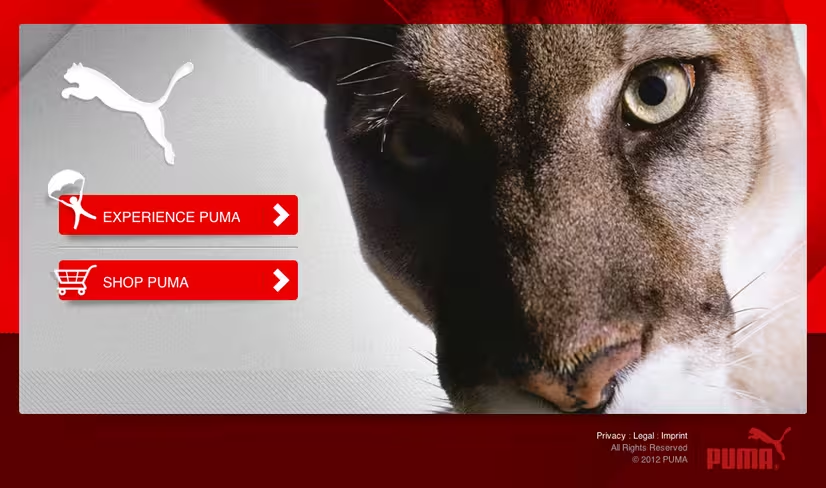 Highly direct and strong, Puma’s landing page gets everything it needs to get done in just a few seconds. You immediately know you’re in the right place and are asked if you’d like to shop or just look around and explore.
➤ Puma
9. ShopLocket
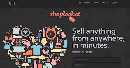 I love ShopLocket’s subtle background and curvy logo. Scroll down to reveal little segments of bright colorful, descriptions.
10. Pixelivery
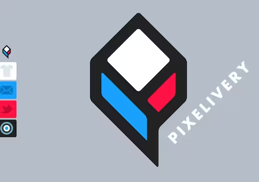 A teaser for an upcoming shop, Pixelivery has a very open and clear design, with strong call to actions and bright colors.
11. FiftyThree
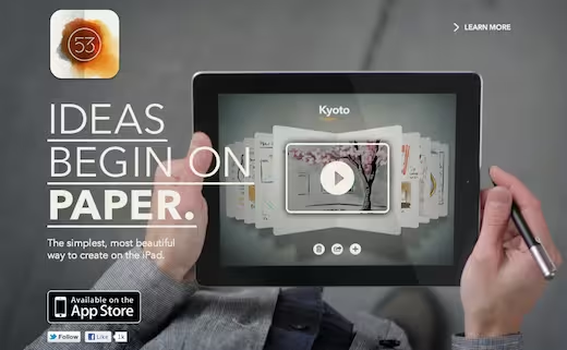 FiftyThree’s homepage says one thing: Paper is an awesome app, and you should try it. The team wastes no time promoting itself, and instead jumps front and center to its featured product.
This list is just the beginning, so if you have any favorites to share, definitely leave them in the comments below!
Thanks to @klavr and @SamseChristian
Get the TNW newsletter
Get the most important tech news in your inbox each week.
