
There are nearly three million apps in the Google Play Store today, and over two million in the Apple App Store. Not only is the app market a fiercely competitive one, users have gotten more sophisticated over time and expect a better, more personalized experience in every app they use.
Under these conditions, there’s no room for mistakes, and yet, it seems like half the apps I open are designed for the sole purpose of pushing me to do things without giving clear direction or while interfering me with what I wanted to do in the app in the first place.
Here are the four most common mistakes I’ve seen in apps time and again, and some creative ways to fix them:
The Smartphone Dumb Push
So you’ve sent a push notification to tell users about a special promotion. Some folks clicked on it, which is great, but instead of finding themselves browsing the promotion in question, they’ve landed on the home screen. Cue the sad trombone.
How to fix it?
If you’ve reached out to your users outside of the app, you better deliver big time if they opted to click on the push notification and enter the app. Don’t expect users to go digging through the app for the promotion in question — lead them directly from push to a dedicated landing page that has more details, and which mimics the language of the message.
A landing page has been a web commodity for such a long time that we almost take it for granted that an email or ad will lead us to a ‘distraction-free zone’ where we can easily decide to take the next step. Landing pages are known for their superior conversion rates and there is absolutely no reason not to replicate it in apps.
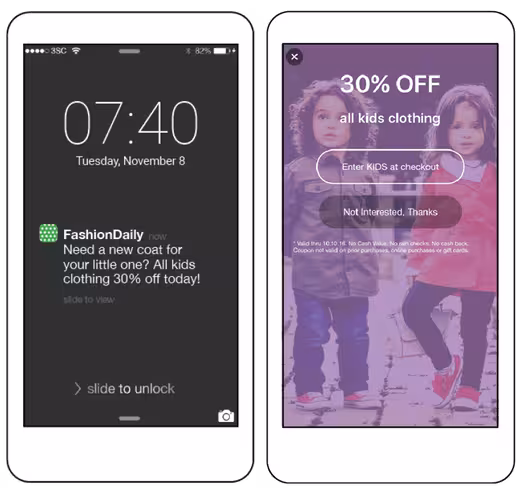
This app directed users from the push notification to a dedicated landing page with more details, so that interested users don’t get lost in the app looking for information.
Jumping the gun
Second-time users are a precious bunch. They have shown more intent than first time users, but they are still on the fence. What’s a surefire way to push them over to the wrong side? Ask them for a rating on that second visit. It’s too early! They don’t know if they love your app yet, and an app store rating is actually a big ask. What have you done to earn their loyalty and trust?
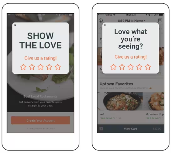
Instead of asking users for a rating right upon launch (left), display it only to those who returned to the app consistently over a period of a month.
How to fix it?
Ask for a rating only from the most loyal of users, and even then, make sure you’re targeting those that are most likely to actually give you a good rating. The best idea is to start with a very quick internal 5-star survey about user satisfaction, and only prompt those who rated 4 or 5 stars for a rating in the app store. Those who are less satisfied should also have an outlet to give feedback, which you can implement to improve their opinion of your app. Either way, you should let users first complete whatever action they may have come to the app for, and only then display your rating request.
Nagging
We all know the feeling of an irrelevant pop-up, a nuisance from which there’s no escape. Too many apps use obtrusive methods (like poorly timed in-app messages, repetitive offers, etc.) when they can convey their intentions much more subtly. Nobody likes a nag.
How to fix it?
Sometimes less is more! Phone screens have less room for error, so use space carefully. A tactful highlight can go a long way to draw attention without blocking the user functionality and interfering with his journey. Of course, the more you know about the user, the less likely you are to be annoying. But if you’re still collecting information about your users, consider highlighting a special deal, or a piece of text you want the user to notice.
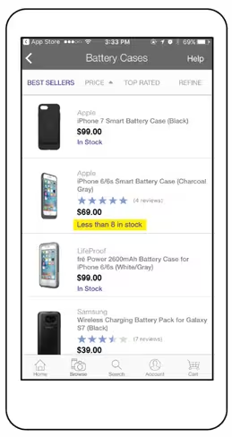
This retail app used a field value trigger to highlight items that are low in stock, thereby creating a sense of urgency without obstructing the screen or user experience.
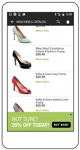
In this example, an incentive banner appeared on the devices of those who were return users, browsing for the same category for a third time, but who haven’t yet made a purchase. This is a way to nudge users down the funnel without interrupting their browsing.
Burying the goods
More likely than not, if you’re launching a new feature in your app, it has come after months of development and testing. In the meantime, users have upgraded your app, but they have no idea that the new feature is even there. Your investment is wasted.
How to fix it?
Learn to celebrate and highlight the newest and best features of your app, especially if they have revenue generating potential. Figure out which audiences this feature will bring the most value to, and target them. A tooltip can be the ideal way to introduce users to new capabilities, because you can trigger them at the right time and they are unobtrusive. But you could also display an in-app message, a video, or even a survey to draw user’s attention. As long as you display it to a relevant group of users at the right time, the chances of them responding positively to your offer will soar.
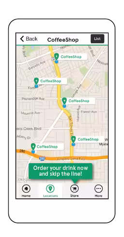
In this example, a coffee chain informs users about an on-the-go ordering feature when they visited the map in the app, when they’re most likely to want to use it and get the most out of it!
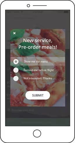
Here, an airline displayed this in-app survey to introduce a new feature in the app. When users check the app to monitor their flight status, or when they’re heading for the airport, they find out that they can now order an in-flight meal, when they are most likely to be tempted to order.
Smartphones are intimate objects, close to the heart of their owners, and always close at hand. Respect that by giving your app users an experience that is both personalized and obvious in the kind of value they can get from it. When building your campaigns to meet your business goals, be it increased user LTV, increased usability or higher rating, always think about your customer. If your campaign is able to either simplify matters, help users with informative data or simply show them you care, you’re on the right way to gaining loyalty.
Get the TNW newsletter
Get the most important tech news in your inbox each week.