The end of the year is coming up fast, and we’re already looking towards what next year will bring. For designers like myself, the end of the year is an inspiring time. What trends and design aesthetics will be popularized in 2020? What trends will likely be on their way out?
“The 10,000 foot-view of these trends makes it clear that ‘web’ design looks more like traditional ‘graphic’ or ‘print’ design than ever. The amount of flexibility that designers in being expressive and creatively nimble is astonishing compared to just five or ten years ago,” states Khoi Vinh, Senior Director of Product Design at Adobe XD.
Vinh couldn’t be more right. Having done this look ahead in design trends for several years now, I can completely agree that these trends show just how creative designers have become with making the web feel more like other types of media, such as graphic design and print design.
If you’re a designer, or a fan of great design, you’re in luck. I’ve done most of the heavy lifting for you, and pulled together the top web design trends that will likely grace your screens in 2020.
1. Text-only heroes
I mentioned in my article last year that experimentation with hero areas — the part of the website when you first load the site, aka the “above the fold” area — was likely to become more evident throughout 2019. This was definitely the case, and one of those experiments was text-only heroes.
While some hero areas have gotten more involved with different kinds of elements than just the standard text-on-image set up, this “text-only” trend is intriguing in that it’s removing the typical background image and just letting typography do the work.
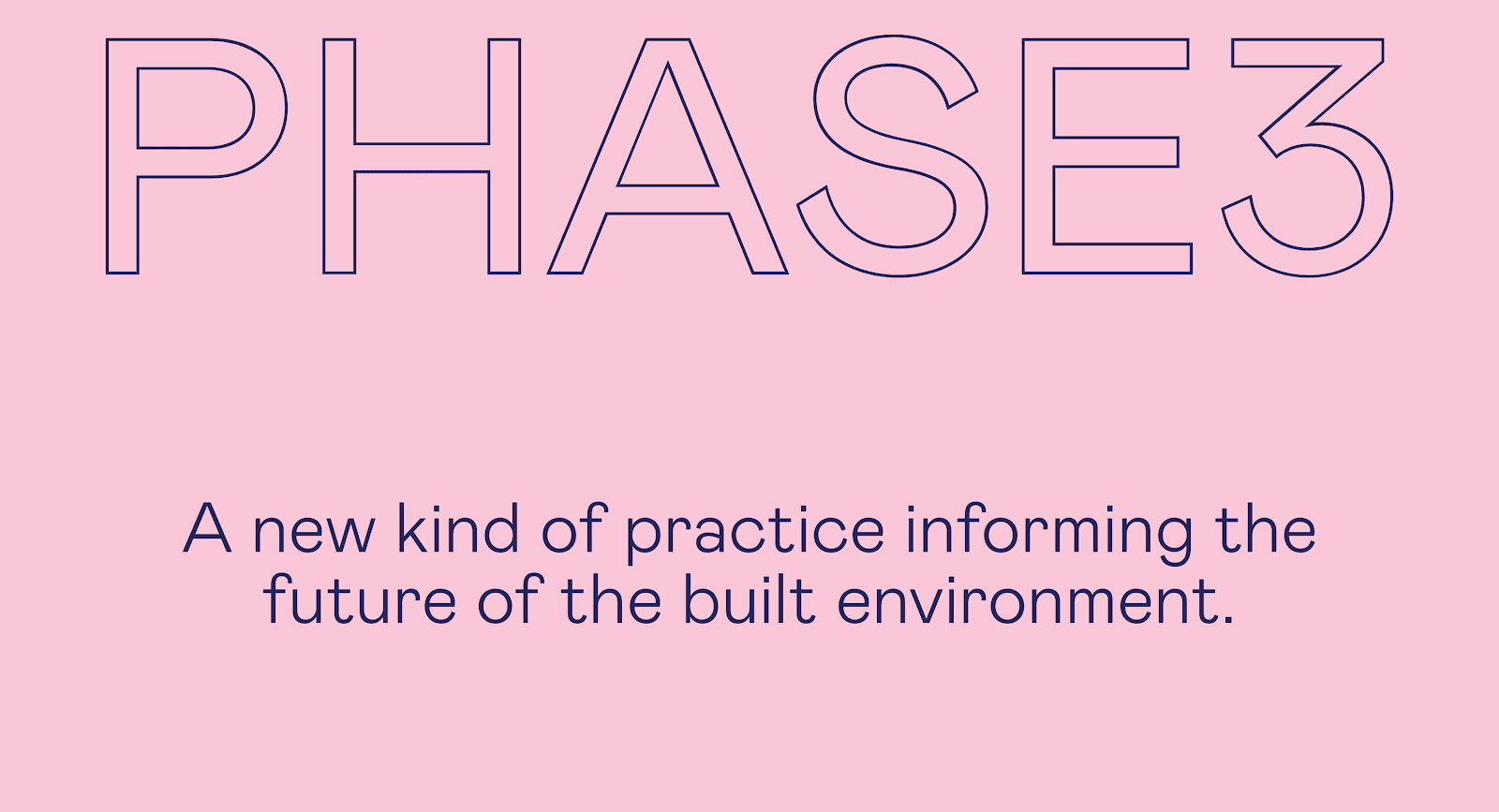
Phase3’s website is a great example of stripping things back in the hero area, and focusing only on typography (although, the color-changing background, which you can see on their site, is a subtle nice touch). That typography also has some personality to it, instead of a standard or overused sans-serif font. You can also see this trend with The New York Times, who paired a custom font with animations for their text-only header for their Food Festival website.

2. Involved illustrations
While illustrations have been prevalent on websites for many years, there’s a growing trend of having custom, detailed, and well-executed illustrations grace websites recently, and I’m sure this is a trend that is just getting started.
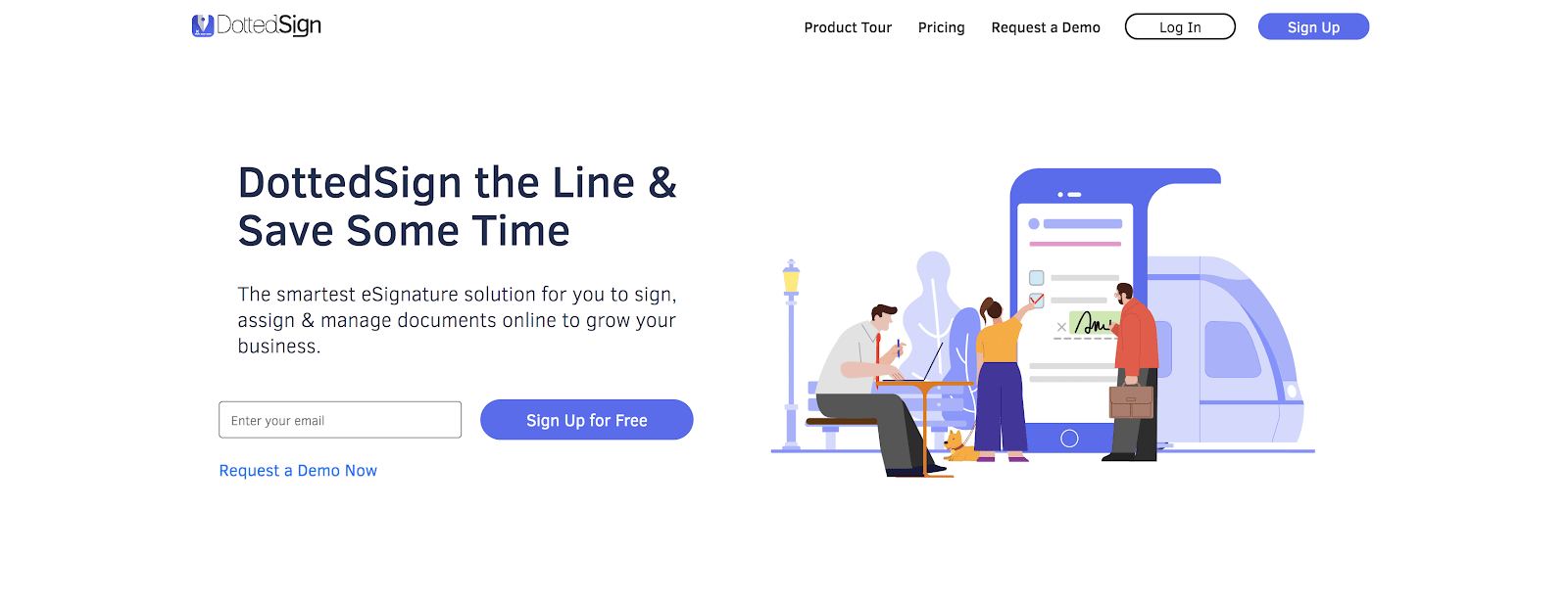
Websites such as DottedSign (above) and Fixate (below) are great examples of this growing trend. Both websites use very well-thought-out and detailed illustrations, not only in their hero section of their site but throughout the entire website to tie it all together.
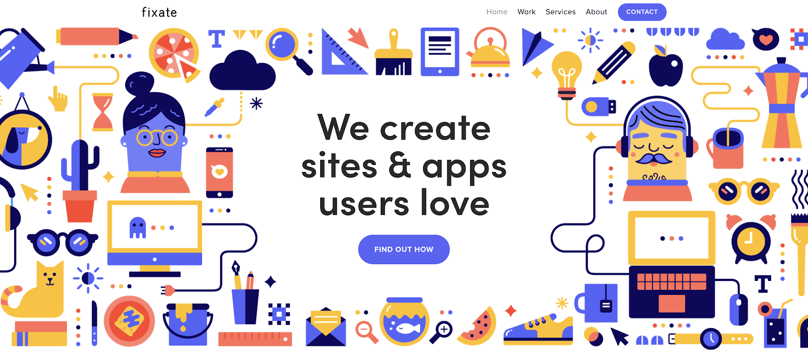
Pairing the illustrations with a bit of animation really helps grab attention and can be used as another way to communicate with your visitors. Animated illustrations are great as a supplementary tool to text, and are often better at illustrating and communicating when used as more subtle and secondary features instead of the main one.
3. Vintage-inspired colors and typography
In my article from last year, I touched on bringing back nostalgia in design as a throwback to previous time periods. This is often influenced by other media forms of the time, such as television and magazines, especially if a throwback to a pre-internet era.
In 2020, I anticipate this trend to take on a different form. Instead of going all-in on a retro or throwback look, I see websites taking nostalgic bits and pieces, and remixing them with modern style.
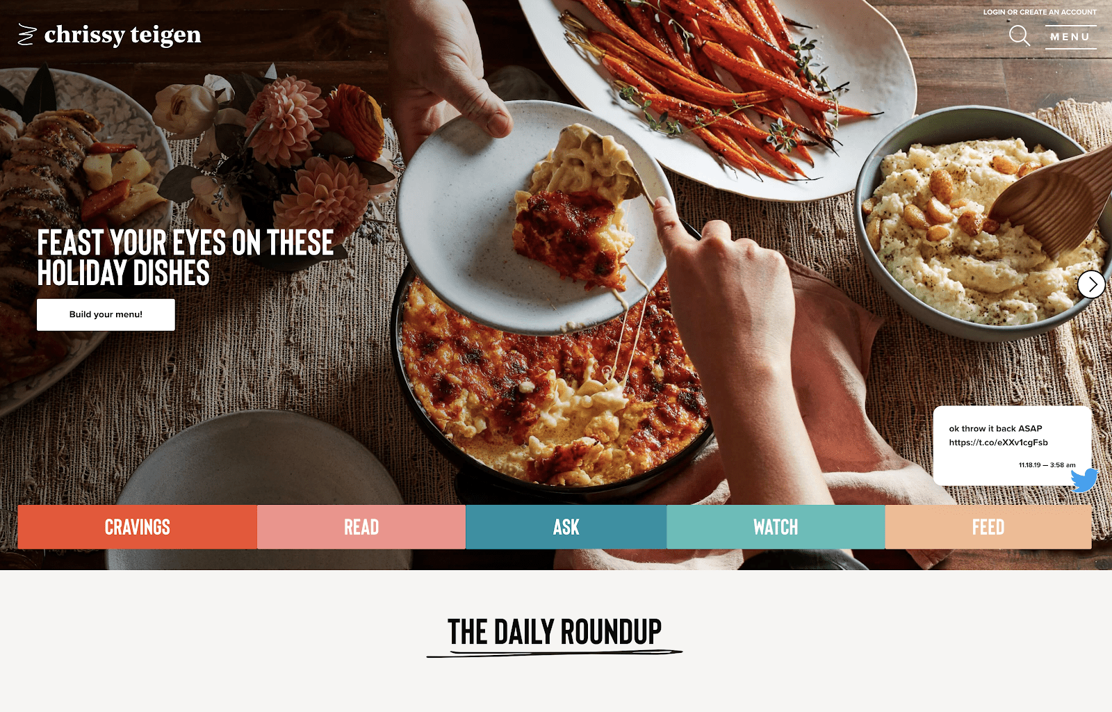
One of the most common bits of design inspiration that’s being used in websites today is using vintage colors and/or typography as a way to convey this feeling of nostalgia. Chrissy Teigen’s new website is a great example of using a vintage-influenced font with a vintage-inspired color scheme (earthy, but bright).

The popular typography trends website Typewolf also uses vintage typography and colors to influence their site design while still staying modern in aesthetic. Their font paired with the background color feels vintage, but not dated.
4. Black and white
Monochromatic is so 2019. 2020 will be the year of seeing more and more sites experiment with having no color at all, sticking to only black and white with very little in between. Consider it monochromatic gone minimalist.
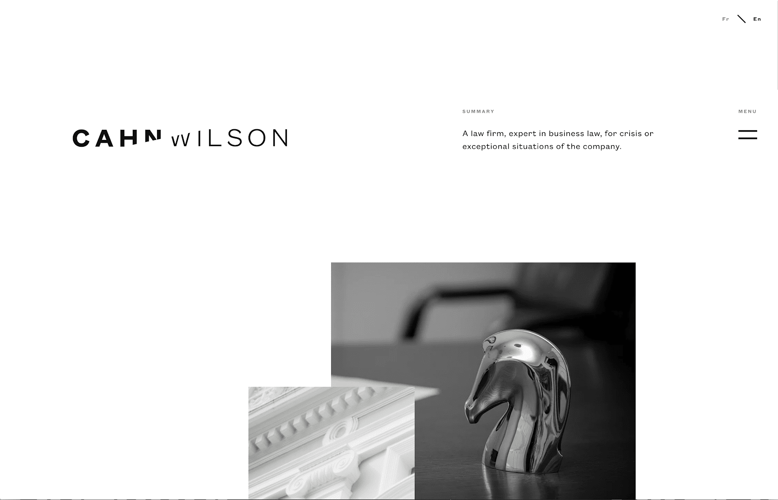
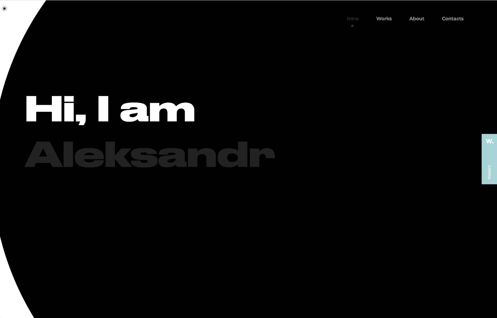
Cahn Wilson’s site is a great example of a design aesthetic absent of color. Focused primarily on black and white with grayscale images, the website is clean, crisp, modern, and on-trend with other contemporary sites. Alexsandr Yaremenko’s site (below) also keeps with the black and white color scheme outside of his portfolio examples.
5. Dominating grids meet cards
Most websites are designed on an invisible grid system that helps keep items on the page organized and in-line. In 2020, however, I anticipate seeing these grids becoming more visually dominant and used as the primary design aesthetic, clearly inspired by the popular “card” design trend.
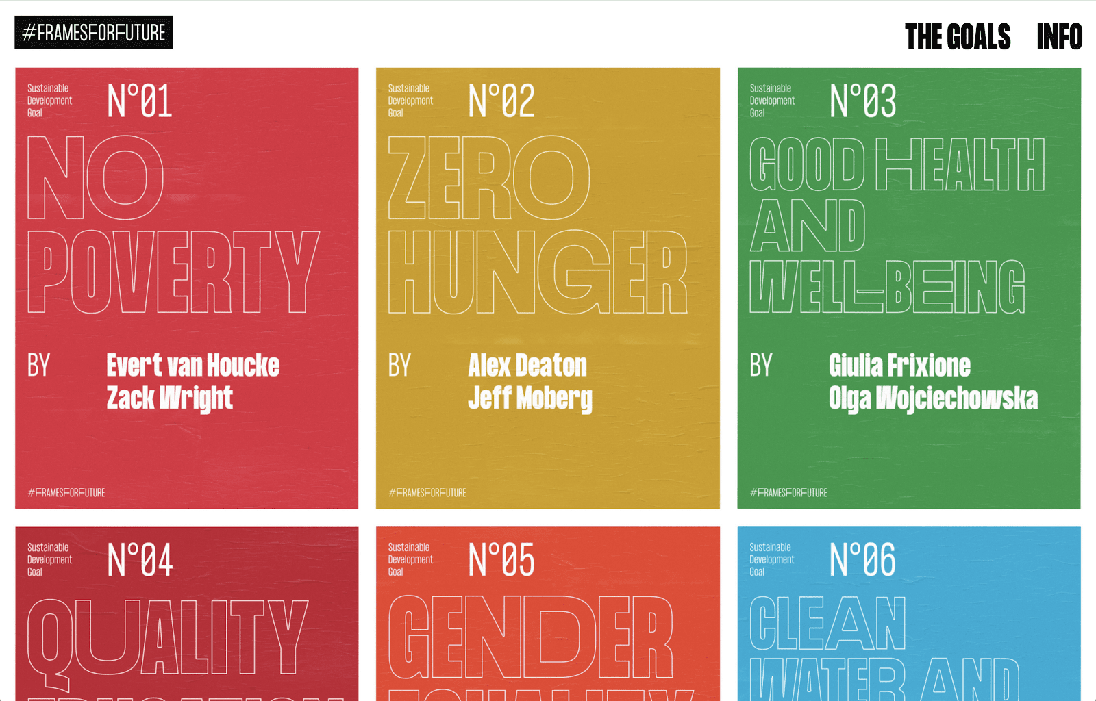
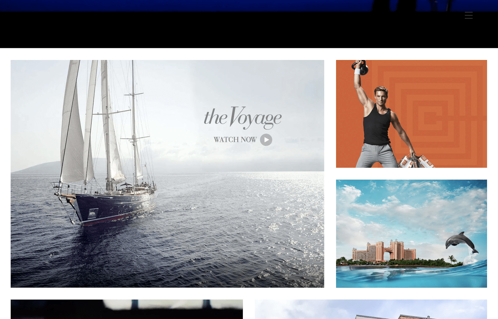
Frames for Future’s site is a great example of using the grid as a design aesthetic rather than just a design tool. Their site’s content is organized in large rectangles aligned in a grid format. Most of Evergib’s site (below) is also laid out in a grid, with different sized “cells” to give it dimension, visual interest, and to change up the cadence.
6. Outlined typography
If you can’t tell already, I really like typography and notice typographical trends in particular. One emerging trend is outlined typography, and we can expect to see this more and more in 2020.
“Being typographically distinctive has become an imperative on the web, which is amazing considering that it wasn’t that long ago when designers only had a handful of fonts to work with,” explains Vinh from Adobe. “We have more web fonts; we need more daring, more diverse web typography too.” There’s no doubt that this is evident not only in this trend, but others already mentioned here.
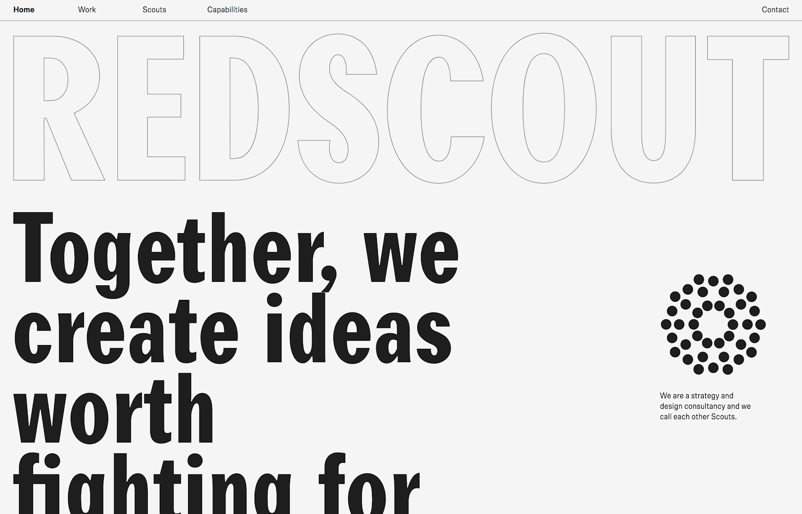
The Phase 3 site mentioned at the beginning of this article features this outlined typography. Redscout also uses a large outlined font as part of their web design aesthetic, combining animation to pull out the “fill” of the letters leaving just the outline behind when you scroll down the page.
7. Massive font sizes
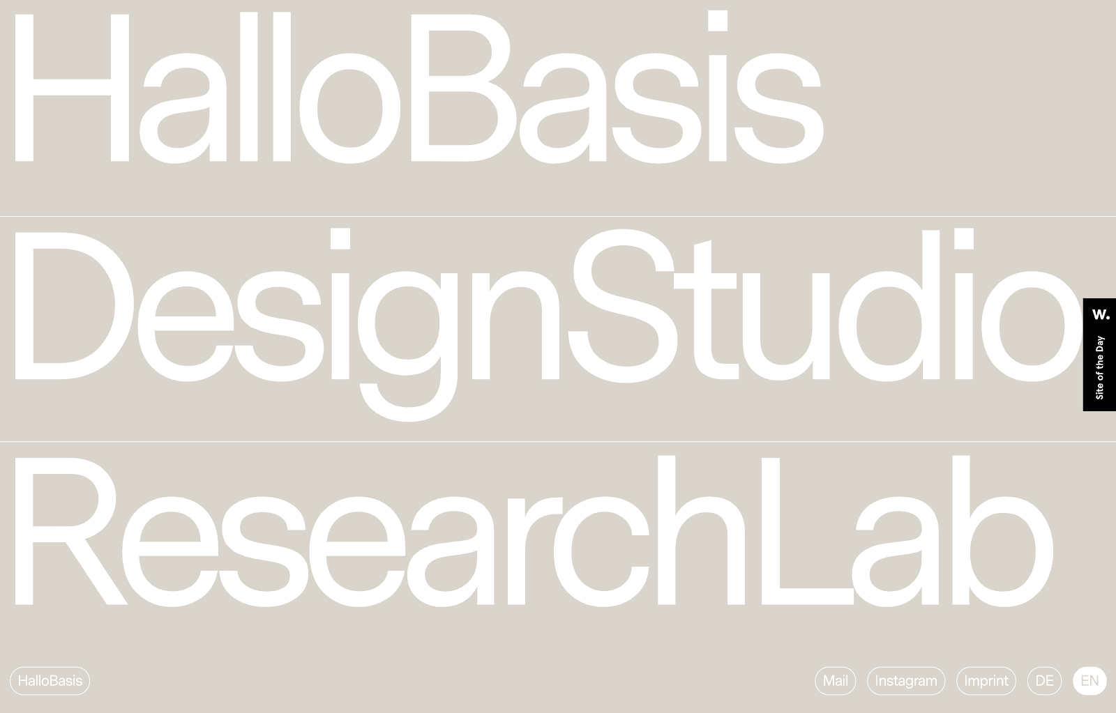
Yes, another typography-based trend, but how can you overlook the ever-increasing font sizes on the web? A trend going into 2020 is larger-than-life typography that can be read from across the room.
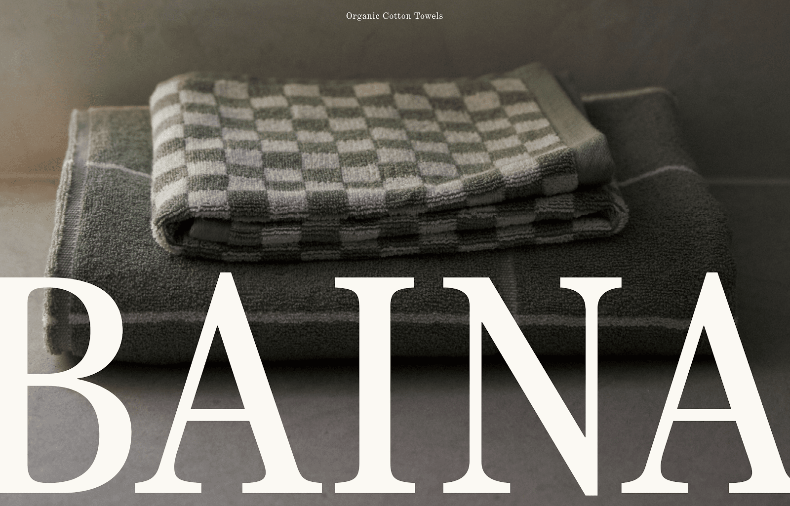
Redscout and The New York Times Food Festival (both featured earlier in this article) are great examples of this trend. Baina (above) takes the font size of their name to very large heights, taking up nearly half of the viewport of their home page.
HalloBasis features very large typography that fills the viewport as a style of navigation to help visitors go to different parts of their site.
8. Geometric shapes and patterns
Last year, I mentioned that more fluid, organic shapes would be trending in 2019, so it’s no surprise that the opposite of that would also be trendy too. Geometric shapes, lines, and patterns are making a comeback for 2020.
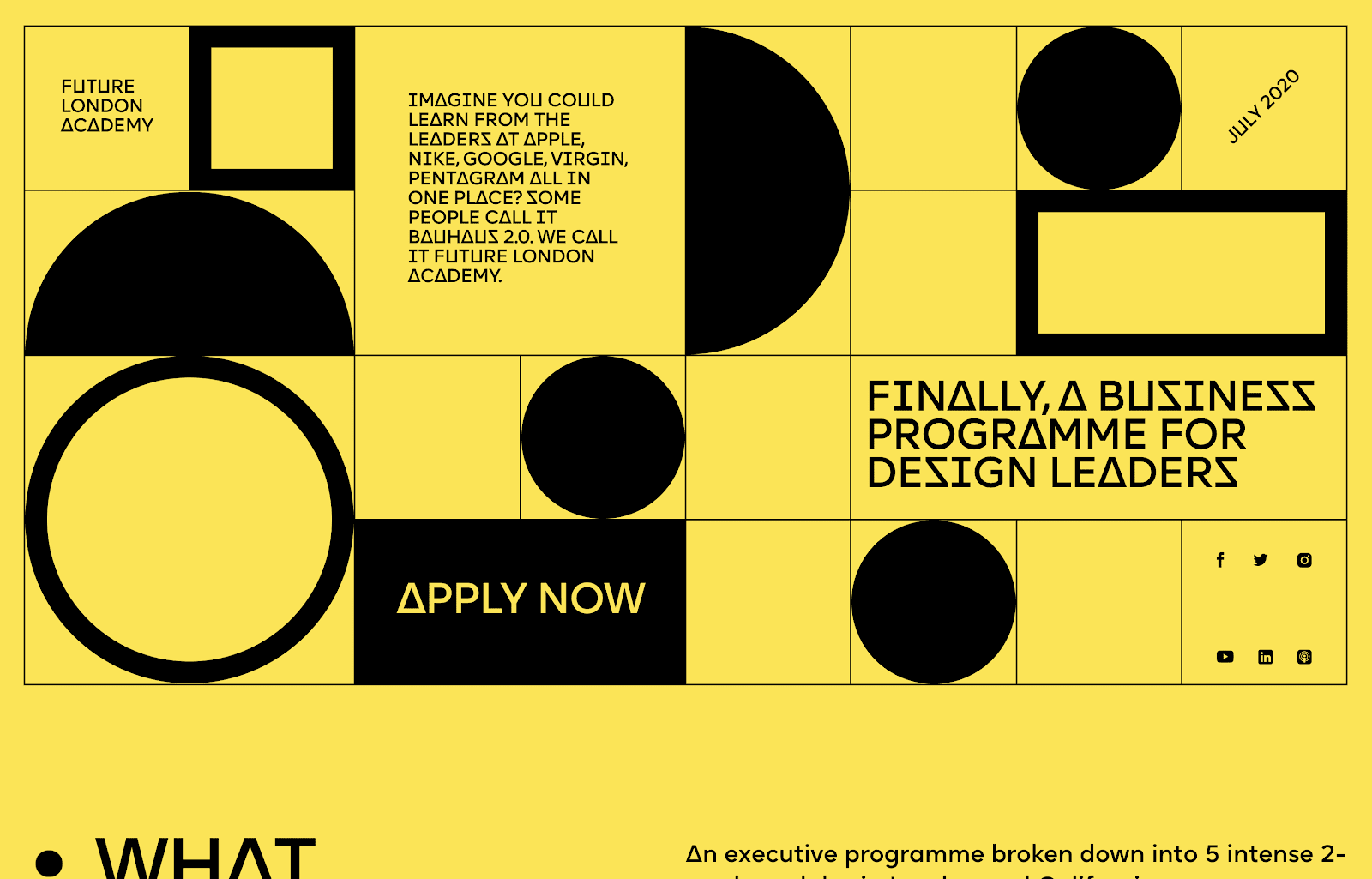
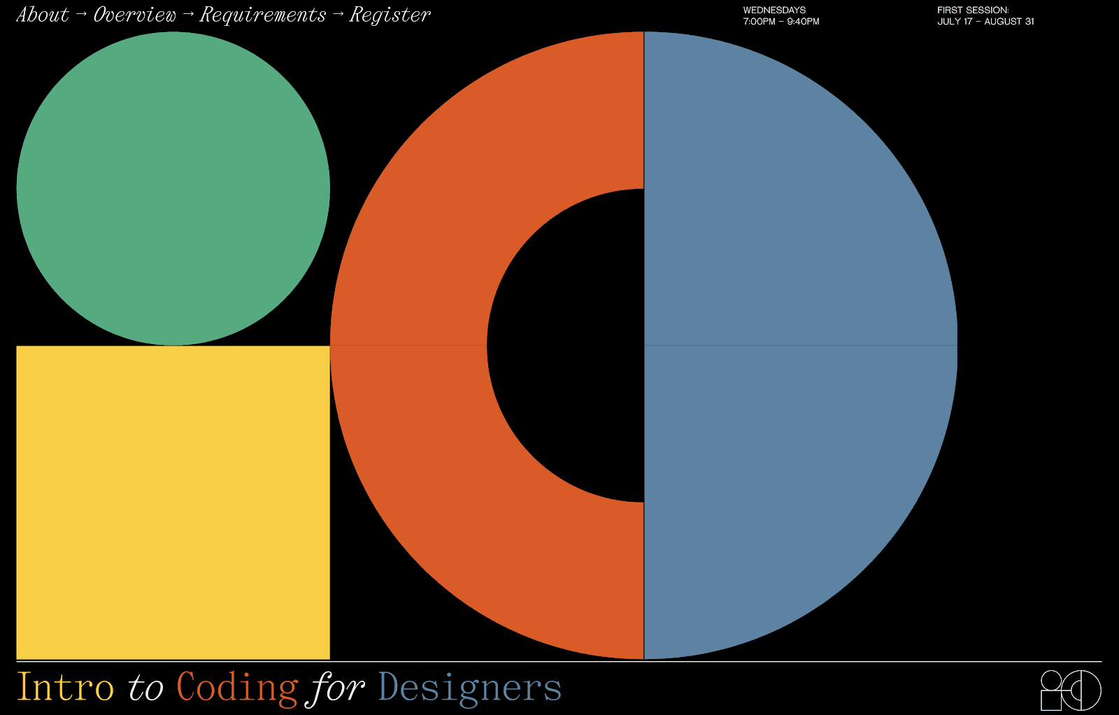
Future London Academy’s website features animated geometric shapes in the hero area of their site, also in-line with the geometric shape and animation trends mentioned above. XXXI’s website (below) for their Intro to Coding uses geometric shapes in a similar way.
9. User-triggered animations
Typically when we think of animations, we see them happening on their own, independent from any action we may take on the page as site visitors. A growing trend in web design, however, is having animation triggered by some type of input or action from the visitor.
Vinh from Adobe certainly agrees. “Combining user interaction with tasteful animation and tasteful type is one of the most exciting things to happen to typography in a generation. Even as web design is increasingly able to match the expressively of print design, putting type in motion in response to user inputs adds a new dimension to how we think about written communication. More of this please!”

Romain Avalle’s site is a great example of this trend, as is Intro to Coding’s (previously mentioned). In the center of their website, the outlines of the initials move around based on where the cursor is. This type of interactive animation helps engage the viewer and slows them down to figure out the animation, making them apart of the website experience and not a passive consumer.
10. Trendy color schemes make their way to websites
I’m sure we’re all familiar with the color combinations and color schemes that are trendy in other parts of our lives, be it music, clothing, social media, etc. I expect in 2020 that some of these color combinations will make their way into website designs.
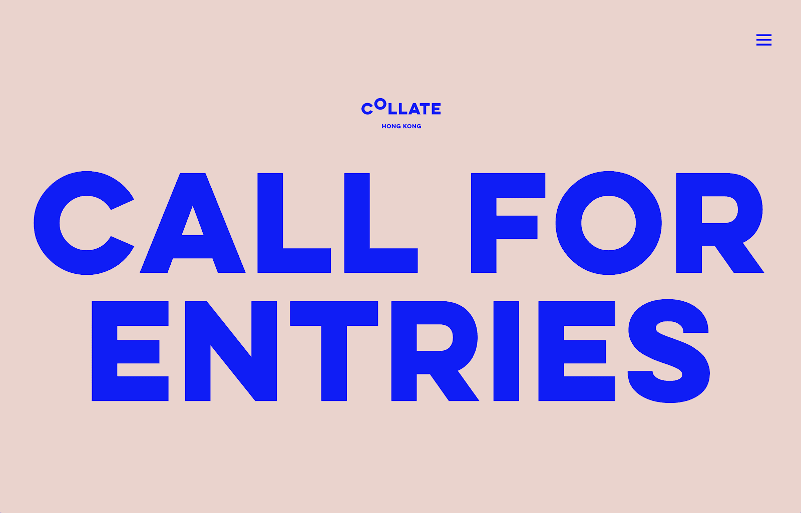
An example of a trendy color combination is the primary blue and pale pink/dusty blush scheme, made popular by Pinterest and Instagram. Collate Art’s (above) and Datalands’ sites (below) both feature this trendy color scheme in their site designs.
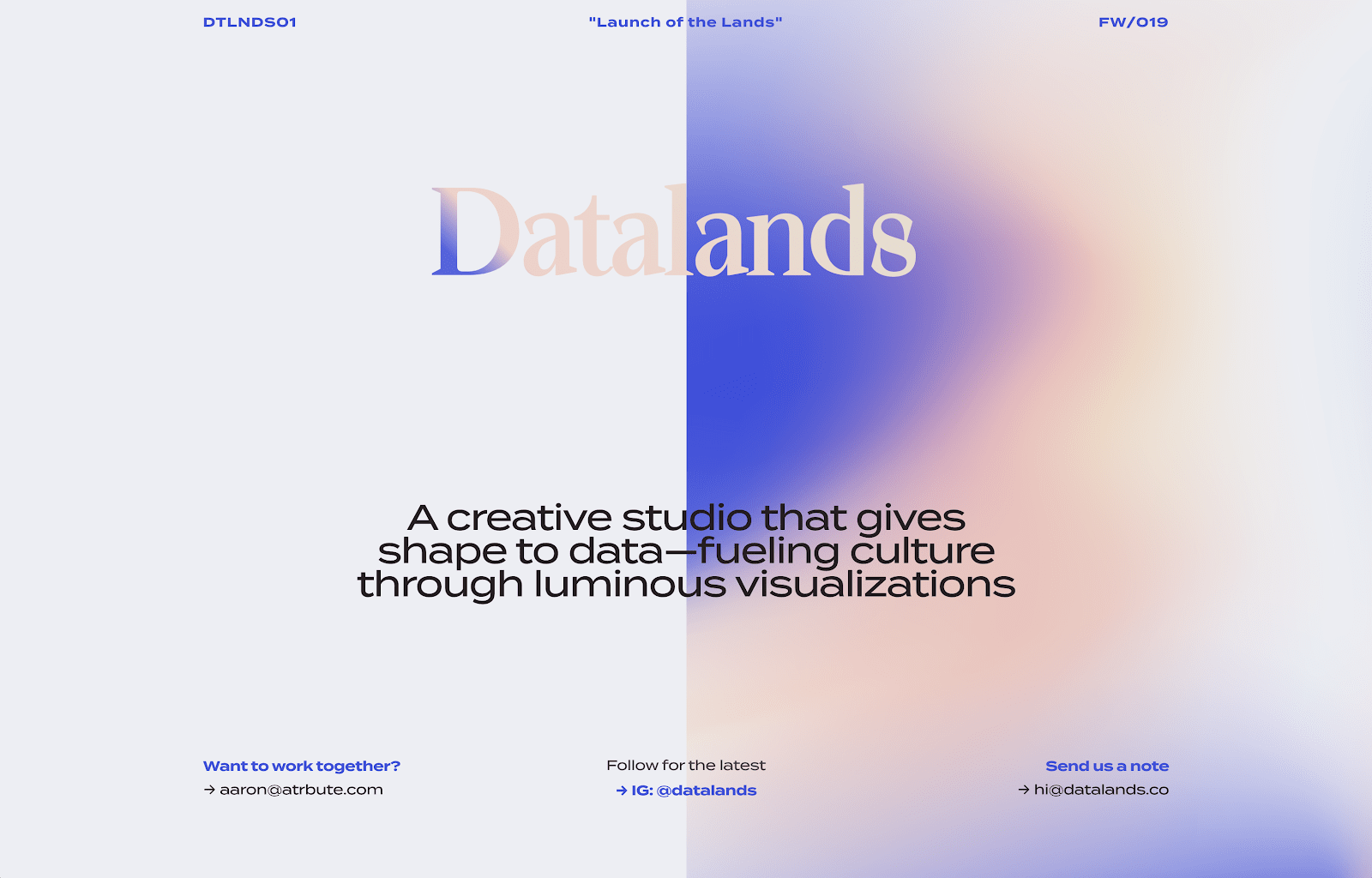
Other examples of trendy color schemes include jewel tones (greens, purples), earthy tones (tans, browns, greens, wood textures), and iridescent/pearl color schemes (pastels that meld together like a liquid, giving an almost metallic look).
Key trend takeaways
Some of the biggest trends we’ll likely see in 2020 involve animations, illustrations, and typography, mixed with new types of color schemes and interactions.
Typography, however, seems to be the big winner here, as I expect to see these several typography trends last way beyond 2020. Vinh at Adobe has this to say about typography in web design trends as we move into a new decade, “Designers—and brands—need to move past the great uniformity that has come to dominate web typography. There are still too many tech companies trying to take the edge off of their less seemly activities through roundish, sans-serif typefaces. And too many consumer brands using serif typography to identify themselves with this illusory notion of Brooklyn-esque hipster classicism.”
(Need more inspiration? Check our 2019 web design guide, 2018 web design guide, 2017 web design guide, and 2016 web design guide, too).
From large typography to outlined typography, vintage-inspired color schemes to trendy color schemes, and everything else mentioned here, 2020 looks to be a great year for designers and design fans, and I for one, can’t wait to see these design trends come to life as we enter the next decade.
Get the TNW newsletter
Get the most important tech news in your inbox each week.
This post is part of our Fundamentals series and powered by Adobe. Drive your business forward with Adobe Creative Cloud for teams. Get started now.
