We’re approaching the end of 2017, which means I get to write my favorite article of the year: web design trends you can expect to see in the coming year.
Below are the top 11 web design trends that I anticipate we will be seeing much more of in 2018.
1. The end of pop-ups and interstitials
Google tends to be the main driver behind web trends, and there’s no doubt that it will be the driving force behind sites wanting to drop their pop-ups and interstitials. Google recently announced that it will start punishing sites that use these annoying tactics in search results — for instance blocking most of the content on a page until you click the “X” button.
In 2018 we will be seeing less of these, as sites become worried that they could take an SEO hit when it comes to Google. However, not all interstitials will disappear — websites that require age verification or signing in before seeing content will still need them.
2. Broken and/or unconventional grid layouts
While designing with a grid underlay is probably not going anywhere soon, more experimentation to grid layouts will likely continue into 2018. Unconventional and even broken grids will become more a prevalent design aesthetic as designers test the boundaries and find new ways to present unique content.
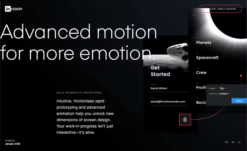
Invision Studio is a great example of this. With their newly-launched website, they push the boundaries of grids by changing up the grid layout as you scroll through the page, even “breaking” it in some cases by having the text overlay an image at certain places (see the “n” at the end of the heading in the image above).
3. Return of the serifs
With flat design came the desire to go really flat — even so much as to remove serifs on typefaces. Well, as flat design starts to see the end of its run, we are starting to see typefaces get their personalities back with serifs returning to the characters.
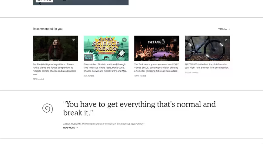
On Kickstarter’s new website, you can see how they use serifs on some parts of their site. This adds personality to their otherwise clean and modern design layout. Serifs tend to have a way to add personality and authenticity and create a timeless look. I anticipate we will start to see more serifs used in designs in 2018.
4. Animations that don’t distract
Animations in websites have blossomed thanks to jQuery and CSS3, but until recently, designers have gone overboard in wanting to animate all things. In 2018, I expect animations and interactions will be used with more restraint and intention — meaning they add to the experience without distracting or confusing the user.
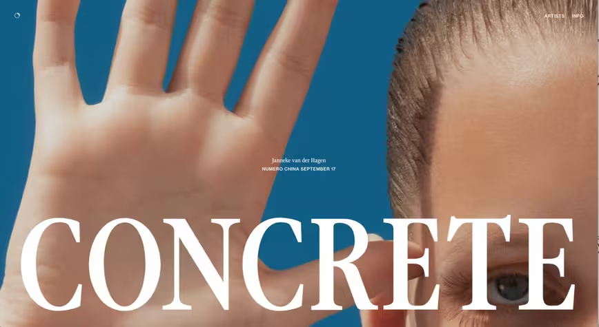
A great example of this is the Concrete Rep site. As you scroll, different images appear and the text changes. It is done well in that it helps add a uniqueness to the experience without taking away from the artists and their work.
5. Sharp gradients
Another trend starting to take off is a new take on presenting a gradient. Sharp gradients are starting to be used to help add some visual interest to gradients beyond just a gradual change in color. Seeing the color change on a sharp line helps take an ordinary gradient of 2015 and make it more modern for 2018.
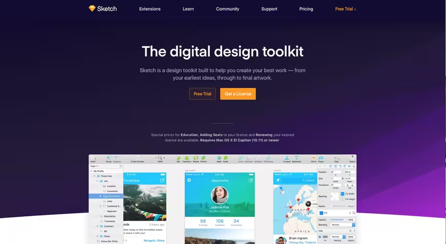
A great example of this is Sketch’s website. You can see in the bottom right how the purple gradient increases along sharp diagonal lines. Also, as you scroll through their homepage, you’ll see a circle bullseye effect that is done the same way. This helps elevate the gradient into something more eye-catching by applying a subtle texture in addition to the gradient.
6. Diagonal section breaks
Whoever said that horizontal breaks had to be… horizontal? More recently, designers have been playing around with how horizontal a line break or section break has to be by putting it on edge, literally. By separating sections of a website using a sharp diagonal, it helps add visual interest and unique website layouts that can help separate it from most sites who are still using the very horizontal break of circa 2014.
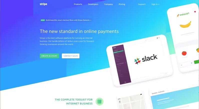
Stripe’s website shows how this trend, when done well, can produce great results. Not only do they use sharp gradients as mentioned above but they also visually break up sections of their homepage using a sharp 10-degree angle. This results in nicely delineated visual areas and offers a unique way to present content.
7. Rounded corners have been brought back to life
Either rounded corners never really died, or a whole lot of people are behind on the trend and now bringing it back around. I expect rounded corners will appear in more places now that flat design has peaked and we start bringing back some design elements that were shredded during the flat design era.

Twitter’s new tweet box is a prime example of this. Twitter went all in in 2017 with the rounded corners design trend, making their tweet box full of rounded corners: From the tweet box itself to the buttons; even to the avatar. I anticipate more websites using rounded corners as 2018 progresses.
8. Bright and bold color schemes
Coming up with color schemes is hard, so it doesn’t surprise me that as 2017 is coming to an end, more and more color schemes pop up that feel like they shouldn’t work, but somehow do. For 2018, I expect seeing more experimental color schemes that are bold and bright; often combining colors that might seem horrible together but work wonderfully.
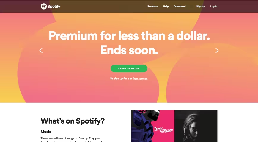
Take, for instance, Spotify’s homepage. It features a homepage color scheme of pink, gold, and orange. Normally, these three colors together would hurt my eyes, but Spotify made it work. Bright and attention-grabbing color schemes are likely to surge in 2018.
9. Interactive storytelling
As publishers find new ways to deliver content in unique ways to their audience, I anticipate seeing storytelling on the web going more interactive using animations and videos to help illustrate various parts of the story.
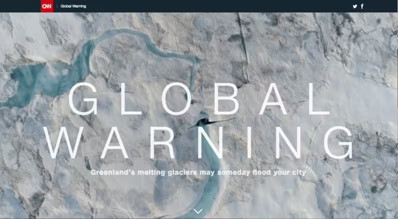
A great example of this is CNN’s most recent story about global warming and Greenland’s melting glaciers. As you scroll, it tells the story with different paragraphs that appear and disappear at times, along with the video in the background changing. Parts of the story are illustrated using maps or other graphics, which readers “pass” when they scroll down.
10. Split screen design on desktop
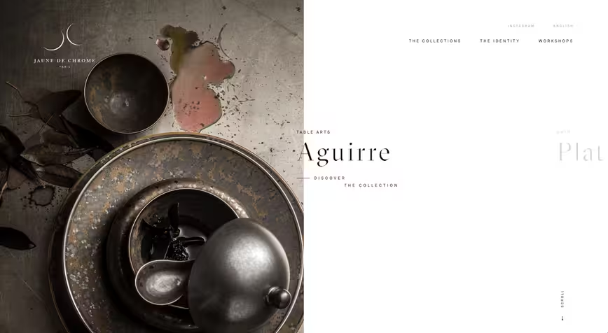
An emerging trend that I love is the split screen layout instead of a hero image. This trend features either one or two images that take over the entire viewport, split vertically down the center of the page. The Concrete Rep site (part four of this list) also features this trend.
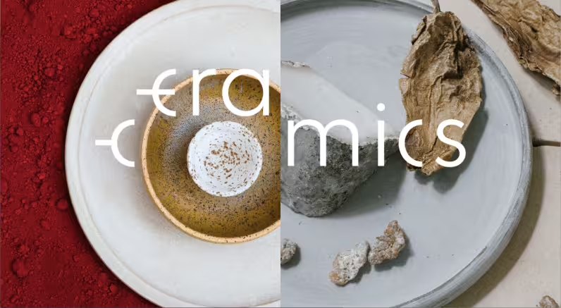
Jaune de Chrome’s site (first image above) and Ceramics (above) both feature this design trend. The Jaune de Chrome’s site features one image in the split screen with the broken grid typography, while Ceramics showcases two images in the split screen format.
11. Emergence of Brutalism
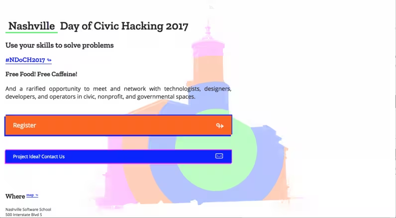
If you haven’t heard of this before: you are not the only one. Brutalism, when it comes to web design, is almost opposite of most of the trends discussed above. In my opinion, the carefree ruggedness of Brutalism can be seen as a rebellion against the clean, organized, and light designs that we see most frequently today. It’s “brutal” in that it feels raw and unpolished, often breaking pretty much every rule of web design and user experience along the way.
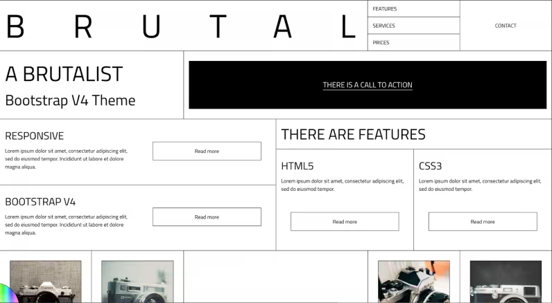
Brutalist websites follow their own design aesthetic and seem almost completely stripped down. They don’t conform to any aesthetic trends. Above, you can see an exemplary framework used to design a Brutalist website. Below is an example of a Brutalist website design — one that feels raw, rugged, is breaking tons of rules, and basically defying most trends.
Conclusion
In terms of web design, 2018 is bound to be an exciting year. I’m looking forward to seeing these new trends emerge in more and more websites: having to deal with less pop-up windows, seeing more sharp gradients, bright color schemes, and even Brutalism. These trends have already gained some popularity in the last months of 2017 and will only grow bigger throughout 2018.
Get the TNW newsletter
Get the most important tech news in your inbox each week.

