Apple’s design has been cutting edge and has set industry standards ever since Jony Ive joined the company’s design team back in 1992.
During Apple’s early days, Steve Jobs made marketing an integral part of the company’s DNA. By combining great-looking products with powerful marketing, Apple has steadily grown to one of the biggest companies of our time.
Microsoft, however, has always been lagging behind on both of these fronts. The design of its product has never been as celebrated as Apple’s, and their marketing efforts have ranged from the acceptable to the absolutely horrible.
This commercial for Microsoft Songsmith, a music app that came out in 2009, shows a low point for their promotional activities. It’s not a joke.
microsoft’s marketing sure came a long way pic.twitter.com/pV0mRjfz1o
— juan buis (@juanbuis) October 27, 2016
Songsmith never became “the cool new thing”, and the extremely cringy ad for it definitely didn’t help. But around the same time, Apple came out with sleek commercials like this:
https://www.youtube.com/watch?v=Ntk8JYsdNFA
It’s clear who was winning here. Apple’s products didn’t just have better design, they were also marketed in a stellar way.
But during yesterday’s epic event, Microsoft was looking better than ever. Throughout the keynote, its new products and software stole the show. However, everything came together with the announcement trailer for its Surface Studio.
This is by far the best promotional video Microsoft has ever made, and it easily matches Apple’s current marketing for the iPhone 7 and Apple Watch Series 2.
It starts off with showing the luscious shapes of the new device, using simple lines and abstract visuals to set the mood.
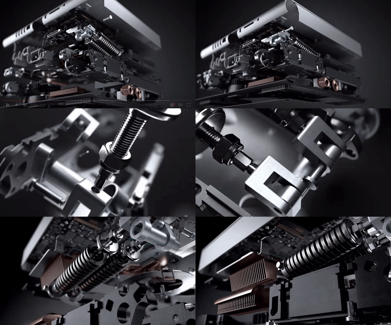
While the music builds up, the focus shifts to smooth animations of the inner construction of the device — something every design or tech geek loves.
Then we dive into smooth shots of the different features, like the zero-gravity hinge that makes it extremely easy to move the screen.
All of this is paired with a custom rendition of Flannel Graph’s track Pure Imagination, which itself is a cover of Fiona Apple’s version. It makes for an epic look at the company’s new flagship device, that makes me feel something I haven’t felt in years — the need to buy a Microsoft product.
Yes, the video and the design of the computer are reminiscent of Apple’s signature style. But it’s also different enough, offering features that no iMac has — it looks like a really great device.
It’s never been a more exciting time for both companies — tonight Apple is hosting an event where it’s expected to launch a new MacBook Pro with some exciting new tricks. And it better bring its A game.
Get the TNW newsletter
Get the most important tech news in your inbox each week.


