Bangalore, India-based firm Creo has come a long way. From creating a commendable Chromecast rival that I liked a lot, it’s now secured funding from Sequoia and others to take on smartphone makers and mobile software developers.
The company recently launched its Mark 1 handset which runs Fuel OS, a custom Android fork that promises a new feature every month.
While India has a number of homegrown smartphone brands including Micromax and Intex, their products are usually poorly designed and badly built. As a result, I was skeptical about Creo’s debut effort from the get-go.
However, the Mark 1 gets a lot of things right and does a good job of showcasing the company’s software platform, which Creo hopes to offer to other manufacturers soon.
Creo says it will look to the community for direction on what features it should add to its OS, which is an interesting idea. At present, it comes with a few neat tools that are certainly worth checking out. The question is, do they make the Mark 1 worth its sticker price of Rs. 20,000 ($300)?
Design
Make no mistake: The 5.5-inch Mark 1 is a large phone. Even if you’re used to devices with a similarly-sized screen, you’ll notice at once that, at 190g and 155.4mm tall, it’s heavier, taller and thicker than most other handsets out there.
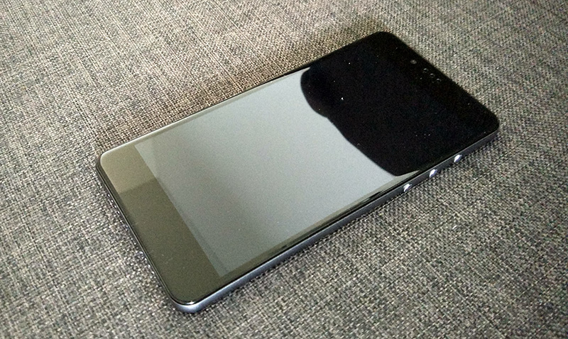
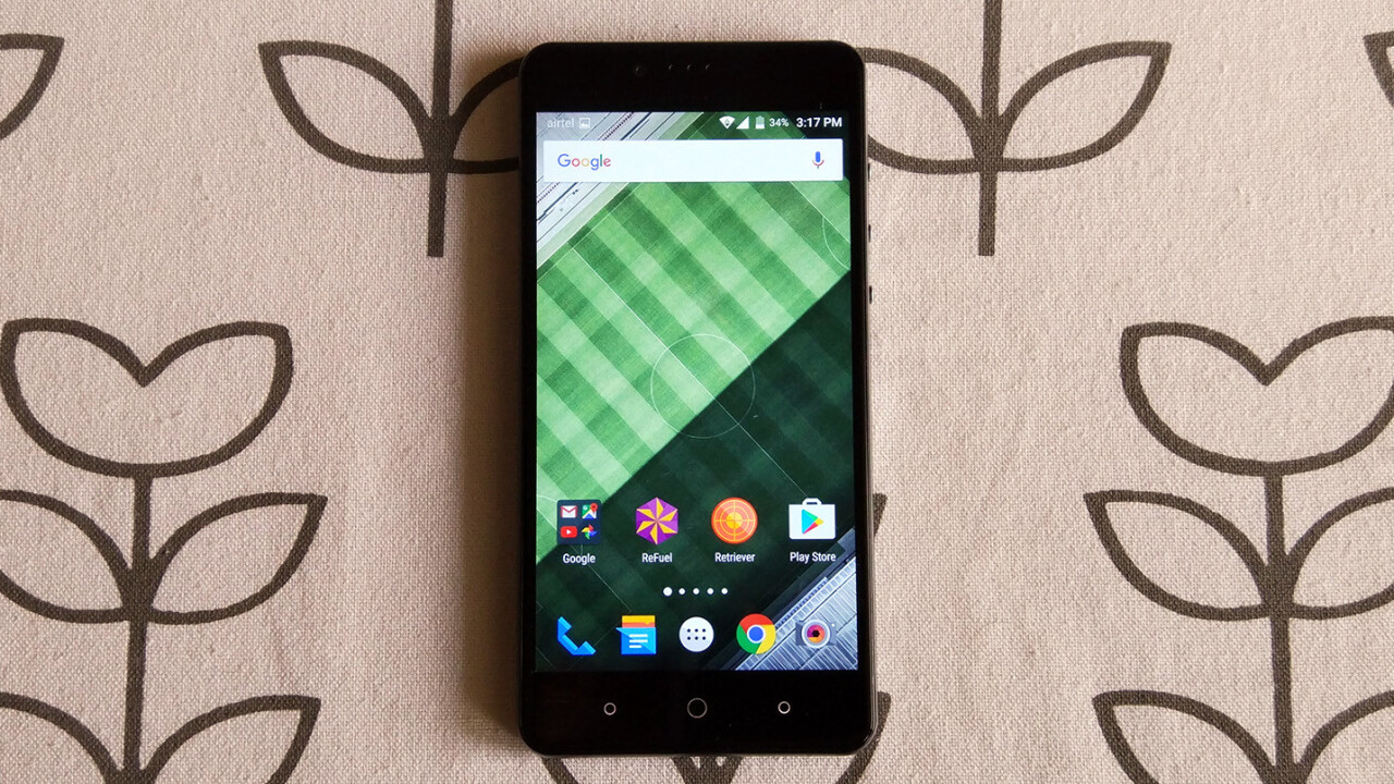
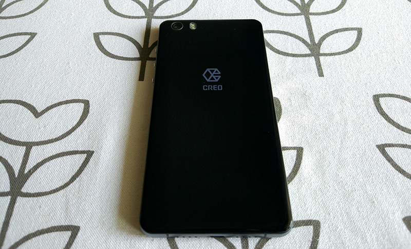
In the right light, the device looks stunning when placed on a table – a gorgeous all-black slab, with discreet speaker holes near the top. Wake the device and you’ll notice that the capactive buttons at the bottom, with their circular design, also add to the Mark 1’s distinctive look.
The back is much the same – the camera and flash sit flush and the brand’s logo is emblazoned in a quiet gray, in keeping with the dark, minimalist look of the rest of the device. It’s beautiful, until it begins getting greasy with fingerprints and slides off your table.
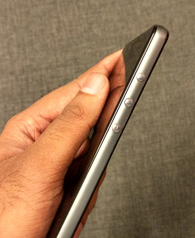
Around the phone is a gun-metal finish trim that’s simple and elegant. On the right, you’ll find three identical buttons for volume and power. It’s a unique look, but the lack of tactile indents to distinguish between them means you’ll frequently end up pressing the wrong button.
If you want to personalize your Mark 1, you can order it on Creo’s site to have any text of your choice laser-engraved on the left side. The effect is subtle and blends in nicely with the look of the Mark 1. It may seem like a gimmick, but it’s a clever one that actually does make the phone feel special.

Overall, it’s a beautiful looking phone that will certainly catch people’s attention, but I’d love for it to be a lot thinner and lighter. If you’re looking for a slim or small model, this isn’t for you.
Display and sound
The Mark 1 sports a 5.5-inch Quad HD (1440 x 2560 px) display that’s plenty sharp at 534PPI, and you’ll certainly see a difference between this and any 1080p screen. It gets bright enough for use in daylight and renders colors accurately. However the incremental bump in sharpness doesn’t quite justify the amount of power it draws.
There aren’t any options to tweak the display, such as color balance and contrast adjustments or even a reading mode to cut blue light. Its only perk is that it lets you tap the screen to wake up the device.
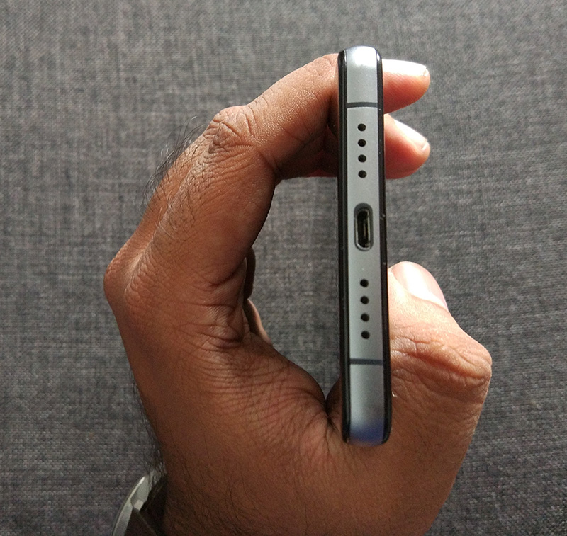
The speakers, located at the bottom by the microUSB charging port, are woefully underpowered. Any ambient noise, like traffic outside your window, can drown them out, and audio featuring quiet dialogue is hard to hear even at full volume.
There are options to enable speaker volume boost and surround sound that help a bit, but virtually every other phone I’ve tried this year, like the 3rd gen Moto G, the LeEco Le 1S and Xiaomi’s Mi 5, has sounded better.
Hardware features
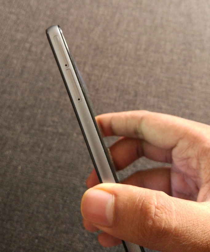
The Mark 1 comes well appointed with useful features like dual 4G SIM support, a smart slot that can hold either a Nano SIM or a microSD card for up to 128GB more storage space, and OTG capabilities for the microUSB port to work with external game controllers and memory card readers.
There are a couple of neat features for dual-SIM users: Smart Roaming automatically sets your local SIM as default for making calls, and Smart Forwarding auto-diverts calls made to an unavailable SIM to your other number.
The 3,100mAh battery supports quick charging and juices up fully when the phone is turned off in under two hours, making for about 14-16 hours of normal usage in my testing.
Rounding out the commendable feature set is gesture support, which lets you quickly turn on the camera or flashlight with just a swipe on the screen when it’s asleep.
Software
There’s a lot to like about Creo’s Fuel OS, which is really the Mark 1’s biggest selling point. If you’re a fan of the stock Android 5.1 experience, you’ll love Fuel OS.
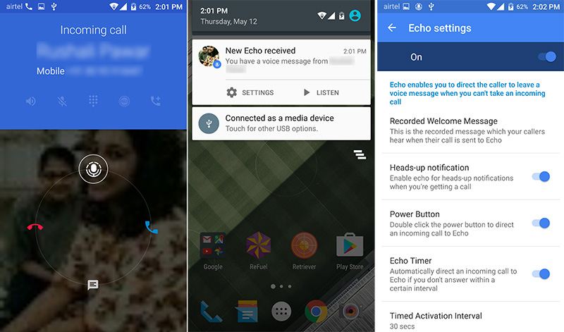
The interface is largely unchanged from the base OS, and the launcher is pretty standard too. But things get interesting when you receive your first call. You can obviously choose to pick it up or decline it, but with Fuel OS, you can alternatively let Echo handle it.
That’s the built-in answering machine feature at play. It lets you record and play back a message to your caller, and records their response as well – all without relying on the cloud or your mobile carrier. It’s easily my favorite feature on this device, and comes in handy when you can’t personally receive a call.
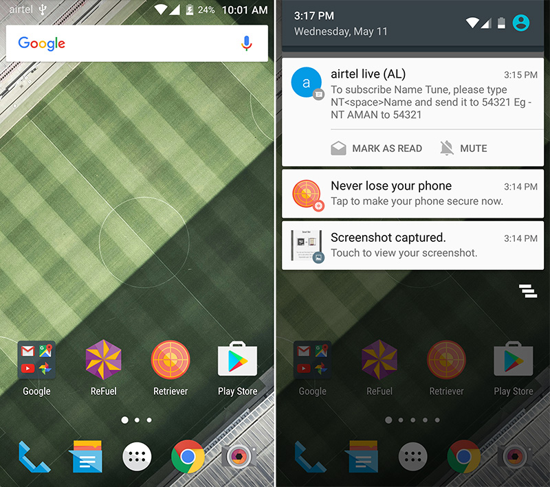
Retriever adds a layer of security for when your Mark 1 is stolen. You can set it up to instantly send an email alert when a new SIM is inserted into it, along with the last known location of the device as well as the number of the new SIM.
You can even lock it remotely by texting that number from another device. Once you do so, the Mark 1 will display the owner’s phone number along with an audible siren and message encouraging the thief to return it. It’ll also lock down the device with a PIN. It’s similar to the security features that are part of Android, but Fuel OS makes it more easily accessible from a second device.
There’s also Sense, which is essentially a system-wide search tool that you can invoke by double-tapping the home button. It surfaces contacts, apps, texts, as well as things like your IMEI number and information about Creo service centers in various cities.
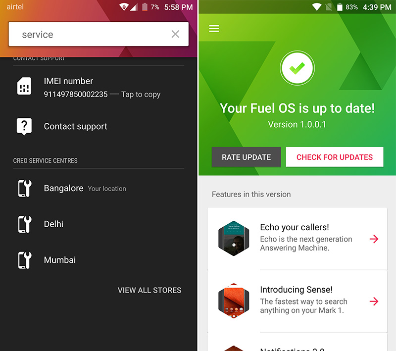
The Refuel app informs you about the latest updates to Fuel OS and lets you navigate to the Creo forum, where you can suggest new features for the company to add to its platform.
At its launch event last month, Creo said it would add a photo editor and a fullscreen flash feature to the OS next. Those haven’t arrived yet, so it’s hard to say if the company will be able to continually deliver on its promise of keeping its software fresh year-round.
Camera
The Mark 1 is equipped with a 21-megapixel rear camera that’s capable of shooting 4K video at 30 fps, as well as 120 fps slow-motion clips at 1080p.
Sadly, it’s the Achilles’ heel on this device. The camera app is sluggish and almost always takes too long to snap a photo. It also got the white balance wrong every time, leading to photos that were too cold.

In addition, it was prone to blowing out highlights and losing detail in light areas and fared poorly when trying to shoot in low light conditions.
The front camera does a good job of snapping sharp selfies, and there’s a feature to automatically remove blemishes with three strength modes. It also performs fairly well in low light, preserving a good amount of detail without adding too much noise.
Performance
Under the Mark 1’s hood is a MediaTek Helio X10 1.95 GHz octa-core processor, paired with a PowerVR G6200 GPU, 3GB RAM and 32GB of onboard storage. With those specifications, it stands up to normal usage and multitasking pretty well.
That sort of firepower along with the lightweight stock interface allow for snappy performance, except for when you fire up Google Now and run some games with intense graphics. In some cases, titles took a while longer to load than on handsets like the Mi 5 and the phone did heat up a bit, but those issues didn’t quite add up to a deal-breaker for me.
However, the Mark 1’s battery life is sorely disappointing. I could barely get through a work day with it, particularly if I used navigation services and the camera – not what one would expect with a 3,100mAh battery.
Verdict
The Mark 1 is a well built device that’s sure to turn heads thanks to its distinctive design – but it’s also one of the largest phones I’ve handled in recent times. That can certainly bum some folks out, but hey, maybe the personalized laser engraving can just about make up for it.
It also offers a bloatware-free software experience and comes with several useful features that you’d be hard-pressed to find on other devices. If you’re not keen on custom OSes like the one Xiaomi offers, Fuel OS might be more your style.
However, it’s too early to say whether Creo will be able to consistently deliver meaningful add-ons in the months to come.
The weak point here is the camera, which failed to impress in terms of image quality and performance. A too-slow shutter means you won’t be able to rely on it to capture action shots, and it’ll likely frustrate your loved ones when you’re trying to take a group photo.
Plus, its poor battery life, for which the high-res display is largely to blame, is inexcusable in 2016. Sure it comes with quick charging, but in my mind, the only benefit of that is that you can power up in the morning before you head out, instead of leaving your phone plugged in all night.
The Mark 1 offers some neat features like expandable storage and a spectacular display, but other than that, it doesn’t do enough to warrant its asking price of Rs. 20,000 ($300). That pits it against the OnePlus 2 at Rs. 23,000 ($345) which has a much better camera, as well as the Moto X Play at Rs. 18,500 ($278), which offers similar specifications at a lower price point.
If you’re on a budget, you can skip all that and get Xiaomi’s excellent Redmi Note 3 that delivers quicker performance and significantly better battery life for half the price at Rs. 10,000 ($150).
All in all, I like the Mark 1 just fine and commend Creo on a solid effort for its debut. However, the phone’s weight, battery life and camera make it hard to recommend in today’s ultra-competitive market.
Get the TNW newsletter
Get the most important tech news in your inbox each week.


