
Google appears to be testing yet another redesign of its search engine, incorporating a new stylish colour scheme but also moving website links to a new position, underneath the title.
The redesign isn’t available to all users, but was spotted and shared on Twitter by David Pierce. It comes just days after the search giant announced it was to roll out new features for both mobile and desktop search users, unveiling new search shortcuts for its mobile pages, Voice Search within its Chrome browser and new Google Instant image search and Instant Pages.
The new layout stays close to Google’s current design but now sports a colourful search button and also Voice Search icons in the search box. The search giant has said that Voice Search “will take several days for Voice Search to be available to everyone” so the new design could accompany the gradual roll out of the new speech feature.
It’s worth noting that the Evernote search feature in the shot below isn’t part of the design, instead being part of the Clip to Evernote extension for Chrome.
More users will receive the update over the coming days, possibly weeks. Google is known for keeping its designs minimal and this redesign is no different, but with links now below the title of the website, we could be about to see a minor change to the way we use Google very soon.
(Click image to enlarge)
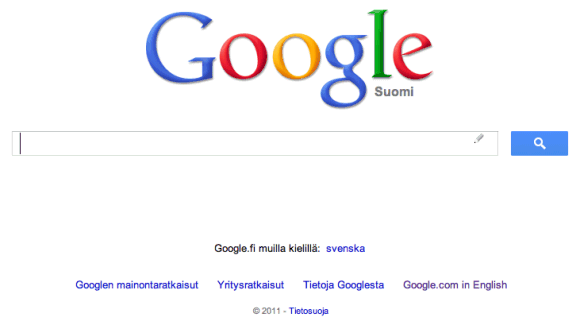
UPDATE: Google Operating System has uncovered the image of Google’s Finnish site below and notes that the new redesign also kills the I’m Feeling Lucky button. Be honest – when was the last time you used it? Still – that button was one feature that helped make Google stand out from other late-90s search engines when it first launched.
Get the TNW newsletter
Get the most important tech news in your inbox each week.