Editorial Note: The Note 7 has been discontinued due to continued risk of fire. This review is for all intents and purposes now simply a historical archive of this smartphone’s short-lived greatness.
In other words, if you find somewhere that still sells it, do not buy it, unless you enjoy toasted underpants.
The Samsung Galaxy Note 7 is a far cry from its early predecessors.
When Samsung first introduced its oversized flagship line, there was nothing else like it. The first Note’s 5.3-inch screen was huge, and much of the press saw it as a one-off gimmick. But users liked having such a large screen in their pockets, and now 5.3 inches is just about standard for Android devices – even Apple was forced to make the iPhone 6 Plus.
But mainstream adoption of big phones also means the Note series can no longer survive on size and specs alone. That’s what makes the Note 7 something of a gamble: the spec sheet doesn’t immediately offer anything competitors can’t match or trade blows with.
Thankfully, the Note 7 is much more than its spec sheet. Taking what it’s learned over the previous six devices, Samsung has refined the Note 7 into not just a great big phone, but possibly the most well-rounded, productive, everything-but-the-kitchen-sink smartphone ever made.
Specs
Let’s get those specs out of the way. On paper, it’s basically an S7/S7 Edge with a few extra bells and whistles afforded by its larger size. Here are the key bullet points:
- Snapdragon 820 or Exynos 8890 (regional, like the S7)
- 4 GB of RAM
- 64 GB of (UFS 2.0) storage
- Dual curved, 5.7-inch display AMOLED display
- Quad HD Resolution (2460 x 1440, 518 ppi) with HDR support
- Gorilla Glass 5, front and back
- MicroSD Slot (tested up to 256 GB)
- 7.9 mm thin
- 3,500 mAh battery
- Wireless charging and quick charging
- 12 MP camera (same as the S7)
- Fingerprint sensor and an iris scanner
- IP68 water resistant (including the S-Pen!)
- Thinner S-Pen tip (0.7 mm)
- 4,096 levels of pressure sensitivity
- USB-C (3.1) with OTG support (comes with a micro USB adapter)
- Android Marshmallow 6.0.1
Unlike last year’s Note 5, the Note 7 has the same processor and RAM as its S series siblings. You won’t be seeing any speed and multi-tasking improvements other than what’s afforded by the software.
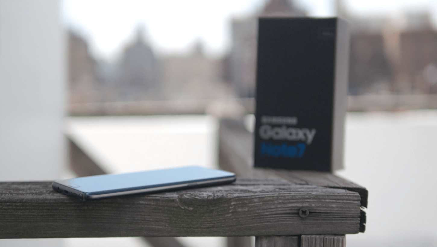
Not only are these are the same basic specs as the S7 duo, they’re the same as almost every single Android flagship being sold in the US. Off the top of my head, a QHD display, 4GB of RAM, and a Snapdragon 820 are the same specs you’ll find in the LG G5, the HTC 10, Moto Z and Z Force and the ZTE Axon 7 – which only costs $400. The also-$400 OnePlus 3 has ‘only’ a 1080p display, but offsets that with 6 GB of RAM.
The Note 7’s advantages are in other areas. Gorilla Glass 5 is supposed to be 1.8 times harder to crack than Gorilla Glass 4, and should survive “80 percent” of shoulder-height (~1.6 m) drops onto concrete. Having 64 GB of expandable storage as the stock configuration is a beautiful thing. The HDR screen is a thing of beauty too, and waterproofing adds a good deal of peace of mind.
Android die-hards might long for the days when the Note series was as overpowered as it was large, but this phone makes its mark in other ways.
Design: How did they make it this small?
The Note 7 continues Samsung’s refined design language introduced with the S6, but you have to hold the phone to really appreciate what Samsung’s design team has done here.
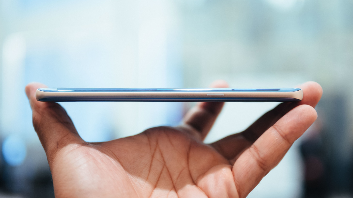
The Note 5 was already more compact than most 5.7-inch devices thanks to minimal bezels. But the Note 7 manages to be even smaller, and, more importantly, feel smaller than a 5.7-inch-screen phone has any right to.
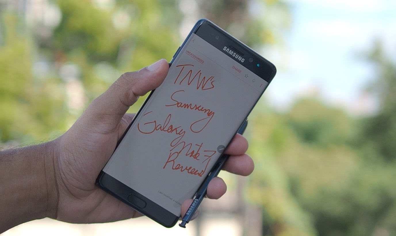
When I said the phone was well-rounded earlier, I kind of meant that literally. While the dual-curved display is less pronounced than on the S7 Edge, the Note 7 actually feels better than the Edge in hand because Samsung has made the phone virtually symmetrical from front to back. Where the Note 5 felt like a relatively hard slab, the Note 7’s round sides help it feel almost pebble-like – kind of like an all-glass iPhone 6.
The curved display helps the Note 7 be 2 mm narrower than the Note 5, making it surprisingly easy to use with one hand. The minimal bezels and capacitive buttons means that the phone uses its real estate more efficiently than pretty much any other smartphone out there.
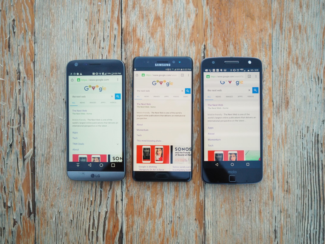
This is most apparent when I switch back to phones with smaller displays. For example: the Note 7 is exactly the same width as the LG G5 (73.9 mm), even though the G5 has a significantly smaller 5.3-inch screen.
Couple that with the Note 7’s rounder shape and useful one-handed mode (which shrinks the display to down to one corner), and that means this 5.7-inch phone is somehow easier to use with one hand than a 5.3-inch one. And the Note 7 doesn’t use silly virtual navigation buttons that take up 10 percent of your display either.
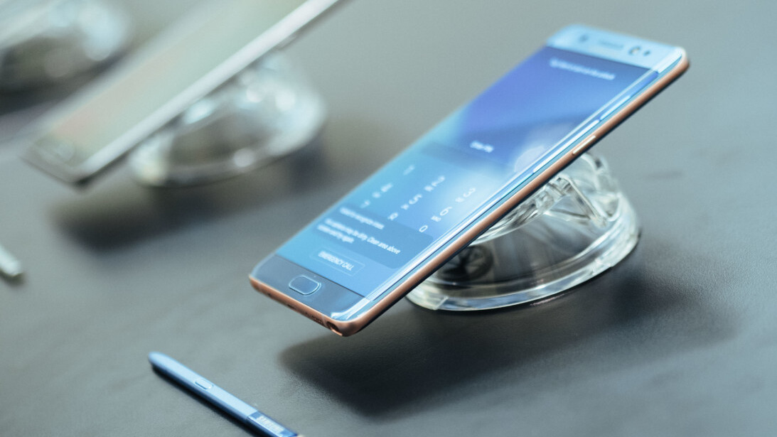
Let this photo illustrate to you how efficient the Note 7’s body is, and how much more information it fits on screen compared to devices of a similar size.
I realize I’m six paragraphs into describing how compact the Note 7 is, but I also need to emphasize that the phone is smaller than the Note 5 while actually adding a good deal of hardware: expandable storage, an IR LED and iris scanner, a larger camera sensor (with less of a hump), waterproofing seals, and an extra 14 percent/500 mAh of battery.
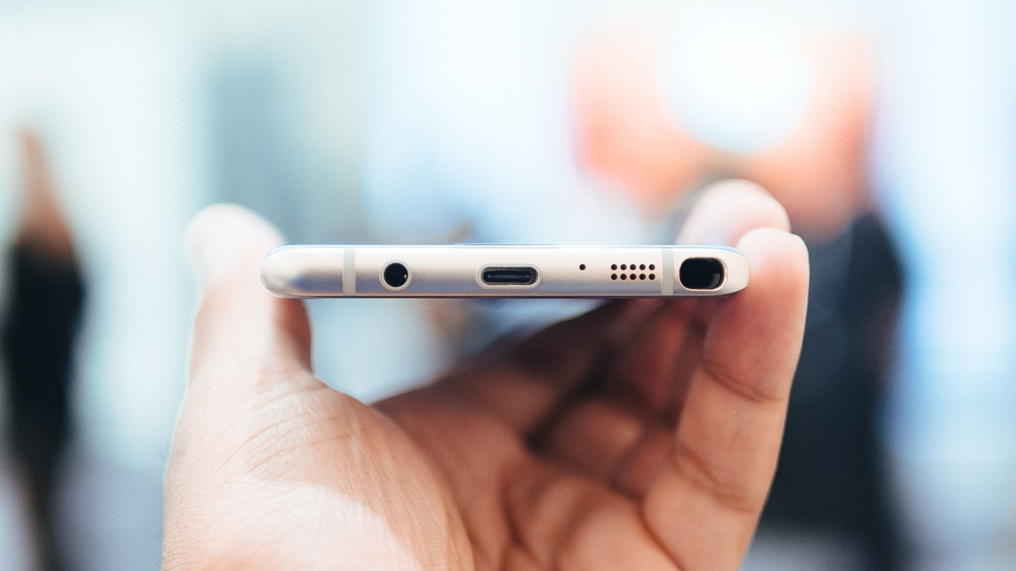
Yet Samsung hasn’t removed the headphone jack (looking at you, Motorola), and it still has to manage to fit a stylus in there somewhere too.
Simply, the Note 7 is something of an engineering marvel. Offhandedly describing it as a 5.7-inch phone feels disingenuous.
Color-wise, comes in black, gold, silver and a beautiful coral blue/gold (still upset I didn’t get the blue – I asked nicely Samsung!). I do quite like the Black unit I have – unlike the S7’s black and silver combo, the Note 7 is a stealthy black all around.
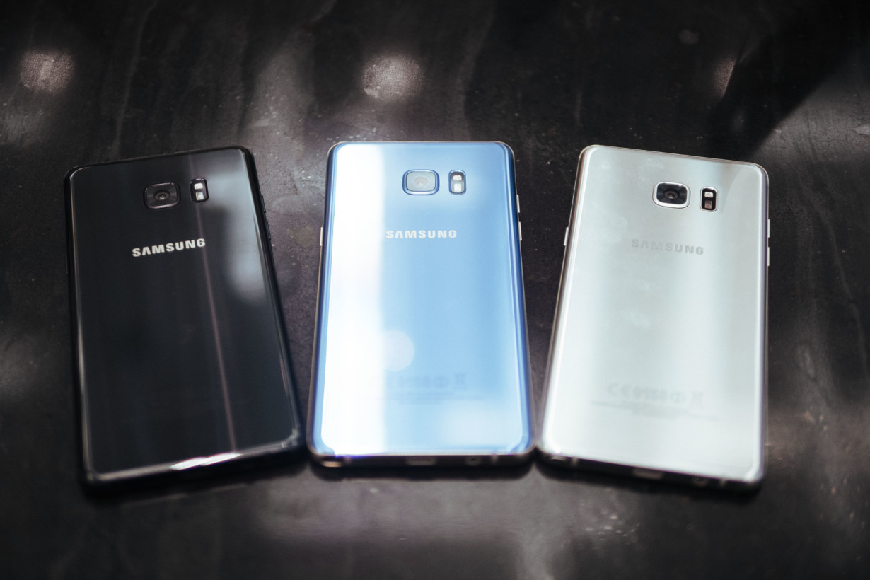
Oh, and yes, it’s waterproof now, all the way down to the S-Pen. That last part sounds gimmicky, but it helps to navigate around the phone since the touchscreen is unresponsive to fingers when it’s wet.
Display: The best smartphone display ever, with one caveat
Early rumors pointed to a 4K panel, but Samsung stuck with a QHD screen and chose to improve it in other meaningful ways instead. DisplayMate ranked it as the best smartphone display ever, and I’m inclined to agree (mostly)
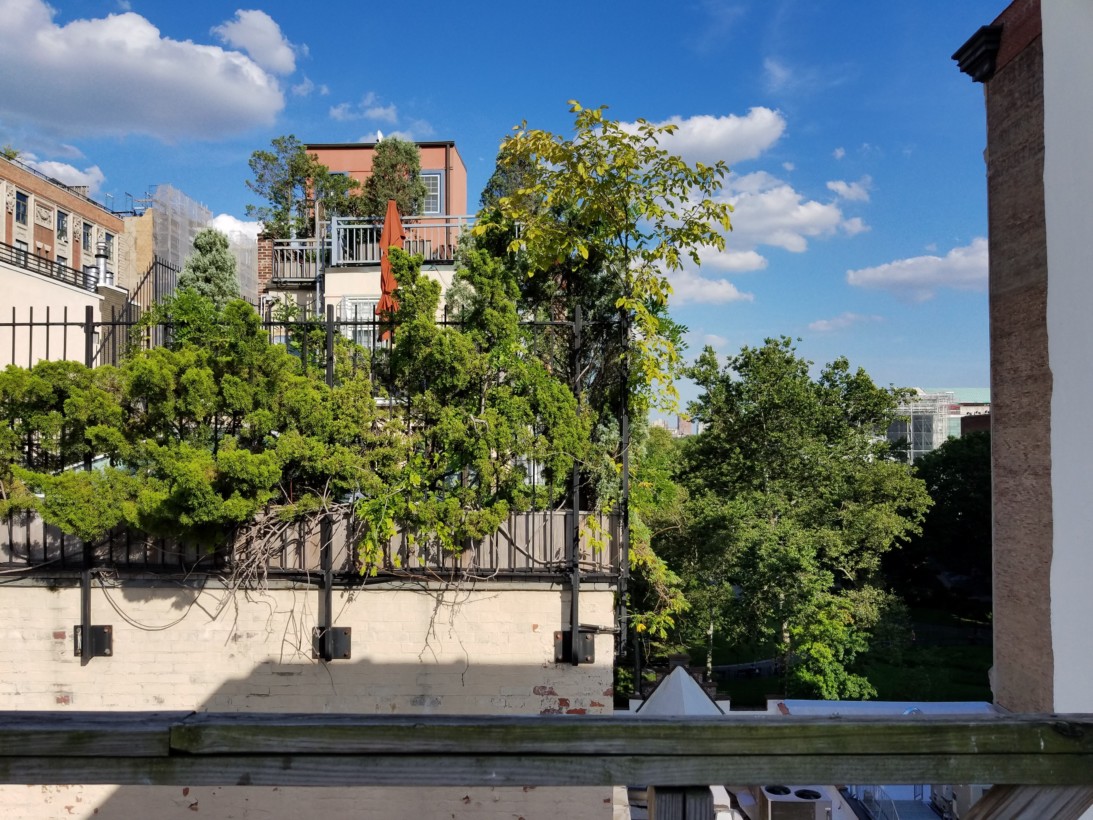
First off: it’s really bright. It has to be, in order to meet the HDR specification, and it reaches over 1000 nits when viewed in sunlight. I’ve tested almost every flagship in the past year, and I’ve never used a phone that’s easier to read in the daylight. That’s helped by apparently being the first phone with an ambient sensor on both the front and the back – I never felt like I had to stray from the phone’s default settings.
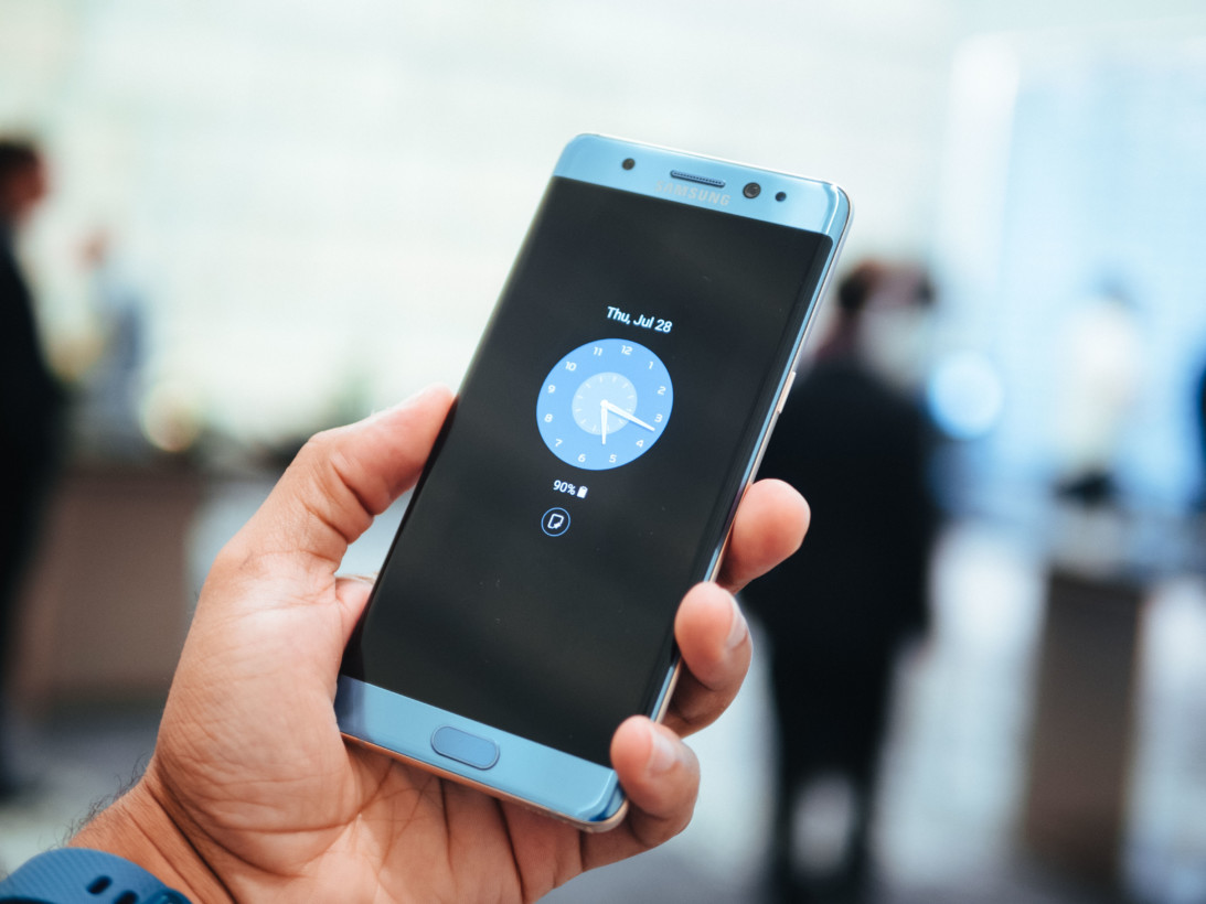
Long gone are the days of AMOLED panels being over-saturated too; colors look just as natural as any LCD panel I’ve tried. This is aided by Samsung’s default Adaptive Color mode, which changes display saturation depending on how you’re using your phone (more vibrant for photos and videos than for apps and the Web, for instance).
Viewing angles have also been meaningfully improved over both the S7 and the Note 5. The phone hardly has the pink/green color shifts present on other AMOLED displays (and some LCDs, like the HTC 10) when viewing from odd angles, and there’s less colored aliasing around text. Meanwhile, the lightly curved edges add slightly to the illusion of realism – it makes it seem like the display is made out of paper.
My one big caveat is that at medium to dark brightness, certain shades of dark grey are tinted slightly green. You’ll rarely notice it, but when you do it can be pretty bit distracting. That was an issue that plagued older AMOLED panels, so I’m surprised it’s made a return here.
I do still want to see a 4K display from Samsung, but mainly as a boon for virtual reality. As a pure smartphone experience, this is about as good as it gets.
Software: TouchWiz is actually… good?
I like stock Android. My main reason for shying away from Samsung phones has always been TouchWiz, not hardware or features. But with the Note 7, I think Samsung may have finally hit a balance that can appeal to both purists and casual consumers – even if it’s still running Marshmallow (Nougat is promised before 2017).
Samsung has simplified some of the aesthetic. It still uses guady squircles for icons (you can turn this off for non-Samsung apps), but at least they now use a more flat design instead of the old gradients. The settings menu is now a simple list, and the notification shade behaves more similarly to stock Android, without horizontal scrolling.
Then there are the bits where it shines over stock Android:
- You can view 15 quick settings at a time with a second swipe from the notifications shade
- You can almost completely skin the UI to a variety of community themes. Some make it look really close to Material Design, and some I’d say look better
- New battery saving modes, such as lowering your screen resolution or reducing screen performance for an extra couple of hours
- The ability to change your DPI between small and large settings (though this feature is coming to Android Nougat)
- Creating floating windows for most apps
- A legitimate one-handed mode that shrinks the entire screen by triple-tapping the home button (although that launch gesture is a bit clumsy)
- Game tools that allow you block alerts, disable capacitive buttons, and record video during gameplay
- A proper equalizer and a few useful sound quality enhancements
- Device Maintenance to clear up storage and manage battery
- Always On display to quickly glance at time and notifications or just setup a cool screensaver
There are some duplicate apps – there are two browsers, two email apps, two gallery apps – but they generally offer a few advantages over Google’s variants – for example, editing GIFs frame by frame in the gallery, or syncing tabs with your Gear VR headset with the browser. You can uninstall or disable most of them too.
Honestly, the worse thing about TouchWiz nowadays the set of terrible, still all-white emoji. You can theme everything else, why not the emoji?
Nitpicks aside, there’s no denying many of Samsung’s proprietary features are legitimately useful – perhaps even most of them. And if you’ve been a long-time Samsung user, I can see it being hard to go back and miss out on the customization.
S Pen: More reasons to remember to use it
The Note 7 is all about the S Pen, and you’re going to actually want to use it this time around.
Kudos to Samsung for reducing its various note-taking apps from four (Action Memo, Memo, Scrapbook, S Note) to just a single Samsung Note app. It’s more powerful too, allowing you to blend colors like real paint and supporting the new pen’s added sensitivity.
Meanwhile, the Note 7’s air commands bring four big new features.
You can magnify any content on your screen by hovering over it with your S Pen, up to 300 percent magnification. It’s useful if you have poor eyesight or are visiting a website you can’t zoom in on images via multi-touch.
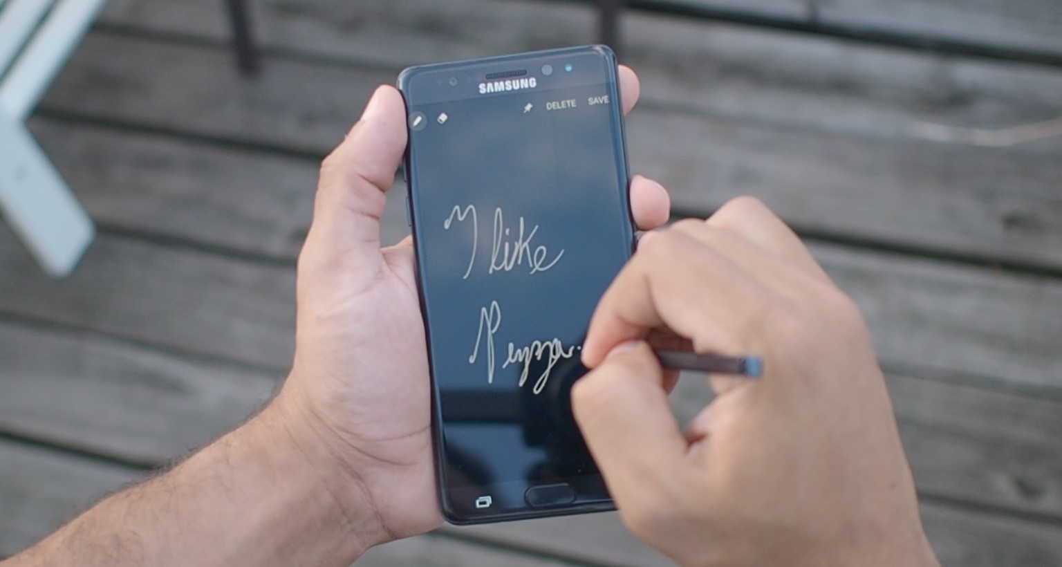
The translation feature is something straight out of a sci-fi novel, allowing you to translate between various languages instantly by hovering over words. Unfortunately, the execution is a bit less exciting in practice.
While it works quickly, you can only translate individual words, which severely limits its usefulness if you were trying to read an article or have a conversation with someone in another language. That could be fixed with a software update, but it seems like a huge oversight as is.
Conversely, there’s the Glance feature, which is extremely useful. It basically lets you quickly take a peak at a secondary app without ever leaving the main app you’re using.
Say you’re typing up an article on your phone, but need to constantly refer back to a document for specific details – Glance streamlines the process by not forcing you to waste time switching between apps, or waste real estate with split view. I’ve used it all the time since I started testing the Note.
The best S Pen feature though is an update to one introduced last year with the Note 5. Whereas before you could take out the S Pen and immediately start writing on your phone without unlocking the device, the Note 7 one-ups it with an always-on display.
That means your notes are displayed permanently without having to turn on the phone to view them, which I can see coming very in handy for shopping lists and the like. For the first time, you can use a Note phone like a real notepad. And unlike before, you can scroll through to have an infinite amount of space to write notes, rather than just what fits on your screen.
Unfortunately, you can’t edit notes after pinning them; you’ll have to go into Samsung Notes for that.
But my favorite new feature is the GIF maker. The screen capture tool lets you select a portion of your display that you want to save as an animation with the S-Pen, tap record, and then save. You can either save to your gallery or share, and you can even edit the GIFs frame by frame and set them to different qualities. I will be sharing all the GIFs.
The suite of S Pen and TouchWiz tweaks make the Note 7 an incredibly powerful mobile productivity tool.
To give you an idea; I wrote this section of the review on the Note 7 while switching back and forth between my scribbled outline and our CMS using the glance feature. I’m not sure I would’ve had the patience to do that on any other smartphone.
Iris scanner: an extra tier of security, not a fingerprint replacement
The iris scanner is the flashiest new touch. I had my doubts given its implementation in Windows Phone, but it’s a smarter approach here; the iris scanner is complements the fingerprint scanner instead of replacing it.
Basically, Samsung wants you to think of it as an alternative unlock method when convenient – it’s going to be great for the winter when you’re wearing gloves – or a second form of authentication when you want extra privacy.
For instance, fingerprint scanners are sucky when your hands are wet, and can be hard to access when you’re busy carrying something. The iris scanner has no such problems, and it’s almost as fast and versatile as the fingerprint reader.
The key word here is ‘almost’ though, which is why Samsung emphasizes using the scanner as secondary authentication (plus, the iris scanner has a lower false-positive ratio).
The phone features a ‘secured folder’ where you can store private files as apps, which you access using the iris scanner. You can easily save naughty private photos to this folder using Android’s share function, and it even includes an incognito browser for when… you need to buy your bae a special gift.
That’ll come in handy if you’re the type of person who tends to share passwords give fingerprint access to your family or partner, but would still like to keep some things private. Of course, Samsung could have done the same with a password, but this is faster, and we all know how terrible people are at choosing passwords.
By the way, the iris scanner doesn’t work with dead people. Sorry, would-be homicidal thieves.
Camera: Still top notch, but nothing new
It’s the same exact camera as in the S7, so you should check out our review of that phone. It’s probably the best single camera on any smartphone right now.
The only difference here is in a slightly streamlined app. You can now swipe down to access the selfie cam, or left and right to change modes or filters, respectively.
Performance and battery life: Good, but not the best
The Note 7 shares specs with most other flagships this year, which also generally happen to have lighter interfaces. So while the Note 7 is definitely fast, it won’t be the quickest Snapdragon 820 phone (we didn’t get to test the international version with Samsung’s own Exynos chip, but it’s worth noting those are traditionally a little more responsive).
For example, the Moto Z, which I’ve been using for longer and have installed more apps onto, feels snappier all around with its near stock UI. The G5 has a heavier skin, but is still lighter on customization than Samsung, and feels ever-so-slightly faster as well.
Entering developer mode and shortening animations helps speed things up a bit, but the Note 7 always seems to be just hair behind those devices in terms of responsiveness, with the very occasional stutter and dropped frames. That feels like something that can be fixed with an update.
Maybe there are some pre-release bugs to iron out, but it shouldn’t be enough to keep you away from the device; it’s still faster than almost any 2015 device, it’s just not the quickest Snapdragon 820 one. I’d also argue the Note 5’s multi-tasking features make up for any mild performance stutters when it comes to actually getting work done.
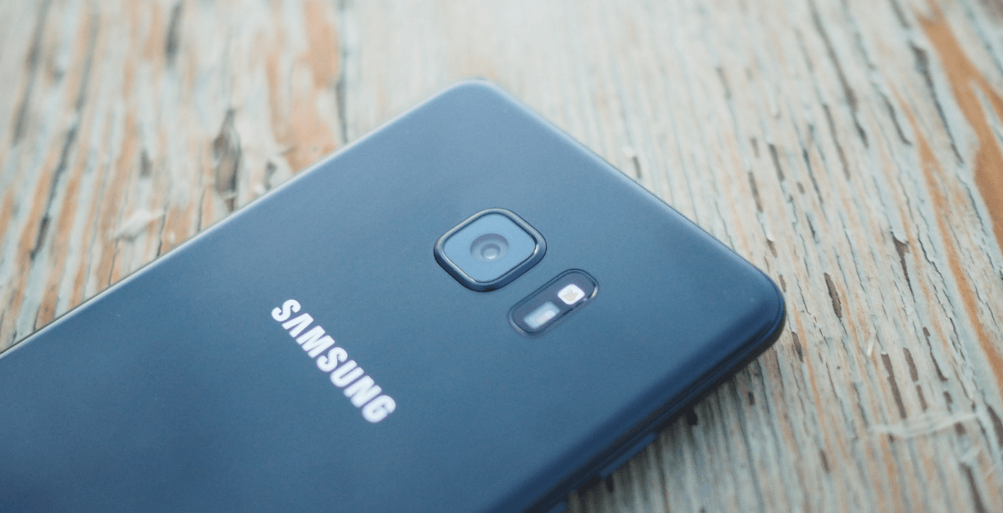
Battery life, on the other hand, pulls ahead of most other 2016 flagships. I’m getting about six hours of screen on time with my average, heavy use. The 3500 mAh battery should be enough to get most people through a full day.
That’s generally without using the new power saving modes. If you know you’re going to be out for a while, you can choose to lower the screen resolution, max brightness, and CPU performance separately; the default power-saving settings will net you about 3 hours of extra battery life over using the phone on full blast.
Unless you’re looking for it, you won’t be able to tell a difference between the 1080p and QHD resolutions, other than that you need to be on QHD to use the highest density DPI setting. There’s a 720p option, but I’d avoid it unless you’re really strapped for battery.
I’ll update this post once I’m able to do a more proper run down of the different power saving settings.
Finally, the phone of course has quick charging (and wireless charging!), but it’s a bit slower than what we’ve seen on devices like the Moto Z. A full charge takes aabout an hour and 45 minutes from empty.
Everything but the kitchen sink
When I reviewed the Note 5, I thought it was the best big phone you could buy at the time. After spending a week with the Note 7, I’m having a hard time not thinking of it as anything else than the most well-rounded smartphone I’ve ever used.
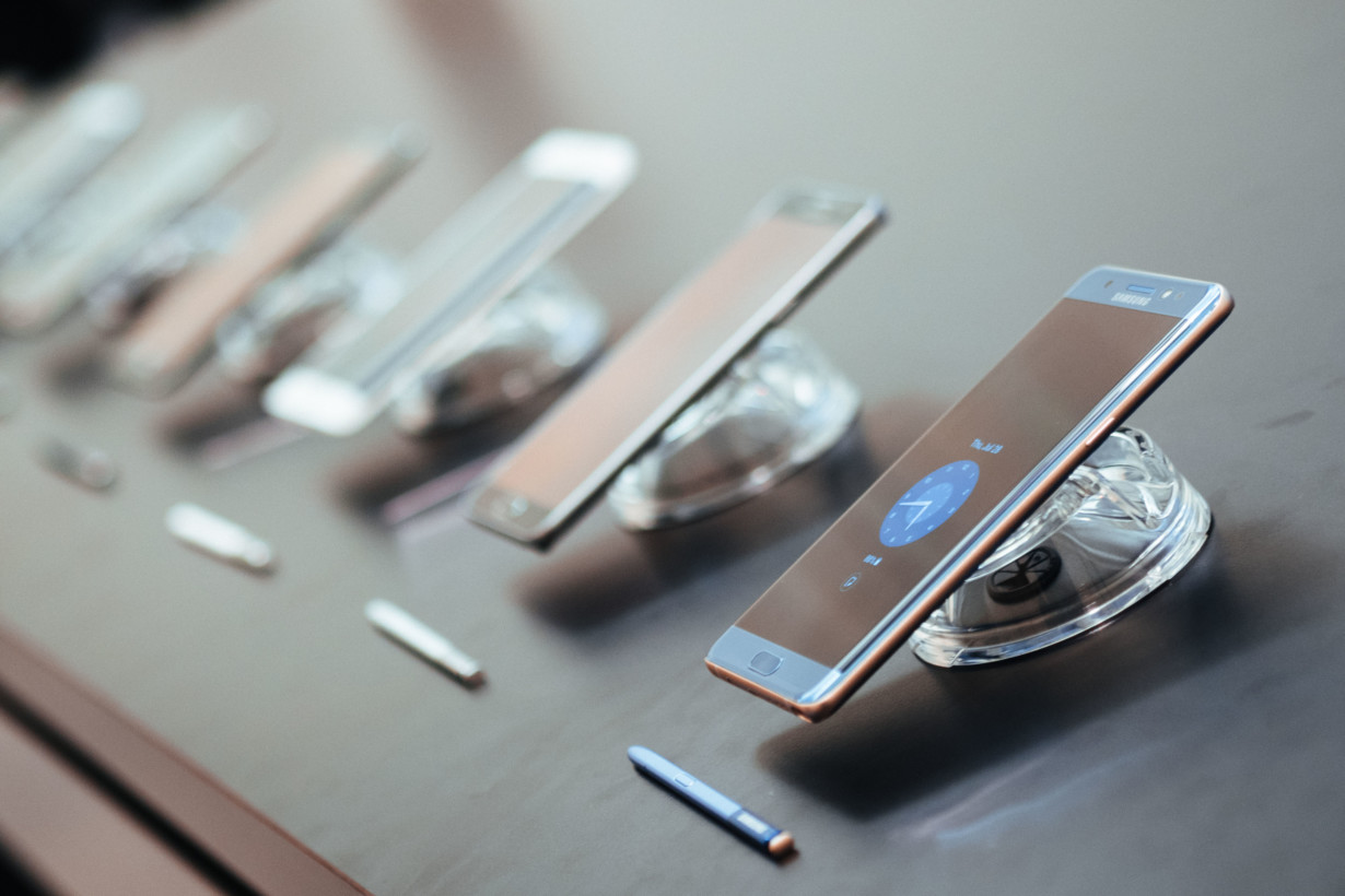
I’m trying to avoid hyperbole, but the Note 7 has almost everything you could ask for from a flagship smartphone in 2016. It might not be the most exciting phone – the Moto Z and its modularity win that prize from me – but frankly, it feels like Samsung just went through a checklist of the things people say they want in a smartphone, and then went and did them all:
- Top of the line processor and RAM
- 64 GB of storage, stock
- Expandable storage because we’re greedy
- Best-in-class camera
- Full waterproofing
- A small body with minimal bezels
- Legit security features
- Sleek, eye-catching design
- A display that (probably, hopefully) won’t crack when you drop it
- Great battery life with heavy use
- Wireless and quick charging
- A history of timely updates
- A not terrible UI
- A stylus
Imagine if someone told you a phone would hit every single one of those marks just one or two years ago, and then add a couple of extras like the best mobile VR headset and an iris scanner as well.
Of course, it might not be the top option if you’re looking to buy unlocked or don’t wan’t to deal with carrier subsidies, and there are plenty of great affordable phones out there nowadays, but you probably knew that coming into this review.
Moreover, the Note 7 brings genuinely useful productivity features, something that becomes more important with every passing years as people look to do more serious work on smaller, more portable devices. The Note 7’s multi-tasking is second to none, to the point that I wrote some of this review on the device.
Yes, the Note 7 is very expensive at around $850, but in the US at least, most people won’t care because of carrier subsidies. Besides, the free Gear Fit 2 or 256 GB (!) microSD card are quite the sweet pre-order bonus.
On the other hand, if you’re looking for the best you can buy right now, the Note 7 is the closest thing to a perfect smartphone there’s ever been.
The Samsung Galaxy Note 7 launches August 19, and you can pre-order the device now from Verizon, Sprint, and T-Mobile in the US. As mentioned above, you can get either a free Gear Fit 2 or 256 GB microSD card when you order “for a limited time,” valued at $179.99 and $250, respectively.
Get the TNW newsletter
Get the most important tech news in your inbox each week.
