The principal role of a logo is to identify, and simplicity is its means… Its effectiveness depends on distinctiveness, visibility, adaptability, memorability, universality, and timelessness. – Paul Rand
The foundation of any brand is its logo. As such, with every redesign, a brand risks alienating its core following, who then flock to social media to broadcast their disapproval.
But why do logo redesigns upset us so much? It all boils down to identity. People with strong connections to a brand tend to react negatively to redesigns, ultimately affecting their attitudes towards the brand as a whole.
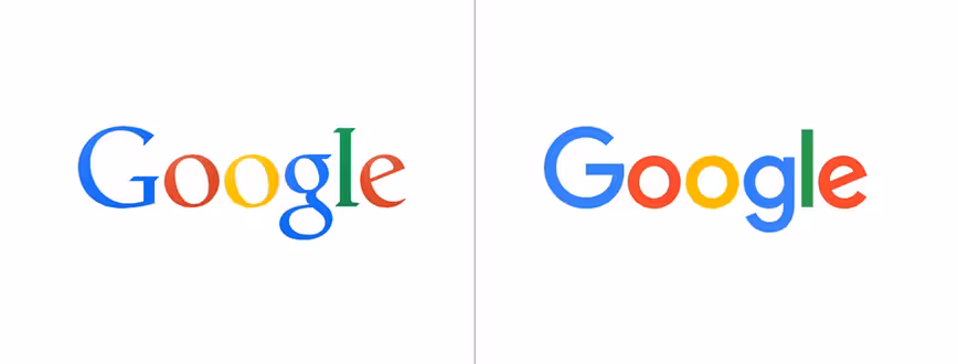
For instance, Google’s latest redesign.

The 💜 of EU tech
The latest rumblings from the EU tech scene, a story from our wise ol' founder Boris, and some questionable AI art. It's free, every week, in your inbox. Sign up now!
I get it. The new logo is more visually in line with Alphabet, Google’s new holding company. But for a conglomerate which got its start archiving, the new logo loses the quaint typeface reminiscent of newspapers and typewriters and, instead, looks more like children’s refrigerator magnets.
Brands do need to reinvent themselves with changing customer preferences and, unfortunately, there is no way to predict how users are going to react. Companies have employed PR tactics that have both thrown us off guard (Spotify) and tempted us with previews (Yahoo!).
There is no scientifically proven way to successfully rebrand; you can only tempt fate and, hopefully, users.
At the end of the day, some companies can afford to change more than others. As much as I don’t care for the latest Google logo, I’m not going to stop using it.
Other companies aren’t quite as lucky. From the confusing, to the strange, to the flat out bad – here’s a look at some tech companies I believe would have benefitted from a more holistic understanding of Paul Rand’s advice.
We need to talk about your flair
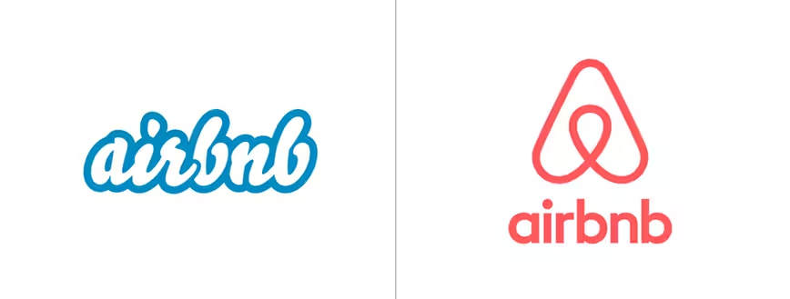
Airbnb’s latest logo has been met with both love and hate for a plethora of reasons. Reproductive organs aside, users have noted their concern towards the company’s new theme of “people + airbnb = love.”
Many have pointed out that it’s too similar to Automation Anywhere as was the exact shape recently found in an old trademark book
The 80’s called
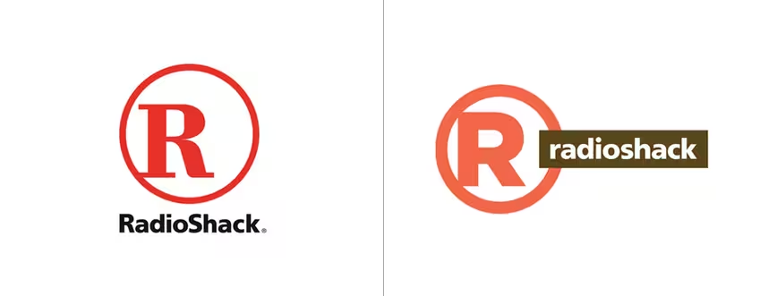
Many online agree the best thing to come from Radioshack’s rebranding was definitely its SuperBowl ad. With its original vibrant red logo, Radioshack’s logo was easily recognizable. However, in order to compete with “cooler” stores such as Apple, the company unveiled a logo described by consumers as “unnecessarily fat” alongside an awful color scheme.
You can’t force a new moniker. Period.
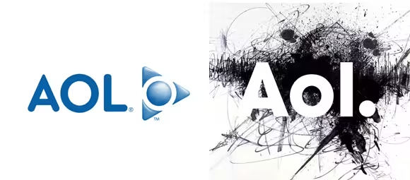
Following its spinoff from Time Warner, AOL relaunched as Aol. Period. Which I will never write like that. Period.
Wolff Olins – the creators of the London Olympics logo – is credited with the redesign. Referred to as the “dinosaur of the internet,” the company attempted to become fresh and hip, but by employing an overused font and a sad, trendy spelling, many complained it showed a lack of actual creativity.
You can lead a horse to water, but you can’t make him to use your search engine
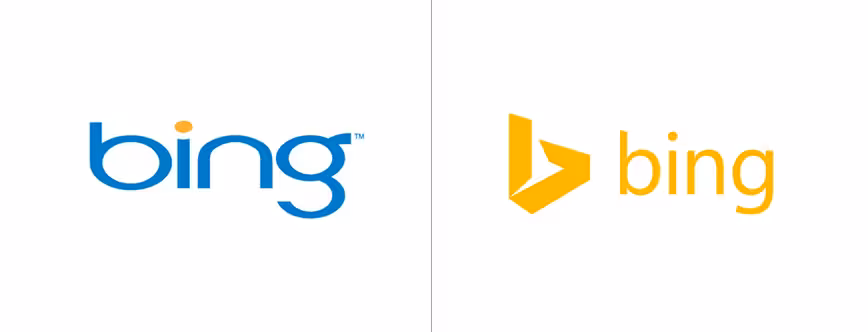
When Microsoft rebranded several of its products in 2013, Bing was transformed. Left behind was its blue logo and in its place was an abstract ‘B.’
While the new yellow integrates Bing with its parent company, many complained it looked as though someone broke the Google Drive icon. And while Microsoft continues to aggressively push Bing as a platform, in a 2014 survey, only 6 percent of respondents considered Bing their primary search engine. You can integrate into a company but you cannot integrate into customer usage.
Waiting on hold sounds so much cooler now
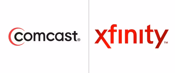
Not so much a logo change as it was a virtual ‘thinking your customers are morons,’ Comcast renamed itself ‘Xfinity’ and it was plain awful. Named one of Time magazine’s ‘Top 10 Worst Corporate Name Changes of 2009,‘ the company obviously hoped the new name would help customers forget the horrible customer service that has plagued so many.
It didn’t, and customers only felt more frustrated.
Not worth the hype
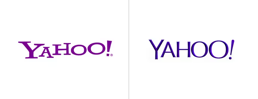
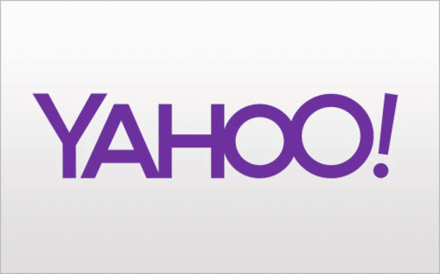
After a 30-day-long logo campaign, by the time the real logo was revealed, Yahoo CEO Marissa Mayer had overhyped the announcement. Mayer additionally angered the design community by bragging about how the whole process was done in house and over a single weekend.
Many designers have pointed out that the human eye is good at spotting things that look off – as is the case in this new logotype. One thing is for sure, between the beveling, the irregular-sized typeface and the slanted exclamation point, the passionless process shows.
If it ain’t broke, don’t fix it
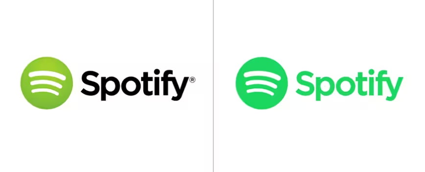
After changing from the logo originally employed by Spotify, users were presented with a nod to the original, albeit dreary, green in the 2013 update. While our eyes may have adjusted to the change in tone, users continue to complain that this shade is awful especially for designers and others who work with colors.
Multiple missteps
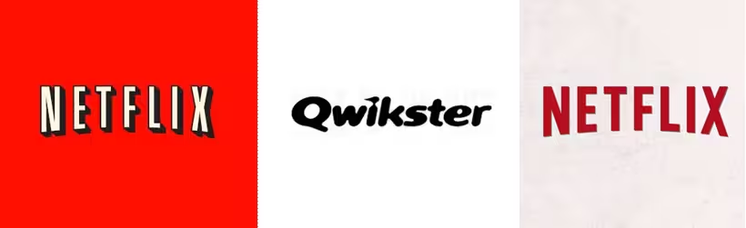
When Netflix updated its logo in 2014, it stripped away all the character from the previous one. Gone was the theater-esque dimension and, in its place, a bland typeface that some compared to a ‘less bloody Dexter.’
This wasn’t the company’s first brush with angry users. In 2011, Netflix spun off its core-DVD business into Qwikster. Besides a confusing name, the word association to obsolete companies like Napster and Friendster doomed the product. The company halted the ‘Qwikster’ plans, but not before Netflix lost 800,000 customers.
Mapping it out
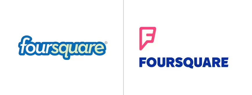
When first launched, Foursquare was one of the hottest apps, but things soon cooled off for the company. In order to revive the hype, Foursquare changed its app and logo and split its service in two – Foursquare and Swarm.
The change caused some confusion and upset a lot of people. While it serves the purpose of looking like a map pin, users were disappointed that the company didn’t use the same color scheme and thought the split itself was unnecessary ultimately vowing to quit using the service altogether.
Checks and balances
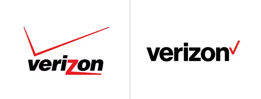
In what’s been called part check this box and part flat-out boring, Verizon said it changed the logo to reflect an identity that “stands for simplicity, honesty and joy.” But was it too simplistic?
Users have complained that the font is uninspired and the checkmark looks completely out of place. It even inspired John Legere, T-Mobile CEO, to mock it on twitter.
Leave us a comment about your favorite rebranding misses.
Get the TNW newsletter
Get the most important tech news in your inbox each week.