![Verizon apparently has a new logo and… well, you be the judge [Update: Confirmed]](https://img-cdn.tnwcdn.com/image?fit=1280%2C720&url=https%3A%2F%2Fcdn0.tnwcdn.com%2Fwp-content%2Fblogs.dir%2F1%2Ffiles%2F2015%2F09%2Fverizon-logos.jpg&signature=eb38d3ea9bd4b5cc0b2dbcc409b5863f)
Update 4:56 pm ET: Verizon has confirmed the logo change. Below is the original story:
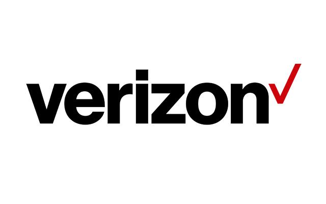
Fresh off Google’s logo unveil yesterday, Verizon is now reportedly set to show off its new look this week. Behold…

… hmm, did you say something? Sorry, the new look bored us so hard, we fell asleep at the keyboard.
We wanted to believe it was fake, but it appears several Twitter users spotted the new logo out and about.
New Verizon Logo? pic.twitter.com/Od4dda1awG
— Robert Ivan (@metaprinter) September 2, 2015
Not that anyone cares lol pic.twitter.com/99fxcX8Y3v — sixela. (@simonexo_) September 2, 2015
The new look showcases an upright Helvetica type with a thin checkmark at the end. Gone is the signature red Z with a speedy tail dragging off to the right.
AdAge reports that the logo was unveiled internally today, and will be publicly announced on Thursday.
Verizon’s new look comes fresh off its recent acquisition of AOL for $4.4 billion. We’ve reached out to Verizon for comment, and will update if we hear back.
Get the TNW newsletter
Get the most important tech news in your inbox each week.


