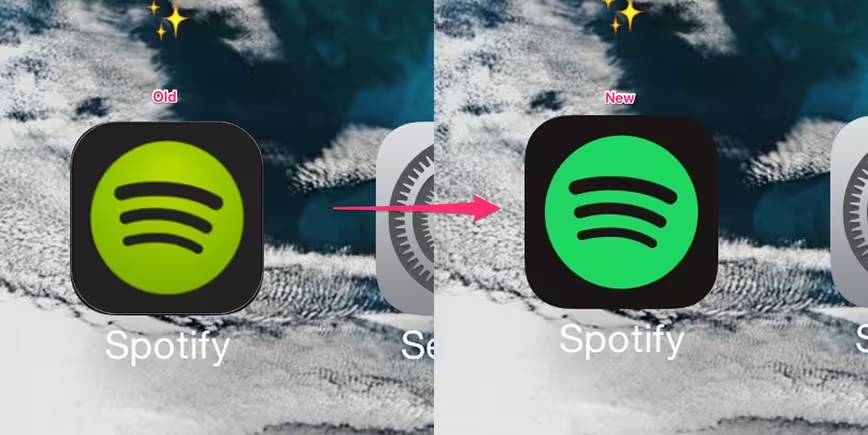
The latest update to Spotify on iOS quietly introduced a new icon for the music streaming service. That new icon is very close to the old one, except the company has tweaked the shade of green and it’s making people mad and confused.
I woke up this morning to the new icon and can’t deal with it on my home screen — something about the shade of green isn’t right.
At first, I thought I was crazy because I checked the Spotify update notes and it simply said “minor improvements” but I’m not the only one confused and a little frustrated:
https://twitter.com/kanabel_kardash/status/610535242496000000
The color of the Spotify icon gives me anxiety
THEY DONT LOOK ANYTHING ALIKE pic.twitter.com/VpUMHyp9ds— queen of sonder🌱🇬🇭 (@vmaayeee) June 15, 2015
https://twitter.com/alproprincess/status/610521190046793729
https://twitter.com/noahdglynn/status/610506507067633664
There are a few people who are confused if their phone has broken or if something else has gone wrong:
is it me or did i wake up to a different shade of spotify icon
— bby pap smear (@lil_merm) June 15, 2015
https://twitter.com/jillian_tg/status/610506516961976320
https://twitter.com/falling_meteor/status/610537517729849344
https://twitter.com/_danpeters/status/610524749324812288
https://twitter.com/_danpeters/status/610524749324812288
For others, it borders on frustration — perhaps even enough to delete it.
https://twitter.com/aishkhanduja/status/610478128507387904
spotify just updated their app icon color and completely ruined the harmony of my home screen
gonna take like hours for my eyes to adjust
— Elias Liedholm (@eliasliedholm) June 15, 2015
The new Spotify icon is such a gross color. Just makes it that much easier to delete once Apple Music launches.
— Wyatt Funderburk (@Funderburk) June 15, 2015
A handful of others, however, seem to like the change:
Dear @Spotify : I love the color choice for your new icon. Don't listen to people with poor taste in design.
— shawnandthecity (@shawnandthecity) June 15, 2015
https://twitter.com/beijiru/status/610392843673337856
It looks like Spotify thought it could quietly update its icon to match its other branding, but users aren’t so happy with the change.
What do you think about the new icon? Is it great, terrible, or simply something you don’t care about? Vote on the poll and let us know in the comments!
Read Next: Spotify’s ‘taste rewind’ is a blast from the musical past
Get the TNW newsletter
Get the most important tech news in your inbox each week.