Despite the common refrain that multi-tasking means not doing anything well, it’s a critical function of mobile app performance. Users expect to be able to jump quickly between tasks, and can get frustrated if they have to wait for content to re-load when moving from one application to another.
With Lollipop, Google has completely reconfigured how multitasking looks and performs. Instead of just dropping the user back into the app, it allows developers to break apart separate tasks, which then appear as a cascade of distinct windows.
It gives developers and users more power, as it’s quicker to get back to and find a certain state within an app. Not only can the user get directly back to work, but the developer can make the app more useful for productivity.

The 💜 of EU tech
The latest rumblings from the EU tech scene, a story from our wise ol' founder Boris, and some questionable AI art. It's free, every week, in your inbox. Sign up now!
The combination of this with the new Material Design is also more aesthetically pleasing, allowing Android apps to have the same kind of polish and elegance that is typically found in iOS.
For the developer, this means making several more decisions about how the app will perform. Fortunately there are several good principles to follow for enabling the right design and programming decisions.
A closer look at Material Design
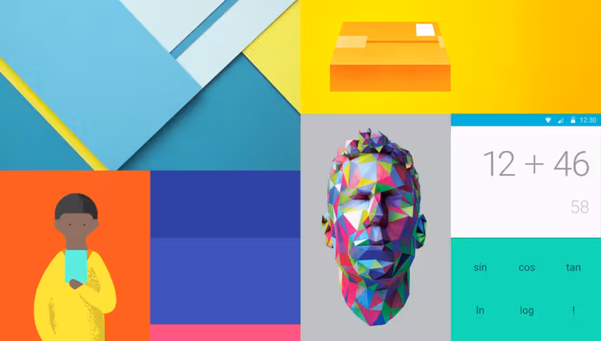
By now there has been plenty written about Material Design, Google’s new aesthetic for Android 5.0. It ramps up the elegance, relying on touch touch events, more animation, increased white space and allusions to real objects.
It’s the most radical redesign yet for Android, and by and large it’s a major improvement to both the look and functionality of Google’s mobile operating system. You may have already dived into the major features and revamped look of Lollipop, but the goal for this piece is more about how it handles multitasking.
For our purposes we are going to look at what Material Design means in terms of multitasking. The paradigm has switched from moving from one app to another, and instead moving between tasks. The “recent apps” screen has been renamed “Overview,” the idea being it’s giving the user a survey of what they are working on, instead of just showing a list of which apps they had open.
Concurrent activities with Overview
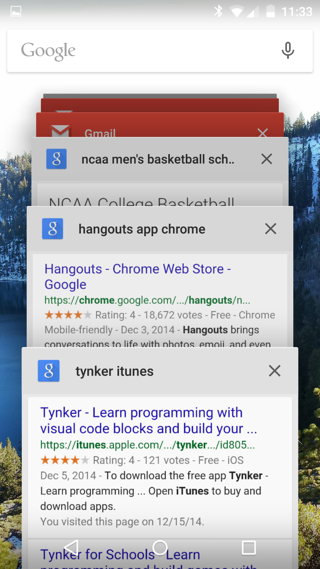
Aesthetically the Overview turns the app-switching screen into a series of cards. Just like Google search and Google Now has done by formatting information into cards, you’ll now begin to see the apps listed this way, frozen at their most recent state.
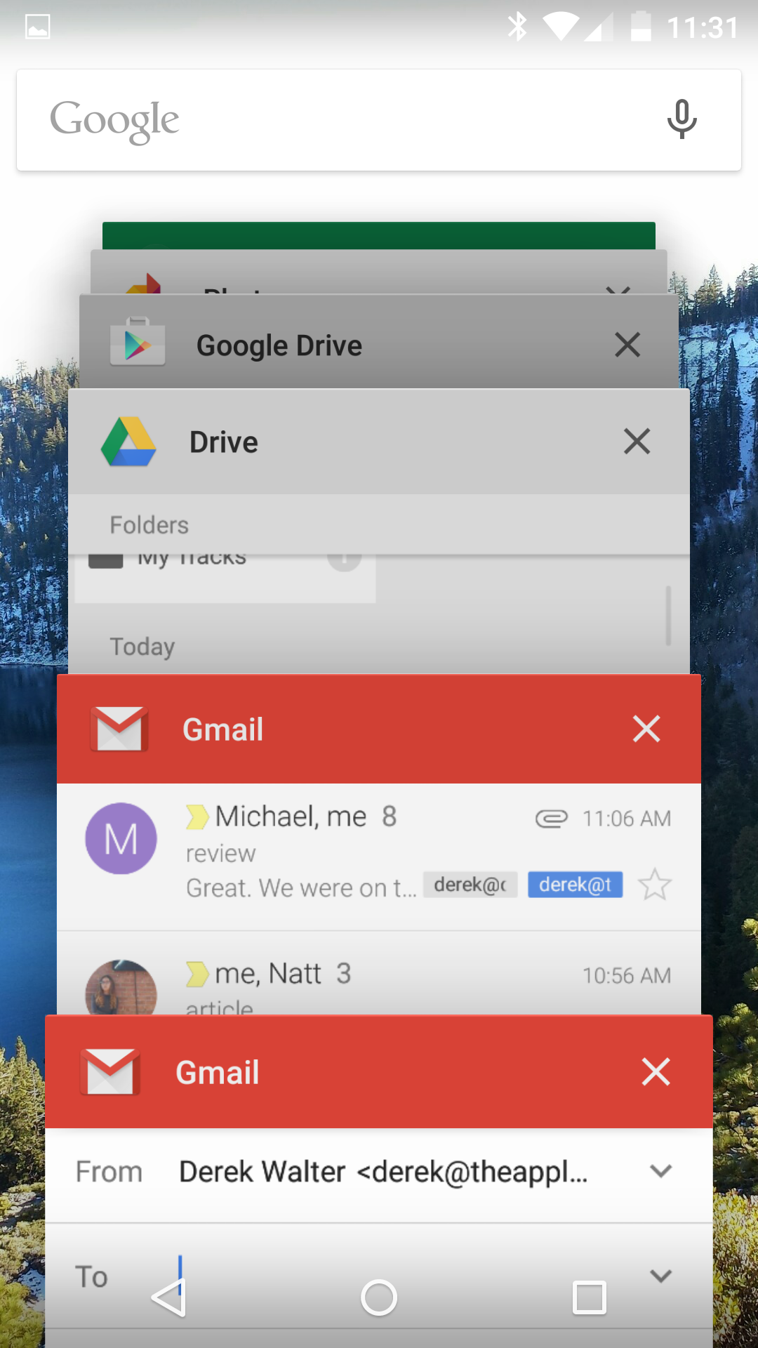
But it goes deeper, as individual apps can break apart their activities into their own cards. Google’s Gmail app (version 5.0) offers several good examples of putting this into practice.
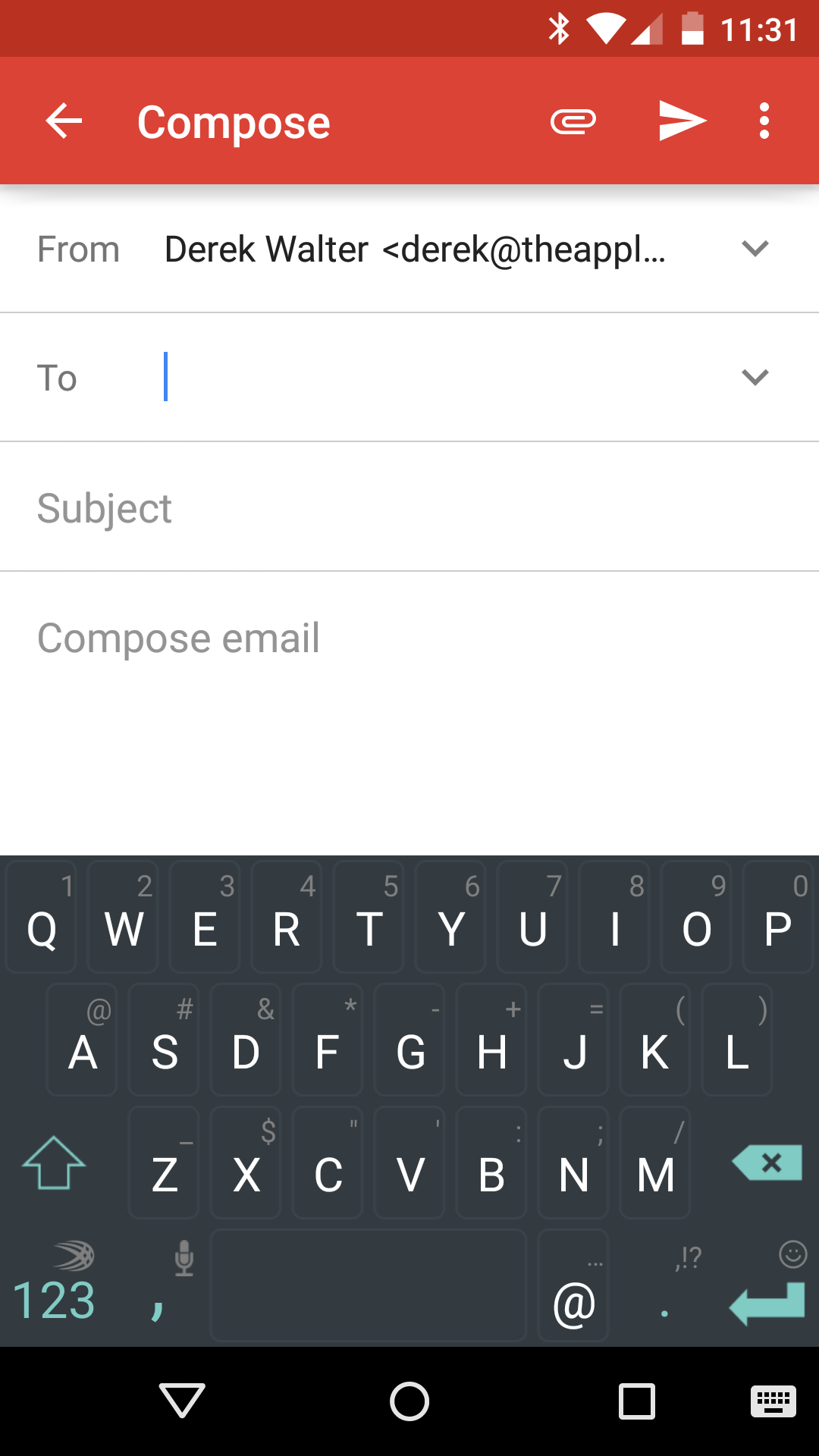
When you press the compose button, there’s an animation that indicates a new action, hinting that you’ve initiated a separate process. Hit the multitasking icon and you will notice two windows – one for the compose box and the other for the inbox.
 Chrome does this as well. Each website becomes its own card that appears separately when multi-tasking (this can be turned off by the user). This makes it much quicker to jump back to a specific web page, instead of multitasking back to Chrome, and then finding the tab you were working on.
Through just these examples, you can see that you have to think of your app less as a closed island and more of a set of pages or windows that users can hop in and out of when needed.
Of course, how deeply to integrate this will depend on the nature of the app. This type of separating of specific tasks will apply more to certain types of applications than others.
Planning out screens
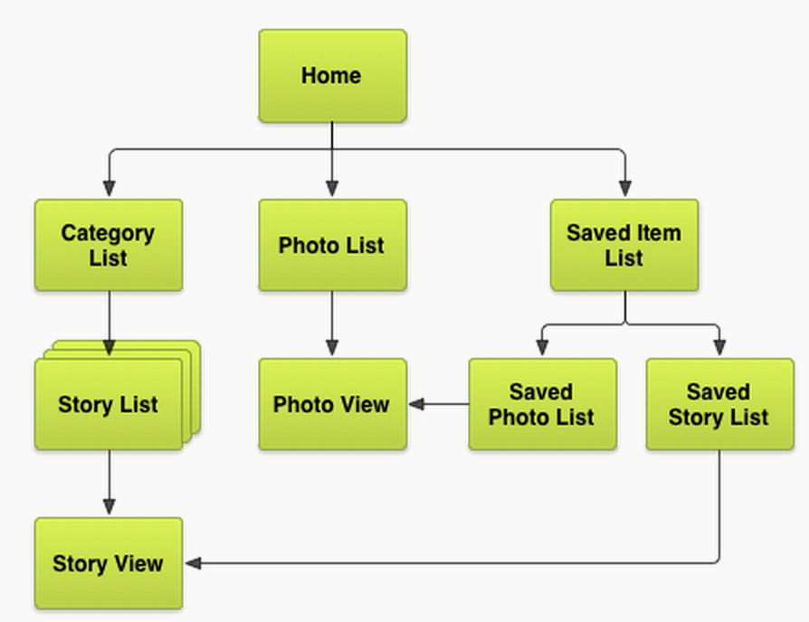
Whatever the new approach looks like, it shouldn’t substitute for good planning of the various screens within the app. As a screen map indicates (pictured) there should be a logical sequence to the app. While this is a good practice in general, it becomes even more important with the new multitasking scheme.
You’ll want to decide what is the most important state for users to move back to when changing up between apps. In Gmail, for example, it makes sense to focus on the compose screen and inbox. With Google search it’s useful to be able to move back to a specific search term instead of starting all over when re-entering the app.
Your app can now have that same kind of flexibility. Perhaps there’s a category list or saved item that serve as a hub for other content. Or a specific note taking or content saving screen. Making such decisions will make your app more efficient, leading to some happier users.
Also, the new Material Design aesthetic plays an important part here. Google has outlined several methods for using the Material Design theme inside your app. With so much of the visual content of your app on display in the Overview, you’ll want to ensure that the status bar and other elements are freshly Material.
Crowding the recent apps list
One of the potential pitfalls with this approach is overwhelming the user with the recent apps list. Right now Google has a cap on the number of concurrent tasks at 50, but even that seems rather high. You also run the risk of annoying someone who has moved on to the other app, but must keep scrolling past all the cards that are open from your app.
It’s best at this time to think of a few core spots that would be a great landing point for re-entering into the app. This will depend on your specific application, but think about what would require the least amount of steps for someone who circles back from another app.
Even the example from the Google search app shows you can definitely have too many places to head back to your app. It can get confusing and somewhat annoying, so hopefully Google will also give some better guidelines and implementation for making this behavior smoother.
The future of multitasking
Google has taken multitasking in a new direction with Android, making it more powerful for both the developer and the user. The challenge is going to be hitting the right balance between overwhelming one with information and including the utility to make moving between applications a smooth process.
Android developers will want to monitor this trend closely, paying attention to both how Google implements it with its own apps and any future guidelines that it rolls out. In the end, it means more powerful multitasking for your apps, and you’ll want to be sure to take advantage of this feature to keep your app in users’ good graces.
Read next: The basics of branding
Get the TNW newsletter
Get the most important tech news in your inbox each week.