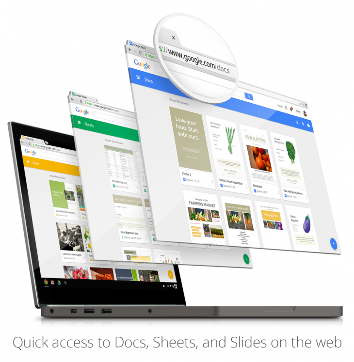
Google’s trio of productivity tools – Docs, Sheets and Slides – are getting all-new home screens on the Web. Whereas before you needed to access them from Google Drive, the company will soon offer a portal for each app at google.com/docs, google.com/sheets and google.com/slides.
The sites will use the modern Material Design language unveiled as part of Google’s new ‘L Developer Preview‘ for Android. Each sports a bright block of color at the top, followed by a grid of cards for recently edited documents. Similar to the recently redesigned Google+ app for Android, there’s also a plus icon in the bottom right-hand corner for creating a new document.
If you choose to download the ‘Office Editing for Docs, Sheets, and Slides‘ extension in Chrome, you’ll also be able to edit Office files and, with the appropriate setting enabled, work on all of your files offline.
Google says the new home screens will be rolling out to everyone over the next couple of weeks. So if you don’t see them yet, hang tight.
➤ via Google+
Featured image credit: Shutterstock
Get the TNW newsletter
Get the most important tech news in your inbox each week.


