Anyone who’s tried their hand at designing a typeface will know that it’s a wildly difficult process, and to actually come out at the end with something beautiful takes an extreme amount of skill, taste and patience.
 Type design isn’t for everyone, but typography is, and nearly every designer works with it every day. This is exactly why Type Release creator Sean Mitchell is here to share with you a list of 38 beautiful typefaces, all of which were released this winter. These are his findings:
Associated Typographics: Ramsey
With strong structure and a warm personality, this typeface is a stout but refined workhorse.
Process Type Foundry: Klavika Display
From extra stuffed to skeletal thin, Klavika Display is a collection of fonts for large sizes and an even larger impact.
Okay Type: Harriet
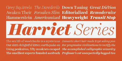
A rational serif family, a contemporary reflection of the serifs popular in mid—20th—century American and English design.

The 💜 of EU tech
The latest rumblings from the EU tech scene, a story from our wise ol' founder Boris, and some questionable AI art. It's free, every week, in your inbox. Sign up now!
Hoefler & Frere-Jones: Tungsten
The New Tungstens, a set of four different widths, each in eight weights. A compact and sporty sans serif that’s disarming instead of pushy — not just loud, but persuasive.
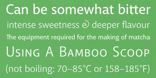
Jörg Schmitt: Ingrid Mono
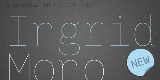
The birth of the monospaced types dates back to the past. There was a need for the creation of typesets for typewriters. The difficulty was to align the different glyphs in the same width.
Lost Type Coop: Dude
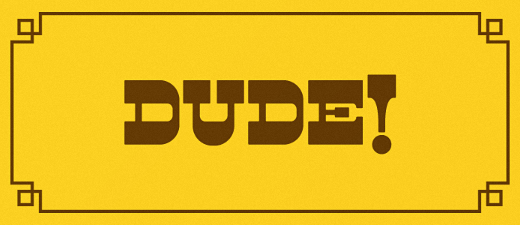
A reverse contrast cowboy font thats got true grit. It’s not about weight, its about style. Twelve different serif styles inspired by country musics legends.
Sudtipos: Poem Script
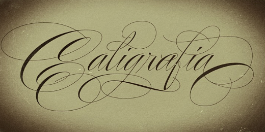
A mixed collection of interpretations conjuring a late nineteenth century American pen script style.
The Northern Block: Baufra
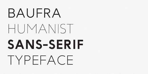
A humanist sans—serif typeface, based on the sans—serif typefaces of the early 20th century.
Monokrom: Telefon
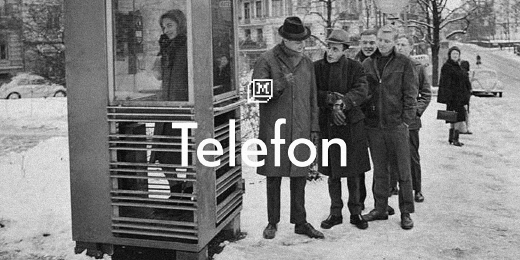
Based on the lettering on the original Norwegian phone booths, drawn by architect Georg Fredrik Fasting in the 30’s. A general purpose geometric sans serif in three weights.
Monokrom: Satyr
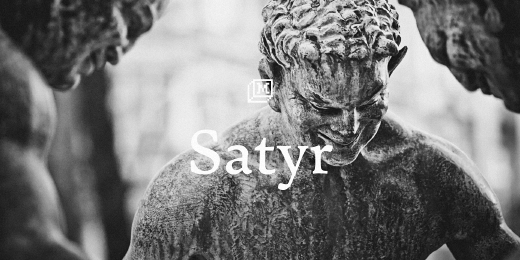
Contrasts convex with concave curves, sculpting letterforms instead of adhering to the traces of a physical tool.
Positype: Anago
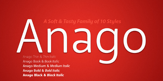
Soft, ample letterforms are casually constructed and the end result produces a typeface that changes color as it varies in size — allowing the type family to work well in both text and display settings as long as attention is given to size.
Positype: Macha
It’s no-nonsense construction bears many influences from Gill Sans and Frutiger while stubbornly blending my own humanist touch.
Borutta: Wood Type Collection
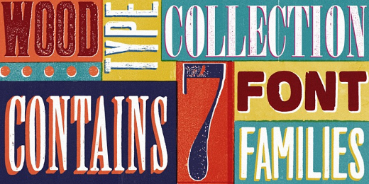
Wood Type Collection from Borutta is a set of wonderful, warm and weathered hand made typefaces. The inspiration for this collection comes from a wooden letter blocks and other old technologies used for printing.
Font Bureau: Serge
A frisky, acrobatic face that dashes off decorative blurbs, signs, and headlines with a lively, angular zest.
Rene Bieder: RBNo2.1
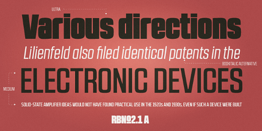
A condensed sans serif typeface with a technical and geometric appearance.
Art. Lebedev Studio: ALS SyysScript
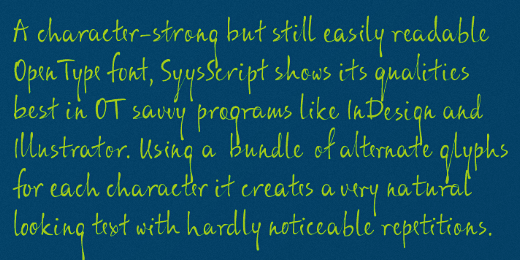
Handwriting of a strong Carelian personality revived.
Suitcase Type Foundry: Tabac Slab
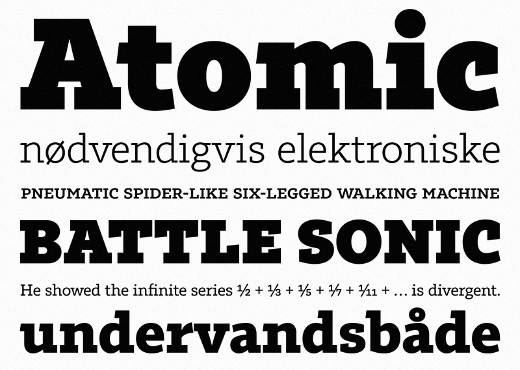
Created by combining several contradictory influences, the result of which is a universal linear font.
Typedepot: Centrale Sans Condensed
15% Narrower than its normal sibling, which makes it precious spacesaving tool. 9 weights from Hairline to Extra Bold plus matching italics.
Los Andes: Magallanes Essential
A contemporary neo—humanist sans serif font designed by Daniel Hernández. Its strokes and terminals are related to the calligraphic strokes from humanist typefaces.
Kostic: Breakers Slab
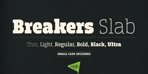
A versatile typeface that is strong in headlines and legible in text, with a range of distinct weights from delicate thin to chunky ultra.
Kyle Wayne Benson: Farmer’s Co-op
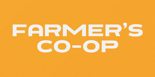
The extended, extra bold, uppercase, sans serif your forefarmers would have used.
Kyle Wayne Benson: Millie
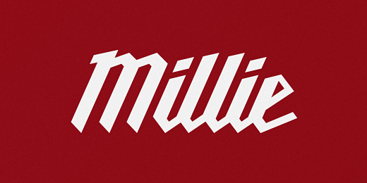
Much like the Milwaukee logo, Millie is meant to be used on a bit of an angle — though, she looks just fine without it.
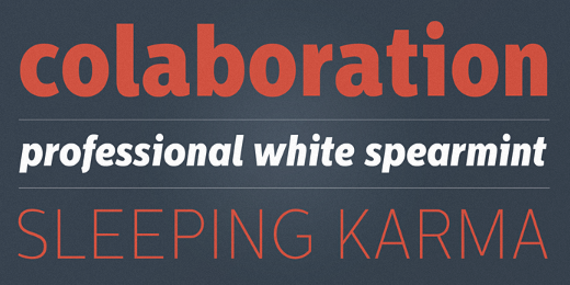
Ludwig Type: Marat Sans
A clean and lively sans serif typeface, characterized by excellent legibility.
Leo Koppelkamm: Blu
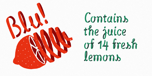
An innovative multilayered font, seemingly inspired by bicycle tires and paper streamers, it fits many use cases brilliantly.
Talbot Type: Kaleko 105
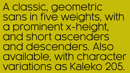
Inspired by the classic, geometric sans-serifs such as Gill Sans, but has shallower ascenders and descenders for a more compact look.
The Northern Block: Reznik
A compact sans serif with a technical origin. Each character was drafted out from a grid template and then refined through the application of subtle curved detailing.
TipografiaRamis: Decima Mono Pro
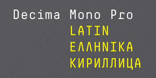
A condensed geometric monospaced san serif, built in six styles.
Mika Melvas: Saline
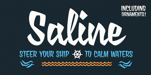
An angular and bumpy brush script. It includes set of nautical ornaments as a OpenType feature.
Latinotype: Schwager
A steampunk slab serif typeface with an industrial accent in a contemporary tone.
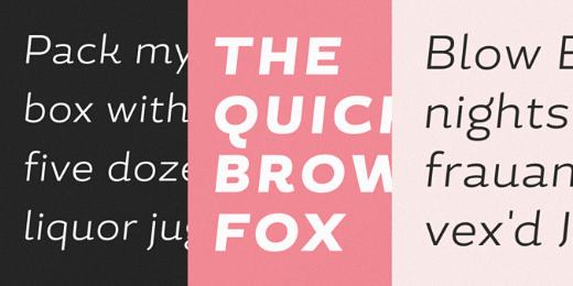
Sudtipos: Platinus Script
Explores the evolution of invitation scripts from the classic commercial lettering of the 1930s to the ideas clearly visible in the greeting cards of the 1980s and 1990s.
Bold Monday: Macula
Can be described as the ‘impossible typeface’, since its design is based on the concept of impossible objects. This optical illusion was explored into great detail in the 1930’s by the Swedish artist Oscar Reutersvärd, and simultaneously made very famous by Dutch artist M.C. Escher.
Wilton Foundry: Cielo
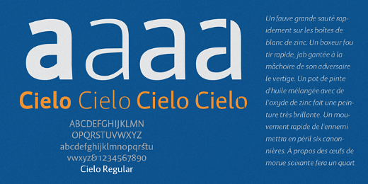
A versatile contemporary typeface family that will serve you well in many design situations.
Rosetta Type Foundry: Arek

A powerful multi—weight type system with an innovative matching Armenian cursive. Originally designed for school books, it responds well to a range of editorial environments.
Storm: Trivia Grotesk
A typeface system which originally arose from the need to simply explain to some publishers “serif, sans-serif, egyptian”, etc.
Soneri Type: Concord
Yet another typeface with simplicity as it’s core element.
Hanoded: Lampion
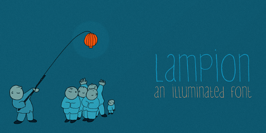
A tall, narrow and very legible typeface, which comes with extensive language support.
Andinistas: Demetria
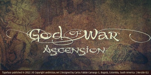
Works to form words and headlines with medieval expressiveness.
Posterizer KG: Posterizer KG Rounded
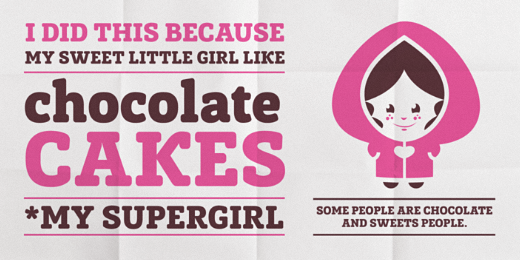
Useful for sweet themes like cookies, puppies, love, joy, or other similar things.
These are just a few of the most impressive typefaces that have surfaced over the past few months. If you believe we have missed something, feel free to share it with us in the comments below!
This isn’t the first time we’ve partnered with Type Release, so check out our lists for September, August, July and June.
Get the TNW newsletter
Get the most important tech news in your inbox each week.