Anyone who’s ever tried their hand at designing a typeface will know that it’s a wildly difficult process, and to actually come out at the end with something beautiful takes an extreme amount of skill, taste and patience.
Type design isn’t meant for everyone, but typography is, and nearly every designer works with it every day. This is exactly why Type Release creator Sean Mitchell is here to share with you some of the latest typefaces released this past month. These are his findings:
HVD Fonts: Pluto Sans
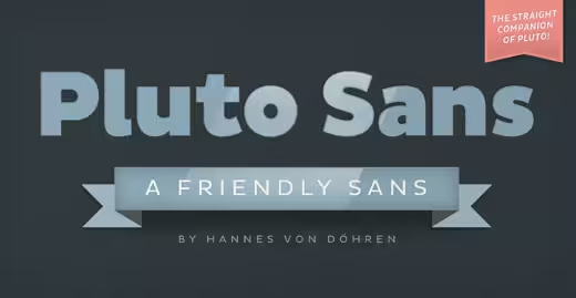 Designer: Hannes von Döhren
The straight companion of the Pluto Family. With its geometric forms and its large x-height it is perfect for long texts in small sizes and usage on screens.
Latinotype: Julieta
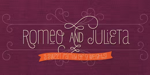 Designer: Paula Nazal Selaive
Inspired by romanticism, Julieta is a charming and versatile typeface. A condensed unicase, full of swashy love.
Oak: Symbolset
Symbolsets are semantic symbol fonts. They work in modern browsers and anywhere OpenType features are supported.
Hoefler & Frere-Jones: Idlewild
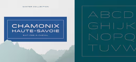
A distinctive typeface that’s at home everywhere it goes. A design whose distinct personality manages to embolden, not overwhelm, its surroundings.
Kostić: Breakers
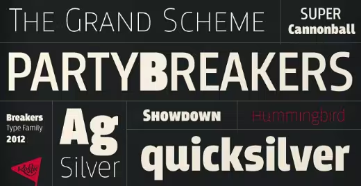 Designer: Nikola Kostić
A sans serif originally conceived to be a display typeface. Works well in text, but the diversity in weights is it’s strong point.
Exljbris: Museo Sans Condensed
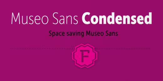 Designer: Jos Buivenga
A sturdy, low contrast, geometric, highly legible sans serif typeface very well suited for any display and text use.
LuxTypo: Colette
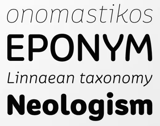 Designer: Greg Lindy
A multi-weight type family. Its formal softness enhances its subject matter, while its structure maintains clarity of message.
Latinotype: Andes Italic
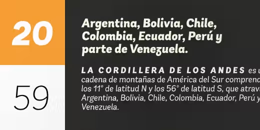 Designer: Daniel Hernández
A display typeface that has neo-humanist characteristics.
Letters from Sweden: Trim Stencil
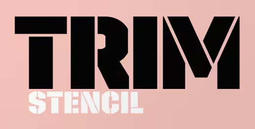 Designer: Göran Söderström
A stencil addition to last months entry, Trim, by Letters from Sweden.
Latinotype: Frida
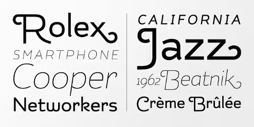 Designer: Luciano Vergara
A latin style hipster typeface, a formal and elegant option for designers.
Mika Melvas: Alina
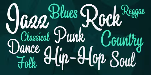
A laid-back condensed script.
Fonts.info: Graublau Sans Web
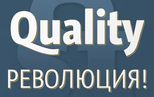 Designer: Georg Seifert
A free webfont for headlines. The regular styles have a rather clean and neutral appearance. The italics on the other hand, have a vivid design based on handwriting.
Talbot Type: Kamerik 105
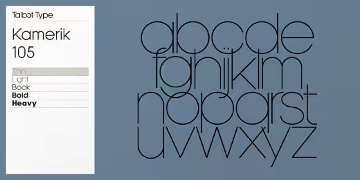 Designer: Adrian Talbot
Inspired by the classic, geometric sans-serifs such as Futura and Avant Garde, but has shallower ascenders and descenders for a more compact look. It’s a versatile, modern sans, highly legible as a text font and with a clean, elegant look as a display font at larger sizes.
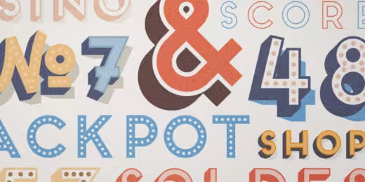 Designer: Juri Zaech
A charming layered type system with endless design possibilities using different combinations of fonts and colors.
Commercial Type: Atlas Typewriter
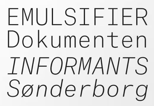 Designer: Kai Bernau & Susana Carvalho
A distinctive monospaced sans, well suited for a wide range of uses, from art catalogues to personal correspondence, through to data visualization.
Commercial Type: Atlas Grotesk
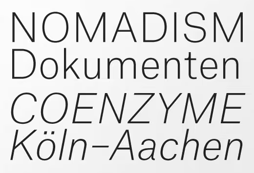 Designer: Kai Bernau, Susana Carvalho & Christian Schwartz
A clean and fresh sans serif with relatively long ascenders but short descenders. This allows the typeface to feel spacious and comfortable for extended reading even when set with tight leading.
PintassilgoPrints: Kokoschka
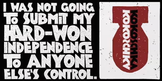 Designer: Ricardo Marcin & Erica Jung
Dense and strong, this family is inspired by the lettering on the poster of a short expressionist play by the astonishing and highly skilled Austrian painter, printmaker and writer Oskar Kokoschka in 1909.
Fontsmith: Elliot
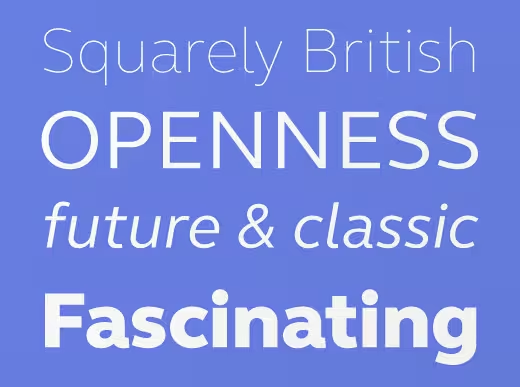 Designer: Nick Job
A future-proof, 21st Century, open & harmonious sans serif design. Rooted in 60’s Brit modernism but re-born with neo-modernist vigour.
Fontsmith: Truman
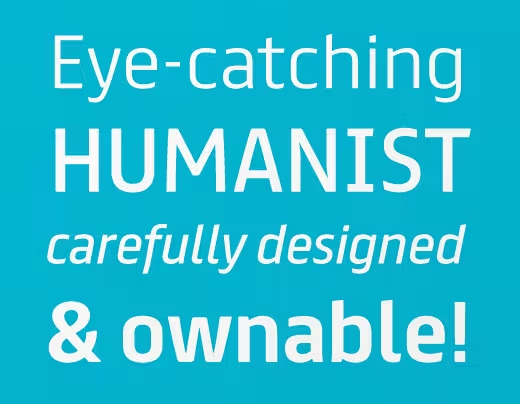 Designer: Jason Smith & Fernando Mello
A strong corporate design built on a sturdy skeleton. A human, rational and spirited design.
FSD: Sys 2.0
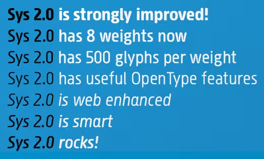 Designer: Fabrizio Schiavi
A condensed font designed to work well at small sizes, but has enough personality to be used at big sizes.
Positype: Halogen
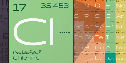 Designer: Neil Summerour
Who doesn’t want or need an expansive contemporary extended sans that has a sense of style and swagger?
Bureau des Affaires Typographiques: Instant
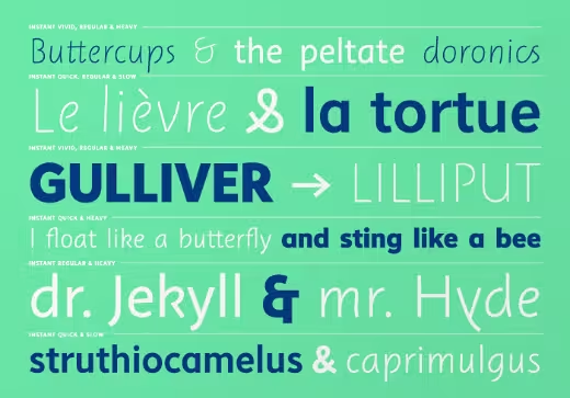 Designer: Jérôme Knebusch
A family in which each member is defined by a speed, which in return lends it both shape and weight. Each weight is an intermediate step which allows the passage from one extreme to another.
Yes Please: International
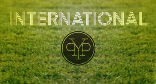 Designer: Lee Schulz
Brings a uniquely modern sensibility to the triline style.
Laura Worthington: Azalea Smooth
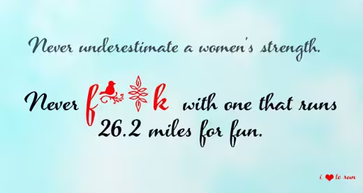
The clean lines accentuate it’s jaunty, angular letterfoms, giving it a modern look.
dooType: Encorpada Pro
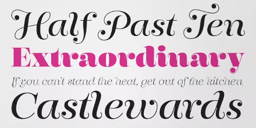 Designer: Eduilson Wessler Coan
Seven weights and a lot of curves, freely inspired by the didones shapes.
Jesse Ragan: Cedar
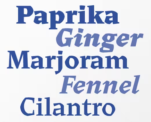
Sharp corners and dramatic curves create an imposing presence at large sizes and aid in legibility at smaller sizes.
Talavera: Ecstasy
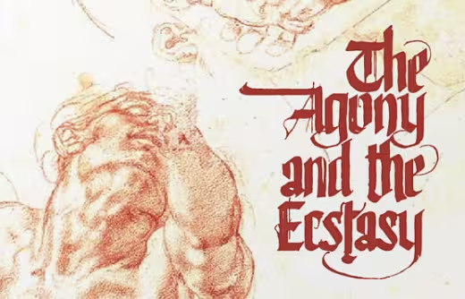 Designer: Jesus Barrientos
Based on a free-styled blackletter with an ink-stained spirit.
Hoftype: Ashbury
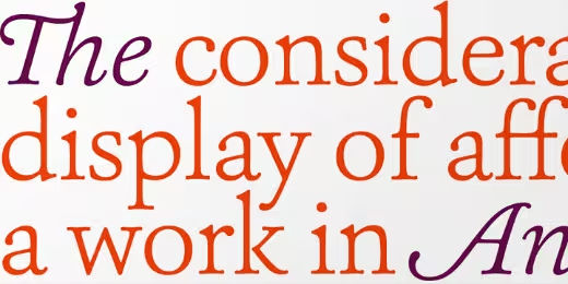 Designer: Dieter Hofrichter
Derives its inspiration from 18th century transitional types such as Caslon and Baskerville. However, it is not a revival but interprets formal aspects in a new and individual fashion.
OurType: Arnhem Display
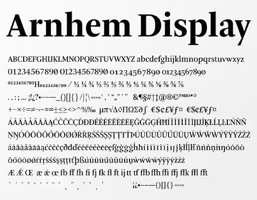 Designer: Fred Smeijers
The latest addition to the Arnhem font family, designed for newspaper headline composition.
Laura Worthington: Shelby
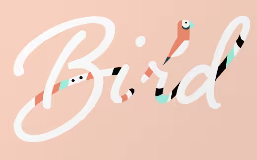
A monoline, semi-connected script typeface based on hand lettering created with a Speedball ‘B’ metal nib.
These are just a few of the killer typefaces that have come out over the past month (give or take a week). If you think we missed something, feel free to share it with us in the comments below!
This is the second month we’ve partnered with Type Release, and you can check out last month’s list here!
Get the TNW newsletter
Get the most important tech news in your inbox each week.
