Anyone who’s tried their hand at designing a typeface will know that it’s a wildly difficult process, and to actually come out at the end with something beautiful takes an extreme amount of skill, taste and patience.
Type design isn’t meant for everyone, but typography is, and nearly every designer works with it every day. This is exactly why Type Release creator Sean Mitchell is here to share with you some of the latest typefaces released this past month. These are his findings:
Aesthetic Apparatus: Valuco

A nice, hearty, gaspipe typeface.

The 💜 of EU tech
The latest rumblings from the EU tech scene, a story from our wise ol' founder Boris, and some questionable AI art. It's free, every week, in your inbox. Sign up now!
Reserves: Sorren
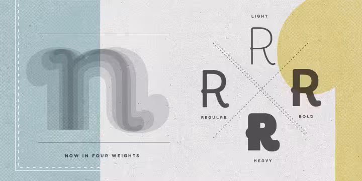
 Designer: Mike Jarboe
A definitive bold condensed sans influenced by neo-grotesque designs. A relatively low stroke contrast complimented with sharp, horizontal stroke ends lend an unyielding appearance, while it’s rounded forms and refined curves juxtapose its inherent strength with grace.
Lost Type Co-op: Maven Pro
 Designer: Joe Prince
Light as a feather.
MCKL: Fort
 Designer: Jeremy Mickel
A contemporary grotesk, inspired by years of working as a graphic designer and the constant need for sans serifs with a flexible voice and durable performance.
Latinotype: Antartida Rounded
 Designer: Luciano Vergara
A sans serif with rounded terminals, its simple, neutral feeling, is functional, clean and minimal. Rounded terminals make it friendly and warm.
Typonine: Thema
 Designer: Nikola Djurek
Consists of letterforms with large x-heights, wide, bracketed hairline serifs, and slightly angled stress. Its italics have crisp yet painterly undertones that suitably contrast with its upright counterparts.
The Northern Block: Uniman
 Designer: Jonathan Hill
A clear and simple sans serif typeface. Straight lines are combined with precision curves to form a functional and versatile typeface.
205: Beretta
 Designer: Quentin Margat & Damien Gautier
Designed upon a proportional structure which makes it surprisingly legible even in very small text sizes.
CV Type: Reverie
 Designer: Galen Lawson
A cheerful band of letters that bounce across the page and get together to create words in four weights. Quirky without being too whimsical.
Gerren Lamson: Handblock

A pair of typefaces that contains four variations of uppercase letterforms, inspired by the playfulness of arranging individual wood type letters.
205: Maax
 Designer: Quentin Margat & Damien Gautier
A typeface with 4 stylistic sets: geometric, modern, grotesk.
Ten Dollar Fonts: Eastwood
 Designer: Jonathan Faust
Inspired by old wood types from the classic western-movies.
dooType: Maestra
 Designer: Eduilson Wessler Coan
A calligraphy font based on calligraphic style called Copperplate.
Photo-Lettering: Norton Tape
 Designer: S.E. Norton & Kimberly Winder
A multi-layer alphabet.
Alias: Ano
 Designer: Gareth Hague
A simple geometric, monoline framework allows for stylistic consistency over three variations.
Alex Connock: Connock

A typeface completely designed with the sole function of being used on eReader devices. Designed by combining many different elements on legibility theory and how the eye reads.
FDI: Graublau Slab Pro
 Designer: Georg Seifert
The latest addition to the popular Graublau type family designed by the Berlin-based type designer Georg Seifert.
Just Another Foundry: JAF Bernini Sans
 Designer: Tim Ahrens
Finely balanced weight distribution and open shapes make JAF Bernini Sans a great text face, while the wide variety of weights and widths provide a rich toolbox for headings and display typography.
G-Type: Rollerscript
 Designer: Nick Cooke
Conceived by writing out variations of each character by hand using a roller pen before the scanning and digitising process.
Playtype: Q Stencil
 Designer: Jonas Hecksher
A hyper-display didone; a true magazine header of extraordinary charisma. Designed to contain and communicate a distinct creative expressiveness.
Playtype: Metro Stencil
 Designer: Jonas Hecksher
Showing both distinct elegance and boldness while optimized for higher legibility. The Metro family was originally designed for the Metro of Copenhagen.
Insigne: Ashemore
 Designer: Jeremy Dooley
A restrained bohemian vibe that seems particularly appropriate for a coffee house or an art gallery.
Type Supply: Timonium
 Designer: Tal Leming
A five weight, high-contrast sans serif display family.
Rene Bieder: RBNo3.1

A sans serif typeface with a technical and geometric appearance. The family includes 9 weights with matching italics. Its large x-height makes it especially legible at small point sizes.
Neal Fletcher: Bouwen

Available in 3 cuts: filled, holes and parts.
These are just a few of the killer typefaces that have come out over the past month (give or take a week). If you think we missed something, feel free to share it with us in the comments below!
Also, it’s the third month we’ve partnered with Type Release, so check out July’s list and June’s list!
Get the TNW newsletter
Get the most important tech news in your inbox each week.