Texture is one of the best ways to add depth and life to any web design. When used carefully, it can help create an expressive and organic experience, but when over-done, it can lead to tacky mess.
It’s not easy to strike the perfect balance, but when you do, something very natural and memorable surfaces. There’s tons of variety in the way textures can be used by web designers, but overall the results tend to fall into 3 categories: photographic, pattern or simulation. Each type has its own purpose, and it’s up to you to decide which one you like best for which project.
Check out this list featuring some of the best examples of texture in web design:
Photographic
 Poco People’s gigantic photo background serves a few different purposes, namely to introduce the team, set the mood and hint at where they’re from. Near the top and bottom of the design, the background functions more abstractly like a texture (instead of a clear photograph), as it blurs and fades to balance visual interest and distraction.
 As we said in our article on minimalism, Christopher Meeks, a freelance web designer from St. Louis, presents only the essential bits of information in stark white over a beautiful grainy photograph. While some details are hard to find due to the navigation’s simplicity (try clicking the arrow on the right of his logo for more information), there’s never a frustrating moment of usability failure.
 Mathieu Strabach’s site presents an overlaid, washed out photograph as the background of a very minimal and beautiful design.
➤ STRBK (source: WDL)
 Pablo Gonzalez’s portfolio showcases the possibility of photographic textures. The subjects of a photo aren’t the focus, but the aesthetic value is still there.
➤ Pablo Gonzalez
Pattern
 As we said in our roundup of 9 gorgeous examples of black and white websites, Blissfully Aware is a cross between a collage and an appendix. Josh Lane’s site showcases a perfect use of space, making it easy for the eyes to bounce around from heading to heading.
 Wearable Print has a soft, tan texture that goes well it’s name. The light paisley background for each catalogue only strengthens the connection.
 Amazee Labs’ site feels like it was made on an old letterpress.
 Hugs for Monsters shares a similar appeal with Amazee Labs, but with a more modern feel. It’s very illustrative, with a texture pattern that carries on throughout the entire page.
➤ Hugs for Monsters (via WDL)
 Create Digital Media features a subtle, fabric-like texture background and a minimalist design contrasted by surprisingly good animations.
 BERG Cloud, of Little Printer fame, shows off it’s minimalistic roots with a balance of subtle textures and solid colors.
➤ BERG Cloud
 Bold type and a fresh looking pattern sets Teixido apart from other sites. But what really makes it shine is the way other elements (like the nav bar) come together.
➤ Teixido (via Six Revisions)
Simulations & Illustrations
 Kaleidoscope’s background plays on its name, and is based on its vivid icon.
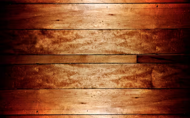
 Pointless Corp’s wood background is just right. Simulated textures with the intention of looking realistic can easily be messed up, unless they are dead on.
➤ Pointless Corp (via Six Revisions)
 Electric Peel’s design (created by Ryan Scherf) has a perferated leather-like header background, with a neon-banana body background. That’s right. Neon-banana.
➤ Electric Peel
 Bloom Health’s page (also by Ryan Scherf) follows a formular similar to Electric Peel, but with a calmer approach. The wood isn’t hyper-realistic, but feels right behind the casual, cut and pasted illustrations.
➤ Bloom Health
 Polargold’s subtle illustration falls right into the background, making it less about the objects and more about the mood it sets for the entire page.
Throughout all of these awesome examples, balance is key. Busy elements, like the animations on Create Digital Media‘s site, have to be met with calmer backgrounds, while Amazee labs‘s letterpress inspired design creates visual interest with texture in the forefront. No matter what styles you embrace, it’s important to use texture with restraint.
With these sites for inspiration, it’s hard to deny that texture can be used to create an amazing design — so long as it’s in the right hands.
For more inspiration, check out the entire Design and Dev channel. You can also take a peak at these 14 examples of illustrative web design.
Get the TNW newsletter
Get the most important tech news in your inbox each week.