Everything created on a computer has this innate tendency to feel slick — and sometimes, even artificial. Picture a blank, white screen. There’s no variation. No flaws. What you see is duplicable, perfected.
Now, stare at a sheet of paper. If you look hard enough, you’ll notice the material, the imperfections and even the presence of a gloss or matte finish. These are natural traits that nobody really thinks about, but they ultimately have a massive impact on the aesthetics of every design.
So what’s a web designer to do? There are plenty of expertly crafted designs that embrace the the inherent aesthetics of a computer screen, and I have no intention of casting this type of work aside. But sometimes it’s necessary to incorporate subtle, tactile elements into our work to recreate the magic of print design. Check out Amazee Labs for a great example.

Creating something that looks like it can be touched and felt has an interesting impact on our brains. It helps us quickly conjure up moods and memories that are otherwise unattainable. As you can see, there are real benefits.
Sadly, textures are often misused. Picture all of the cliche, grungy designs everyone (including myself) creates when they first learn Photoshop. Those are bad. Stop.
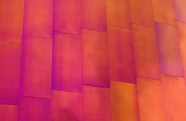
In order to utilize texture correctly, you’ll need self control. There are essentially three types of textures that you can embrace: Patterns, Photographs and Simulations. All of these styles have their own strengths and weaknesses, and some are easier to master than others.
Patterns

Patterns, like the one above (Solo), are often the best way to start incorporating texture into your work. Sometimes a simple noise texture, like the one found on the black background of TNW, is all you need to create natural variation. Just like the use of reverb for musicians, texture is all about moderation. Check out this tutorial for how to create subtle noise textures in Photoshop.
Photographs
 Photographic textures, like those created with a camera or scanner, can provide very realistic results without looking too cheesy. These sort of textures are often utilized with layer masks to help blend artificial and natural elements together. It may be tempting to use large photographs of these textures as a background, but careful as this can adversely affect your page’s loading time.
Simulations

As for simulated textures, they can actually be very risky for inexperienced designers. Apple’s latest release of Lion and iOS 5 embrases 3-dimensional, simulated surfaces like leather and wood. All in all, Apple hasn’t done a bad job, except for iCal, which looks pretty bad.
Just remember this: every time artificially created textures are made to look hyper-realistic, they’d better end up looking like PIXAR — otherwise, your design will look terrible.
Sometimes you really are better off embracing the inherent design properties of the digital world, instead of looking to the past for inspiration. This can be compared to digital instruments, which were first used only to recreate pre-existing sounds. As time has shown, an entire new class of instruments, like Moog‘s synthesizers, have been created for the better.
In the end, it’s up to you to decide if texture is necessary for your design, but there is no doubt that it can lead to amazing results if you do it right.
You might also want to check out this list of 14 awesome examples of illustrative web design.
Get the TNW newsletter
Get the most important tech news in your inbox each week.