The purpose of minimalism is to expose the essence a design by eliminating all non-essential forms, features and concepts. In web design, minimalism erases potential distractions and strips away elements into their most basic forms.
It’s a style that continues to be trendy, being a rection to the chaos and overflow of information that’s inherent to the Internet. And if your portfolio’s sole purpose is to showcase the best work you’ve ever created, the biggest favor you can do for yourself is to simply get out of the way.
Milton Glaser
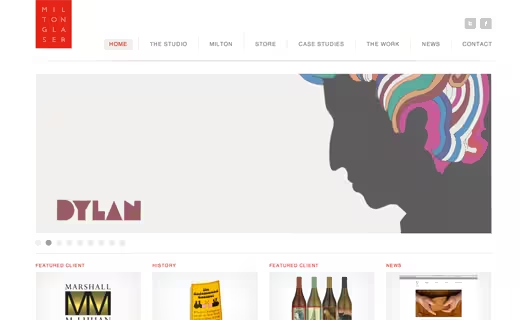
Milton Glaser, the iconic designer of I Love NY, showcases a beautifully minimal portfolio design for both himself and his studio. From the symmetry in his logo to the restrained use of shadow and gradient for depth, this design sets high standards for every web designer to try and meet.
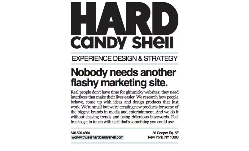
Hard Candy Shell
Hard Candy Shell‘s portfolio may be off-putting for some, while others are sure to embrace it with open arms. The design, akin to a minimalistic Vitamin Water label, cuts right to the chase: “Nobody needs another flashy marketing site.” While the downside here is that no work is actually shown to potential clients, most of Hard Candy Shell’s work is behind the scenes and unreleased to the public — meaning this really isn’t an issue.
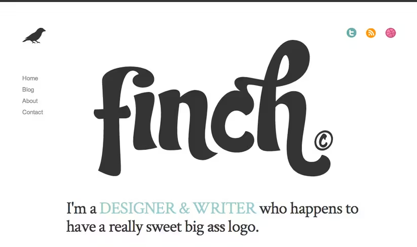
Get Finch
Finch is the online presence of Francisco Inchauste, a designer and writer “who happens to have a really sweet big ass logo.” His Finch logo is so bold and illustrative that it brings the entire site to life without serving as a distraction. The use of spacing, in some ways, is rather peculiar, but nevertheless helps maintain a clear, simple and digestible site with tons of personality.
Craft
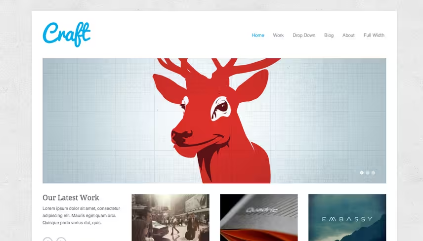
Craft, a WordPress theme designed by Theme Trust, does so many things right. It manages to have its own unique look, while following standards that make the site easy to predict and understand. The single post pages are perhaps the most impressive aspect of the design. They’re image centric, but still provide ample room for large quantities of text.
Bärnt & Ärnst

Bärnt & Ärnst is a small design and web development company based in Stockholm, Sweden. Its site features an impressive use of icons with an interesting color scheme. The menubar shines for being highly navigable while adding a lot to the site’s composition.
Stefan Kirov
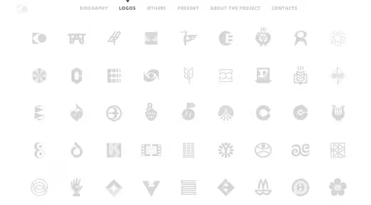
The portfolio of the late Stefan Kirov, a prolific and unbelievably talented logo and icon designer, showcases Kirov’s work without a single distraction. All of his work can be viewed from the homepage, and the menu bar locks to the top of the page without getting in the way.
Christopher Meeks
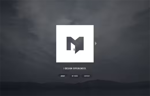
Christopher Meeks, a freelance web designer from St. Louis, presents only the essential bits of information in stark white over a beautiful grainy photograph. While some details are hard to find due to the navigation’s simplicity (try clicking the arrow on the right of his logo for more information), there’s never a frustrating moment of usability failure.
Yuna Kim
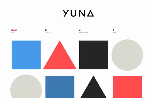
Yuna Kim’s use of elementary shapes helps to organize her portfolio, and goes perfectly with her personal logo. The site’s experimental nature comes at the partial sacrifice of usability, but all-in-all, the site serves its purpose well.
Google‘s homepage has always hailed an overtly minimalistic design, only consisting of a simple search bar and a few links. This design may have started due to a lack of taste and ability by the co-founders, but Google’s simplicity has proved absolutely imperative to its success.
Minimalism isn’t perfect for everyone, and sometimes designers prefer to use their portfolios as a piece in its own right. For example, if your style is very illustrative and decorative, you might want your portfolio to reinforce this, steering clear of minimalism so not to confuse clients.
Most importantly, your portfolio must represent you and your work. Minimalism is one way to show control, restraint and taste while showing off your work, but it’s not the only way.
What do you think of minimalism in web design? Is it a trend or a lasting solution to an over-crowded web?
Get the TNW newsletter
Get the most important tech news in your inbox each week.
