
Like minimalism, illustrative web design is a very distinct and impactful way to showcase a brand. Illustrations communicate personality, skill and creativity, and if done correctly, ultimately create a completely original presentation that can’t be replicated by other designers.
There are so many reasons to use illustration in your designs. As Webdesigner Depot explains, illustration in web design tends to serve three purposes: Concept reinforcement, decoration and mascots.
Below are some the best uses of illustration in web design out there, setting high standards for anyone with a Wacom Tablet and a dream:
Carsonified
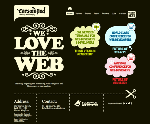 Carsonified showcases simplistic, 2D icons and embellishments with a fantastic color scheme of creme on black, with soft red, blue and green accents.
Creative Spark
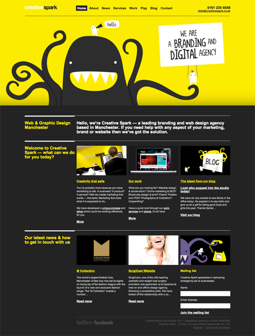 Creative Spark‘s vibrant use of yellow and gray with quirky characters creates a bold look with depth and balance.
Carbonmade
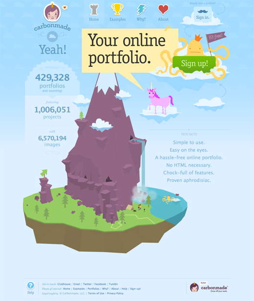 The atypical layout and whimsical, colorful illustration make Carbonmade worthy of exploring.
Forrst
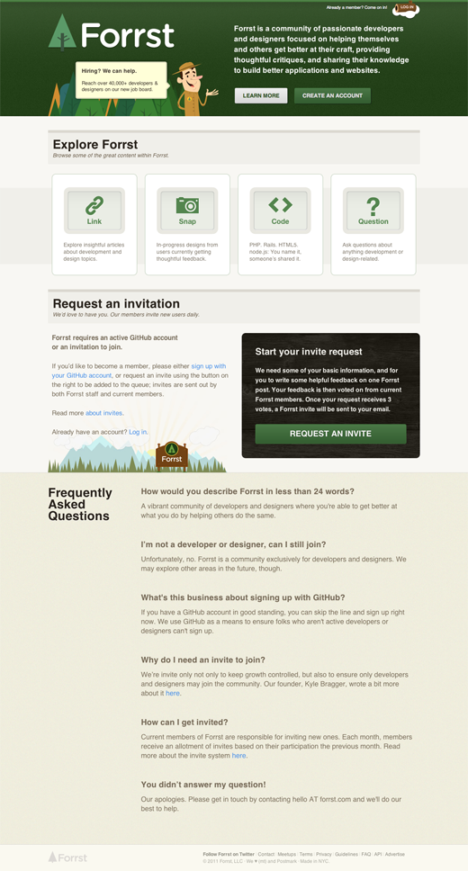 Forrst‘s reinforcement of its forest theme isn’t overdone, but it is very obvious, creating a strong brand connection quickly. The rest of the page leaves enough room to breathe, so viewers aren’t overwhelmed.
MailChimp
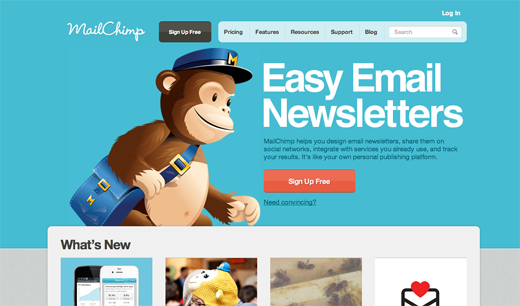 MailChimp‘s gigant monkey illustration is paired with an otherwise plain site, striking an interesting balance. There really isn’t much here that could actually use any improving.
Inservio
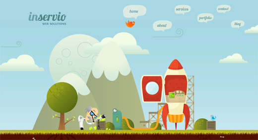 Inservio‘s homepage is well done in nearly every way. The finer details don’t distract, while instantly showing what it is all about. I particularly love the red padding in the rocket ship.
Vimeo
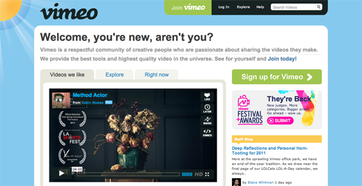 Like Carbonmade, Vimeo‘s illustration carries on throughout the entire page, with a calm color scheme and breaks between details and simplicity.
Multiways
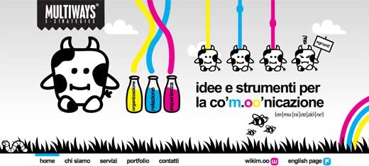 Though very busy, with tons of movement, there’s something very charming about Multiways‘ cow illustrations and the CMY…milk?
Zaarly
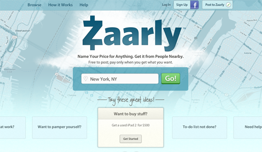 Zaarly restricts the use of very illustrative elements to the footer of the page, while offering hints in the header. This is a great example of a functionality driven site with a strong use of illustration.
XHTML Cafe
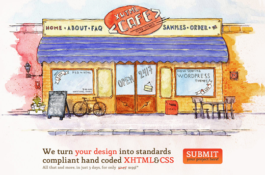 XHTML Cafe is a wonderful example of watercolor in web design. Perhaps different pieces were scanned into Photoshop, but this design looks convincingly hand painted and really gets my attention.
Amazee Labs
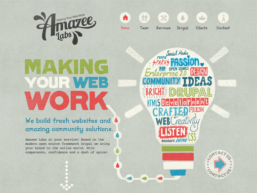 Amazee Labs has a strong letterpress print feel, with bold text and original icons. The repeated texture pattern is a nice touch.
Idyllic Creative
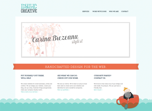 Idyllic Creative’s design oozes elegance and restraint. Most of the illustration serves a decorative purpose, and the logo type suits the company very well.
Polargold
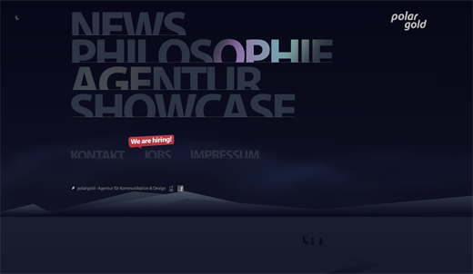 Text on Polargold’s site lights up like the northern lights. The way the tabs adjust when clicked is a little distracting, but the overall design is still impressive to say the least.
Bookish
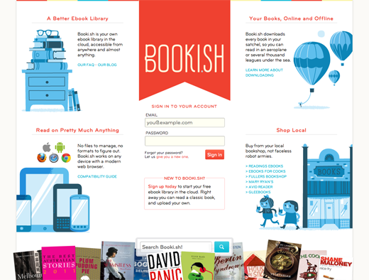 Bookish, like Idyllic Creative, follows a very elegant design, but with a much busier layout. The blue-toned illustrations and bookmark-like logo give a strong impression.
For more inspiration and advice, check out TNW’s Design Channel or take a peak at these 9 reasons to consider Minimalism for your design portfolio!
Get the TNW newsletter
Get the most important tech news in your inbox each week.

