
Python is great for data exploration and data analysis and it’s all thanks to the support of amazing libraries like numpy, pandas, matplotlib, and many others. During our data exploration and data analysis phase it’s very important to understand the data we’re dealing with, and visual representations of our data can be extremely important.
It’s common for us to work on these projects using Jupyter notebooks because they’re great, fast, simple, and they allow us to interact and play with our data. However there are limitations to what we can do, normally when we work with charts we use libraries like matplotlib or seaborn, but those libraries render static images of our charts and graphs. Many things get lost in the details, and thus we need to fine-tune our charts to explore sections of our data. Wouldn’t it be great if we could just interact with our charts by zooming in and adding contextual information to our data points like hover interactions? Here is where Plotly can help us.
Plotly is a python library that makes interactive, publication-quality graphs like line plots, scatter plots, area plots, bar charts, error bars, box plots, histograms, heatmaps, subplots, and much more.
[Read: How to use Python and Selenium to scrape websites]
So, let’s start building some charts…

The 💜 of EU tech
The latest rumblings from the EU tech scene, a story from our wise ol' founder Boris, and some questionable AI art. It's free, every week, in your inbox. Sign up now!
Installing dependencies
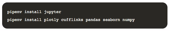
Before we build anything, let’s install dependencies. I like to use pipenv but the same applies to anaconda or other package managers.
Here’s the list of dependencies we need:
- jupyter: A web application that allows you to create and share documents that contain live code, equations…. you know it!
- pandas: A very powerful library for data analysis in general and we will use it in our project to handle our data.
- numpy: A scientific computing for Python, used in our project for math and generating random numbers.
- seaborn: a Statistical data visualization based on matplotlib, we will be using it to load some sample data that comes with the library.
- cufflinks: This allows plotly to work with pandas.
- plotly: An interactive charting library.
Here are the commands to install them:
Getting started
To get started we need to start our jupyter notebook and create a new document:

Once we’re there we can start adding some code. Since this article is not a tutorial on Jupyter Notebooks, I’ll just focus on the code and not on how to use the document.
Let’s start importing the libraries:

Plotly, with the help of other libraries, can render the plots in different contexts. For example on a jupyter notebook, online at the plotly dashboard, etc. By default, the library works with the offline mode, which is what we want. However, we also need to tell cufflinks that we’ll be using the offline mode for the charts. This setting can be done programmatically by adding the following cell to our notebook:

Now we’re ready to get some data and start plotting.
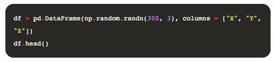
Generating random data
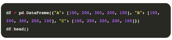
I don’t want to focus so much on how to load or retrieve data, so for that reason, we’ll simply generate random data for the charts, in a new cell we can use pandas and numpy to build a 3d matrix:
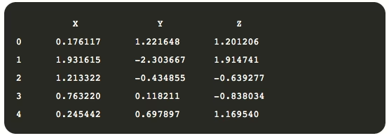
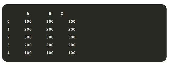
Using numpy we can generate our random numbers and we can then load them into a pandas DataFrame object. Let’s see what our data looks like:

That’s great! Now, it’s time to plot some charts.
Our first plots
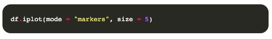
A convenient way to plot DataFrames is by using the method iplot available on Series and DataFrames, courtesy of cufflinks. Let’s start with all the defaults:

At first sight, it looks like any other chart, but if you hover with your mouse over the chart you’ll start seeing some magic. A toolbar appears when you hover on the top right of the screen that allows you to zoom, pan, and other things. The chart also allows you to zoom in by drawing an area on the chart or to simply see a tooltip on each data point with additional information like the value.
Our chart above is certainly better than a static chart, however, it’s still not great. Let’s try to render the same chart using a scatter plot.

Not terrible, but not great, the dots are too big, let’s resize them:
Much better! Next, let’s try something different.
Bar charts
Let’s forget our randomly generated dataset for a minute, and load a popular dataset from the seaborn library to render some other chart types.
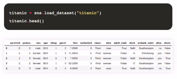
The dataset we’ll be working on is called “titanic,” and contains information about what happened to the people who were traveling on the Titanic that tragic day.
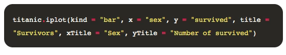
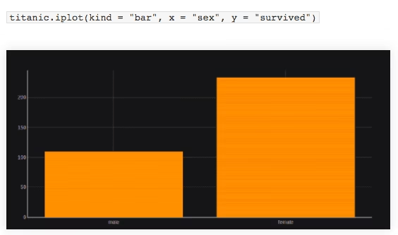
One special variable in this dataset is the survived variable, which contains boolean information, 0 for those who died, and 1 for those who survived the accident. Let’s build a bar chart to see how many men and woman survived:

The trend can be easily seen, however, if you just share this chart it’s impossible to know what we are talking about as it has no legends, nor titles. So let’s fix that:
That’s now much better!
But what if we want to draw a horizontal bar plot? Easy enough:

Themes
Our charts so far look great, but perhaps we want to use a different color scheme for our charts. Luckily enough, we have a set of themes we can use to render our plots. Let’s list them and switch to another one.
Listing themes:

It should output something as follows:

We can switch the theme for all future charts by simply adding:
And now if we render our bar chart again we get something like:
Dark mode is one of my favorites.
Surface charts
So far we rendered 2d charts, but plotly also supports 3d charts. Let’s build some 3d charts just for fun. The next plot is the 3D Surface plot and for that, we need to create some data using pandas as you see in the following:
You should get something like:
Now let’s throw this on a 3d chart using the “surface” kind:
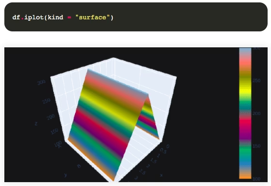
Looks amazing! Now, let’s change the color scale to make it more visually appealing:
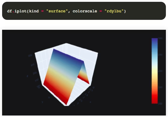
Beautiful! But that’s not it, have you tried interacting with the chart in your notebook? You can even rotate it.
Plotly is a great chart alternative for your data exploration and analysis. As seen in this article, it provides interactive dashboards that can help you better identify your outliers and get a greater understanding of your data by navigating through it. I probably won’t use plotly for every single dataset, but it’s a very interesting library we should know about.
This article was originally published on Live Code Stream by Juan Cruz Martinez (twitter: @bajcmartinez), founder and publisher of Live Code Stream, entrepreneur, developer, author, speaker, and doer of things.
Live Code Stream is also available as a free weekly newsletter. Sign up for updates on everything related to programming, AI, and computer science in general.
Get the TNW newsletter
Get the most important tech news in your inbox each week.