The term Accessibility covers a vast field of standards that comes with a confusing myriad of acronyms. In this post, I assume I don’t need to convince you to care about accessibility (check out one of my former manager’s articles if you still need a push!). I jump straight into attempting to summarize the basic structure of Web Accessibility Standards to provide beginners with a high-level starting point to dive into the topic. I highly recommend checking out the free edX course (I found it very helpful) or the W3C resources if you want to dig deeper.
Web accessibility means that websites, tools, and technologies are designed and developed so that people with disabilities can use them. More specifically, it is so people can perceive, understand, navigate, and interact with the Web as well as contribute to the Web. Additionally it is also helpful for people without disabilities such as people with “situational limitations” such as in bright sunlight or in an environment where they cannot listen to audio.

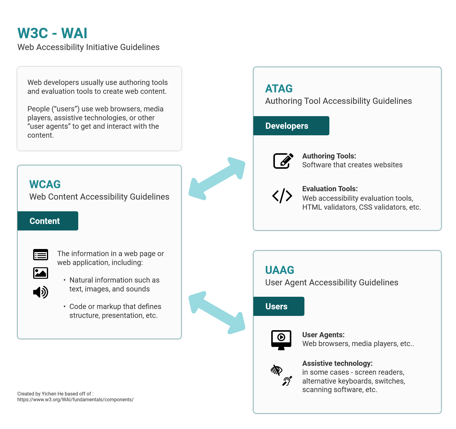
Web Accessibility Initiative (WAI) is seen by most as the standard in Web Accessibility. WAI made up of three primary components. ATAG for development, WCAG for content and UAAG for users. WAI is developed by the Accessibility Guidelines Working Group (AG WG) that is part of the World Wide Web Consortium (W3C).
Let’s take a look at each of these three sections:
WCAG
Web Content Accessibility Guidelines (WCAG) addresses web content, and is used by developers, authoring tools, and accessibility evaluation tools. Something that is neat about WCAG standards is that it is backwards compatible, meaning something that is compliant with the latest version (2.1) would also pass (2.0).
WCAG is one of the most common standards for UX and Product designers as it applies to all the content. There is a simple rating system for all the guidelines under WCAG:

Level A (minimum)
The most basic web accessibility features. The website MUST satisfy this checkpoint. Otherwise, one or more groups will find it impossible to access information in the document. Satisfying this checkpoint is a basic requirement for some groups to be able to use web documents.
Level AA (mid-range)
Deals with the biggest and most common barriers for disabled users. Website SHOULD satisfy this checkpoint. Otherwise, one or more groups will find it difficult to access information in the document. Satisfying this checkpoint will remove significant barriers to accessing Web documents.
Level AAA (highest)
The highest level of web accessibility. A website MAY address this checkpoint. Otherwise, one or more groups will find it somewhat difficult to access information in the document. Satisfying this checkpoint will improve access to web documents.
Certain products (such as ones for many federal agencies) may have to meet a specific level of compliance. There tends to be a grey area for private businesses, but generally the more compliant the score, the more accessible a product is to the general public.
A summary of the general WCAG 2.0 Guidelines are as follows:
(*indicates Cognitive Accessibility Success Criteria)
1. Perceivable

Text Alternatives: Provide text alternatives for any non-text content so that it can be changed into other forms people need, such as large print, braille, speech, symbols or simpler language.
Time-based Media: Provide alternatives for time-based media (commonly videos) such as captions, described audio or a media alternative.
Adaptable*: Create content that can be presented in different ways (for example simpler layout) without losing information or structure. This includes considerations for, proper labeling, consideration for different screen sizes etc.
Distinguishable: Make it easier for users to see and hear content including separating foreground from background. This includes common UI decisions such as contrast and text size in addition to audio considerations like background noise.
2. Operable

Keyboard Accessible: Make all functionality available from a keyboard. This mostly refers to the ability to move focus to and from all components of the page using a keyboard interface.
Enough Time*: Provide users enough time to read and use content. This includes moving, blinking, scrolling, or auto-updating information as well as interruptions and time-outs.
Seizures and Physical Reactions: Do not design content in a way that is known to cause seizures or physical reactions. This generally means limiting flashes and motion animation to below the approved threshold.
Navigable*: Provide ways to help users navigate, find content, and determine where they are. This includes important UI decisions like information architecture, focus order, and proper titles, headers and labelling.
Input Modalities: Make it easier for users to operate functionality through various inputs beyond keyboard. An example of this is consideration for the minimum size of touch targets.
3. Understandable

Readable*: Make text content readable and understandable. This could be as simple as identifying the human language of a page but can also include advanced standards such as identifying and explaining idioms or abbreviations.
Predictable*: Make Web pages appear and operate in predictable ways. This includes predictable interactions from components and consistent form of navigation.
Input Assistance*: Help users avoid and correct mistakes. This includes identifying input errors and providing helpful, timely and relevant instructions or suggestions.
4. Robust

Compatible: Maximize compatibility with current and future user agents. This is mostly work for the developers to make sure the product is built in a way that supports assistive technologies.
ATAG
Authoring Tool Accessibility Guidelines (ATAG) addresses authoring tools -software and services that “authors” (web developers, designers, writers, etc.) use to produce web content (static web pages, dynamic web applications, etc.). Some good example of these are popular social media sites, forums and wikis.
ATAG is split into two parts that make the authoring tools themselves accessible, so that people with disabilities can create web content, and help authors create more accessible web content — specifically: enable, support, and promote the production of content that conforms to WCAG.
Part A: Make the authoring tool user interface accessible

The authoring tool user interface must:
- Ensure that web-based and non-web functionality is accessible
Editing-views are perceivable
- Make alternative content available to authors
- Ensure that editing-view presentation can be [programmatically determined]
Editing-views are operable
- Provide keyboard access to authoring features
- Provide authors with enough time
- Help authors avoid flashing content that could cause seizures
- Enhance navigation and editing via content structure
- Provide text search of the content
- Allow users to manage preference settings
- Ensure that previews are at least as accessible as user agents
Editing-views are understandable
- Help authors avoid and correct mistakes
- Document the user interface, including all accessibility features
Part B: Support the production of accessible content

When fully automatic processes produce accessible content
- Ensure that automatically-specified content is accessible and accessibility information is preserved
Authors are supported in producing accessible content
- Ensure that accessible content production is possible
- Guide authors to produce accessible content
- Assist authors with managing alternative content for non-text content, accessible templates and accessible pre-authored content
Authors are supported in improving the accessibility of existing content
- Assist authors in checking for and repairing accessibility problems
Authoring tools promote and integrate their accessibility features
- Ensure the availability of features that support the production of accessible content and documentation promotes the production of accessible content
UAAG
User Agent Accessibility Guidelines (UAAG) addresses web browsers and media players, including some aspects of assistive technologies.
UAAG documents explain how to make user agents accessible to people with disabilities. User agents include browsers, browser extensions, media players, readers and other applications that render web content.
Some accessibility needs are better met in the browser than in the web content, such as text customization, preferences, and user interface accessibility. A user agent that follows UAAG 2.0 will improve accessibility through its own user interface and its ability to communicate with other technologies, including assistive technologies.
Unless you work on a user agent product such as a browser, you will probably not be required to be familiar with these standards. They are somewhat similar to WCAG with five base principles of Perceivable, Operable, Understandable, Programmatic Access and Specifications & Conventions. If you would like to see the detailed list of guidelines, here is a link to the UAAG 2.0 Guidelines.
Final Note
A final note here is while many of the guidelines are presented like a checklist, any resource you encounter on this topic will warn you against just looking at these criteria like boxes to be ticked off. Certain exercises such as Microsoft’s Inclusive Design Activities tend to work much better at identifying with the users these criteria target and result in more empathetic and effective design decisions. Learning more about different assistive technologies and interacting with their users is a great place to start.
Lastly, I can’t end this article on web accessibility without mentioning that one of the most important jobs of people working in product is to get buy in. This Medium article by Timothy Whalin does a better job than I at explaining how to get support for accessible design. Each organization is responsible for developing and adhering to their own accessibility policy, so knowing the guidelines is only a single step in the process towards more accessible design.
Thanks for reading. I am still very new to many of these topics but wanted to consolidate some of the information I came across into a single source that can act as a springboard for further learning. Open to all suggestions and feedback.
P.S.I hope to cover an overview of other common acronyms in web accessibility in a future article as I wanted to keep this one short(ish). For example what are the differences (or similarities) between ADA, 508, EN 301 549 and ISO/IEC 40500:2012 compliance? How do technical guidelines such as ARIA, ACT and EARL fit in? Stay tuned!
This article was originally published on UX Collective by Yichen He. Yichen is a UX consultant for enterprise software with a background in business. She believes better design is a culmination of continuous learning and relentless iteration, and as a result, is always open to feedback and suggestions. You can read the original article here.
Get the TNW newsletter
Get the most important tech news in your inbox each week.


