Social media sites and apps are constantly changing and evolving to match the needs of their user base — for good, and for ill. Whether it’s Facebook Watch‘s new shows actually making it worth using, or Snapchat’s reviled redesign, social media changes can be a polarizing topic for the millions of people who use the sites every day.
But sometimes, the changes just raise the whole site or app a bit, and make the experience of using them better (or mercifully less tedious). These are the best social media changes we saw this year.
Reddit’s stunning overhaul
Reddit’s complete website redesign is a bit controversial, as there’s still a large contingent of users who don’t like the big changes to the interface and layout. But it’s the kind of thing that grows on you: once you get used to just how different it looks, you begin to see how pleasing the new look can be — especially if you’re a bit of a Reddit newbie and found the old layout to be just a little flat.
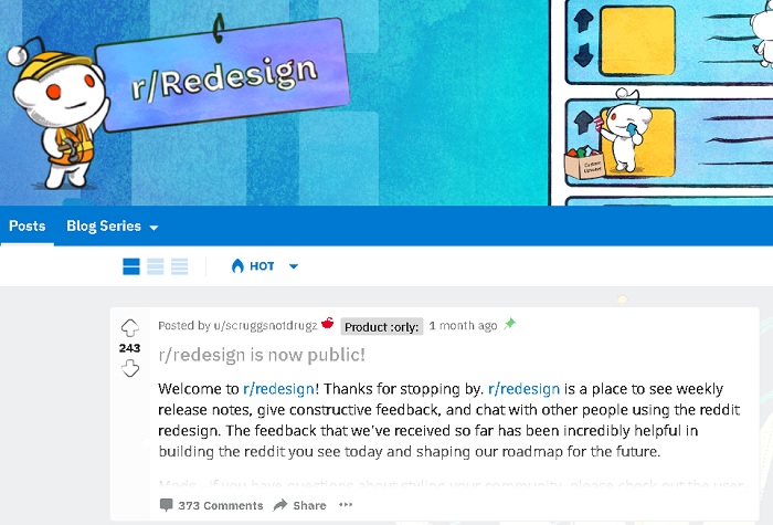
Admittedly, when I first booted up the new look, I had to blink a few times in surprise. But I found the more visually-oriented “Cards” layout better to look at than classic Reddit, and over time I even found the sidebar, which I initially disliked, more useful. And if any of you are the sort who just can’t take this look, you can still access the original anytime you want.
YouTube finally folds in Gaming
YouTube Gaming never exactly did much to deter the notion that it was YouTube’s answer to Twitch. The two were very similar and seemed to be catering to the same audience. The trouble was, YouTube tried to spin Gaming off into its own separate app, which always seemed massively inconvenient. Thankfully, this will no longer be a problem come next March.
The new features we’re adding to the YouTube homepage will make it easier to discover gaming videos you love. You can find over 80,000 different games by browsing our game pages. pic.twitter.com/GEWgBgtcMm
— YouTube Gaming (@YouTubeGaming) September 18, 2018
After admitting that, ironically, plain old YouTube was generating way more gaming traffic than Gaming was, YouTube has now folded Gaming back into the main experience. Now Gaming has its own portal on the main YouTube page, and will no longer be a standalone app next year. It’s a much more organic experience for everyone involved — and doesn’t require gamers to keep two separate YouTube apps on their phones.
Facebook’s simpler Messenger 4
This update to Facebook’s uber-popular messaging app took a metaphorical scythe to its infamous clutter. Rolled out in October, this update trimmed its multiple tabs and options, and made it much easier for users to actually get to the content they’re looking for — namely, the messages.
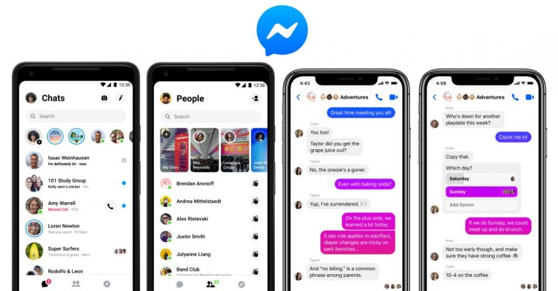
While it still feels the company is trying to do a little too much with what began as an extension of its chat feature, anything that slims down what has become a very crowded and confusing app is very welcome. The fact that I can now access my messages directly, without having to comb through four or five different tabs that each look like they belong on a separate app is enough to earn the new update my thumbs-up. Also, an update this year included dark mode, so… bonus points.
Instagram’s standalone IGTV
As far as video goes, YouTube is still tops. But Instagram has been slowly carving itself a niche in the live video arena. In June, it officially revealed its dedicated video app called IGTV. Within IGTV, users could shed the limitations placed on them by the main app, uploading videos up to one hour long and incorporating all of vanilla Instagram’s most fun features — stickers, filters, and the like.
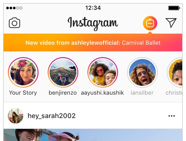
Also, the video introduced the one thing I think Instagram’s videos have been in need of for ages: a progress bar that allows you to scrub to the part of the video you want to see. Sure, it’s not for everyone, but for both Instagram and its younger-skewing audience, it’s a place that new people will feel comfortable uploading content that won’t send people scuttling for the YouTube app.
Twitter’s tweet bookmarks
This change to Twitter is relatively small compared with its recent push to be more “newsy.” It’s partnered with local news organizations to offer up-to-the-minute coverage, and also introduced personalized news notifications. However, we think the average user is much more likely to use the new Bookmark option on a day-to-day basis.
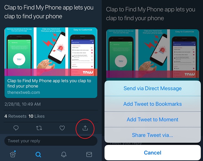
If you’re like me and enjoy following the massive tweetstorms sent out by outspoken users, you’ll enjoy having the ability to save one of the tweets for later perusal. It’s especially useful if you’re following a Twitter debate or rant in progress and you want to be able to come back to it. It’s also great for research and keeping track of news stories you want to read later — a sort of cut-rate, in-app Pocket, if you will.
These are the features we enjoyed the most from this year’s crop of social media changes. Were there any we missed? Let us know with a comment.
Get the TNW newsletter
Get the most important tech news in your inbox each week.
