It’s hard to believe Reddit is over ten years old, but the design does admittedly show its age. So the site’s designers are working to bring it forward with a sleek new look. As you might imagine, not everyone’s onboard.
Reddit’s redesign is the most radical change in the site’s history. It takes the site’s one-note post-centric interface and adds bells and whistles like a side panel, a banner image, and several different ways of viewing a subreddit. Here’s an example of a post from r/redesign, the subreddit dedicated to discussing the new look:
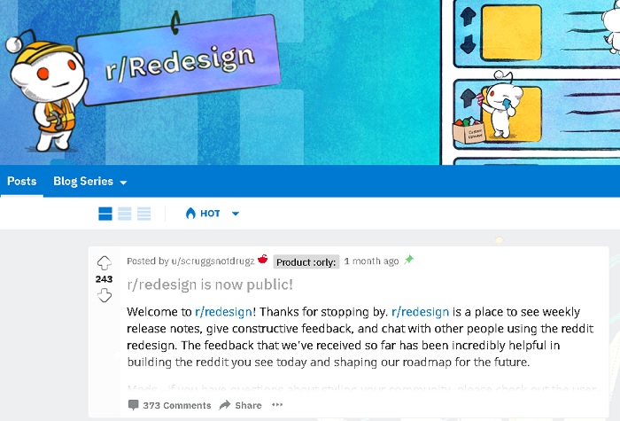
Along with the updated look, the redesign grants the users greater control over how their version of Reddit looks. You can change the appearance of posts from classic, compact (a condensed version of classic) and card. The last one places a greater emphasis on images. The side panel, which gives you quick access to your subreddits and feeds, can be toggled on and off. Users are even given the option, currently, of switching between the classic design and the redesign.
Reddit’s head of design, Diego Perez, reports the redesign has had constructive and positive feedback since the early days, when the design team tested rough designs over video calls with subreddit moderators. He told TNW the design team will be open to change even as the redesign launches to the general public:
We think of the redesign as a starting point, and it’s going to be something that ever-evolving. After launch, we’re still going to be taking feedback and making improvements.
But not all feedback was positive, as you might expect. You’re always going to get some pushback when you redesign anything popular — remember the user backlash to the Snapchat layout update? (If you don’t, it was a petition with over a million signatures.) Reddit is no different. All you have to do is visit r/redesign and you’ll see a plethora of unhappy users — though, to be fair, you’ll also see users justifying the changes and attempting to placate them.
Some communities in particular were not always amenable to the change. For example, moderators from the Change My View subreddit complained the new “pop-up window” for viewing posts makes the comments “a secondary content experience.”
Other users have complained about the redesign breaking their subreddit’s functionality. For example, the college football subreddit (r/CFB) described at length how the redesign broke its detailed, CSS-based layout. Several other sports-based subreddits jumped in on the complaint, including r/hockey and r/soccer.
Andreas Gross, Reddit’s lead product manager working in the redesign, told TNW part of the purpose behind the redesign is to make the product easier on newcomers:
Familiarity was a very important aspect. We don’t want to shock people. But for new users, Reddit today is a really hard product to learn. We want to let more people experience what really makes Reddit special.
Reddit CEO Steve Huffman concurred with that in an interview with the Wall Street Journal:
There is always that change aversion. We believe everybody has a home on Reddit. The challenge is finding that home, particularly for new users. Helping them find their home, helping find their community and sense of belonging on Reddit, it’s something we’re not very good at. The redesign is a big effort towards making that better.
It remains to be seen if Reddit’s redesign is something users can just get used to, or if many will continue to push back against the changes.
The Next Web’s 2018 conference is almost here, and it’ll be ??. Find out all about our tracks here.
Get the TNW newsletter
Get the most important tech news in your inbox each week.
