Ready to get started on YouTube? Or wish your YouTube Channel were performing better? I’m here to help!
YouTube is effectively the second largest search engine in the world (behind only Google). With video becoming more and more important (we even launched Buffer for video last week!), now is the perfect time to start optimizing your YouTube Channel and begin reaping the benefits of a strong video strategy, including connecting with new potential customers, getting a better search presence and building your brand.
I’ve had a lot of fun exploring YouTube optimization and wanted to share what I’ve found. Here is everything that I have learned and would do to optimize a channel.
Optimizing Your YouTube Homepage
Think of your YouTube channel like a website. What feeling do you want users to get when they come to the homepage? What features do you want to highlight? Thinking on these questions will help you set up the following sections.
Channel icon and art: Your introduction and calling card
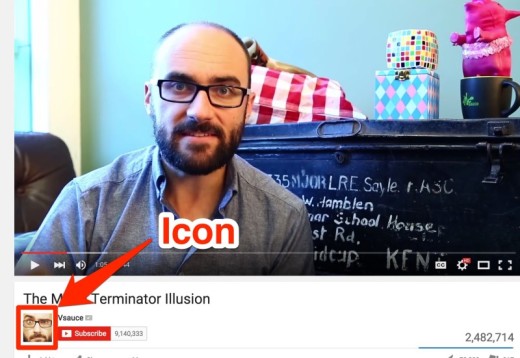
YouTube lets you set your own custom channel icon and channel art. Here’s an example from Vsauce of what both of those look like on the page:

And here is where to click to edit or change your icon, channel art and/or links.

(Example from TV Equals, a channel I run.)
Icon
The icon is the square image that appears at the top left of your channel. It also appears below every single one of your videos.
“Your channel icon visually represents your channel everywhere across Google and YouTube, so make sure it looks good large and small.”
Think of the icon as your calling card: Which image represents you the best? A logo for a company might be the way to go and a headshot might be more appropriate for an individual. ReelSEO has a few great tips to help you picking the right icon.
Channel art
The channel art is the header image at the top of your channel. This is where you can provide a little bit more information about who you are and what your channel is about. (If you have a posting schedule for your videos, this is also the perfect place to include it.)

(Example from Fine Brothers Entertainment)
Channel art appears differently on various devices, so it helps to craft one that works for every place your audience might find you. (YouTube has an image size guideline and Channel Art Template you can find here.)
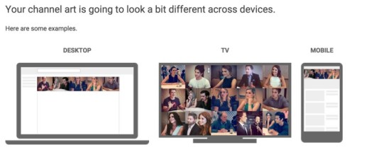
For best results on all devices, YouTube recommends you use a single 2560 x 1440 px image. There is a safe area, in which text and logos are guaranteed not to be cut off (1546 x 423 px centered on the image).Try putting all the relevant information and design within that safe area and extend non-crucial design elements outside of it.
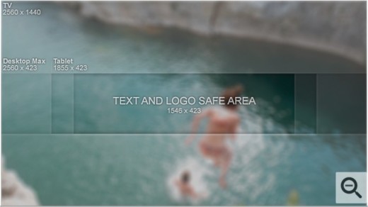
A couple of tools that can help you design your header include PicMonkey and Canva. Both allow the use of custom sizes. Photoshop is also great!
Alternatively, you could hire a designer to create your channel art. Fiverr is a great place to find low cost designers. If you are looking to spend a little more money, DesignCrowd and 99Designs are great places to find designers as well.
Some examples of great channel art:


(Cyprien)


(ReelSEO)


Trailer: Introducing your channel to new viewers
You might notice that one video is highlighted at the top of YouTube channels. That video is the trailer. It is a video meant to introduce a new audience to your channel.
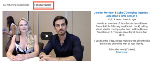
The trailer only appears to viewers who do not yet subscribe to your channel. This is a great place to tell them what you do and why they should subscribe to your channel.
YouTube has some great tips on how to create a good channel trailer:
- Assume the viewer has never heard of you
- Keep it short
- Hook your viewers in the first few seconds
- Show, don’t tell
- Ask viewers to subscribe in your video and with annotations
Examples of great trailer videos:
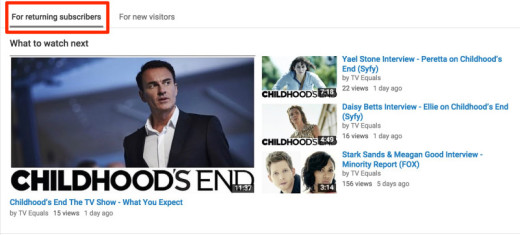
If a subscriber comes to your channel page, they will not see the trailer. Instead you can highlight a specific video or playlist. If the content you selected has already been seen by the returning visitor or if you decide not to set a specific video or playlist, YouTube gives you the option to either show your latest upload or latest activity.
Page Layout: Organizing your content
Now that you have your trailer in place and have given your visitors information about why they should subscribe to your channel, it’s time to dazzle them with your incredible content. This is where your page layout comes in handy.
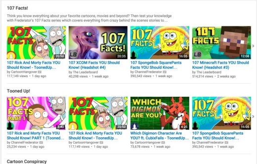

Channel Frederator, above, provides great navigation on their channel page by using sections to highlight their content. New potential fans get information about the variety of content the channel produces. And returning fans can easily find the latest episode of their favorite series.
How to add sections
Here’s where to add sections on your channel homepage. The videos under “The Player” headline are part of a section, for instance. It shows all the videos under “The Player” playlist. New videos added to the playlist will automatically appear here.
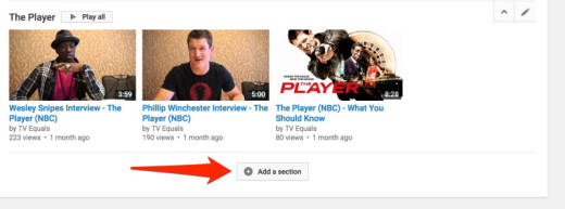

YouTube provides you with quite a few options to highlight your content. You can choose to populate sections with Popular Uploads to Your Latest Uploads, Playlists, Channels and others.
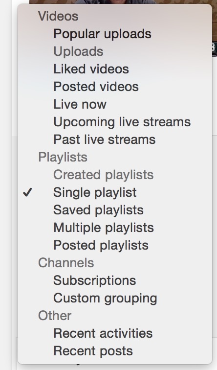
The items under the “Videos” and “Other” sections will be created automatically by YouTube. The lists under the “Playlist” and “Channels” sections will be populated by you depending on your playlists and subscriptions, etc. (YouTube has more information about Sections here.)
It’s up to you to decide what you feel will be the most valuable for your audience. Don’t be afraid to test things out and try different layouts to find out what appeals to them.
Here are a few examples of Section Headers:

(Example from Marques Brownlee)

(Example from Savvy Sexy Social)
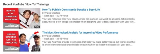
(Example from Video Creators)
Playlists
Playlists are a great tool to organize your videos and make it easier for viewers to find videos related to a similar topic they are interested in. You can use playlists to organize your channel homepage and surface specific videos for visitors.
Tip: When creating a playlist for a series of videos, you can select “Set as official series for this playlist” which will help YouTube connect the videos when recommending them.
- You must have a verified account in order to use series playlists.
- A video cannot be in more than one official playlist.
- Only videos uploaded by you and that you have the rights to can be added to a series playlist.

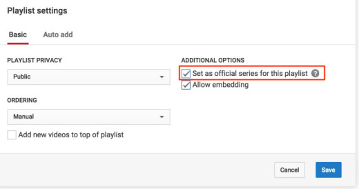
From YouTube:
“A series playlist allows you to mark your playlist as an official set of videos that should be viewed together. Adding a video to a series playlists allows other videos in the playlist to be featured and recommended when someone is viewing a video in the series playlist. YouTube may use this information to modify how the videos are presented or discovered.”
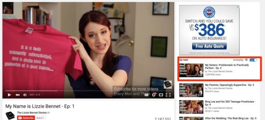
(Example from The Lizzie Bennet Diaries)
Optimizing Your YouTube Videos
Now that your channel is all set, let’s move on to optimizing your videos themselves.
Thumbnails: Consider eyes, emotion, excitement

(Example from The Lizzie Bennet Diaries)
Optimizing Your YouTube Videos
Now that your channel is all set, let’s move on to optimizing your videos themselves.
Thumbnails: Consider eyes, emotion, excitement
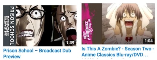
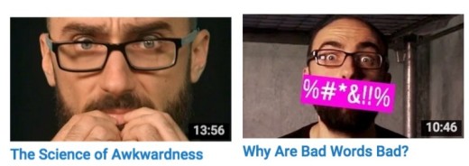
Having a unified look for all your thumbnails can also get your videos more traction by creating a pattern that viewers can recognize. A recurring color pattern, logo, or outline can help in creating this. Here are a few examples:

(Example from FUNimation)

(Example from lisbug)

(Example from Fine Brothers Entertainment)
Tubefilter has an amazing article/guide to help you create the best/most effective thumbnails for your channel.
Titles: Tease the story, pitch the benefits

(Example from Vsauce)
Just like thumbnails, titles are a very important tool to get viewers to click and watch your video.You could try testing different types of titles and seeing what appeals to people. ReelSEO has a great article on this, with some suggestions including:
- Tease what’s in the video
- Don’t give it all away, but get people curious
- Play around with CAPS
- Be aware of the character limits (YouTube allows for 100 characters)
- Make sure your key words appear in the search page of YouTube
- You can also use current events to your advantage
Tim Schmoyer over at the Video Creators Channel has a fantastic video on “How To Write Titles that Get Views.” A couple of the things he recommends for titles:
- Pitch the value or benefits your viewers will get by watching your video, especially for instructional videos and/or DIY videos.
- Tease part of the story, especially for storytelling type videos.
Description: Delivering information to YouTube
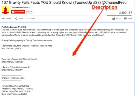
(Example from Channel Frederator)
Your video description is important to give YouTube information about your video. YouTube cannot extract information from the video itself, so it relies on the information you write out (and user interactions with the video) to determine what it is about. The more information you include, the better, without spamming of course. ?
ReelSEO has a fantastic in-depth article about optimizing your video descriptions. Some of the things they recommend include:
- Link out to external URLs
- Shoot for a 200-500 word synopsis
- Include strong calls-to-action (more on that coming up!)
- Include a ‘Subscribe Here!’ link
- Link out to social media
- Channel upload defaults
- Choose the right category
Tags: Think about how your user will search
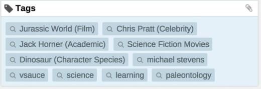
From the experience of many YouTubers, tags don’t seem as important as titles or description, but they can still help with providing valuable information about your video. Think about how someone would search for your video: What word or combination of words would they use?
If your video is about baking a cupcake, some of the tags to include could be: Cupcake, baking, bake cupcake, how to bake a cupcake, cooking, frosting, cake, cupcake recipe, best cupcake recipe. (Include the most important tags at the beginning.)
It’s also a great idea to look at the kinds of tags other, similar videos to yours are using. To find those, you can download the vidIQ extension for tons of great insight into other YouTube videos.
Call to action: What do you want viewers to do next?
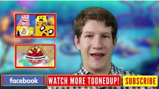
(Example from Channel Frederator)
To keep your audiencewatching your videos and/or subscribing, have a clear and specific call to action, like:
- subscribe
- comment
- like
- watch another video
- visit your website
In order not to overwhelmed viewers, pick maybe the two most important actions you’d like your viewers to take and give them a good reason why they should do it.
For example, if you baked an amazing five-layer cake, let them know to subscribe because you bake new cakes every Thursdays and next week will be a 10-layer cake!
Or ask them a question and encourage them to share their answer in the comments section.
It’s a good idea to also have a call to action in your video description. Provide a link to subscribe, if that’s your focus, or a link to your email newsletter, or any other prompt you would like viewers to do.
Bonus: 3 Time-Saving YouTube Tools
YouTube offers many amazing and useful features directly in your YouTube account—all you need to do is activate them.
Find the following three time-saving tools by going to the Creator Studio:
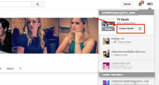
and locating the channel section:
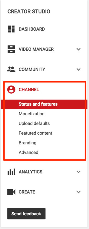
Upload defaults
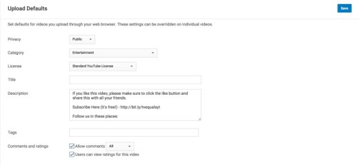
This feature will save you lots of time. Upload defaults allows you to prepare a few default sections that will appear on every single one of your videos.
My favorite is the Description. Being able to have all the links and information automatically added to all my videos when I upload them not only saves me time but helps make sure I never forget to include them.
All that’s left for me to do when I upload a video is simply add the description of that particular video at the top.
Featured content
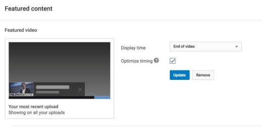
YouTube provides you with a way to feature some of your other videos on every video being watched. It’s a bit like free advertising for all your other content. The best part is, you can decided which video(s) to highlight—whether it’s a specific video, playlist or your latest video. YouTube also allows you to decide at which point the featured content should appear.
Branding
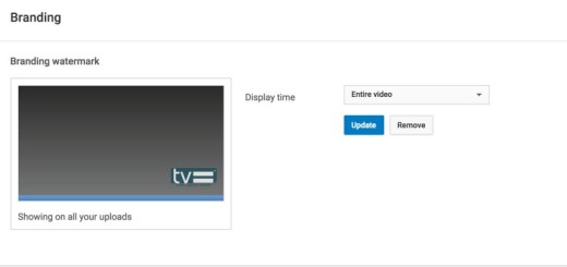
YouTube allows you to upload an image/logo to automatically appear on your video. You can pick whether you want the image to appear at the end of the video, to start appearing at a specific time or to simply be there the entire video.
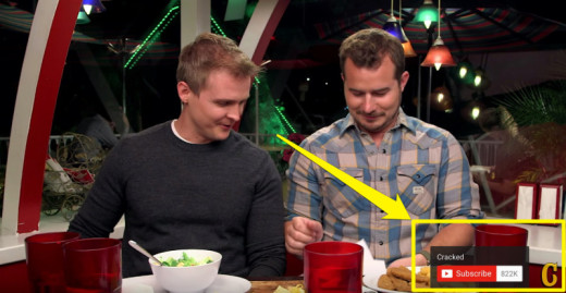
(Example from Cracked)
What I like about it is that when users hover over the image, they can see some basic information about your channel (name of the channel and number of subscribers) and when they click on the image they are redirected to your channel. This is especially useful for videos embedded on other websites. It allows people to be redirected to your channel and subscribe if they enjoyed the video, even if they are not on YouTube to begin with.
Over to you
That’s everything that I’ve learned so far that might be handy in order to optimize your YouTube Channel. I hope it was helpful!
I’d love to hear any thoughts you have or any additional tips you might know to help other YouTube creators optimize their channels. Share them with me in the comments!
Read Next: YouTube’s Web video player just received a sleek transparent update
Image credit: Shutterstock, Pablo, Unsplash, YouTube
This post first appeared on Buffer.
Get the TNW newsletter
Get the most important tech news in your inbox each week.
