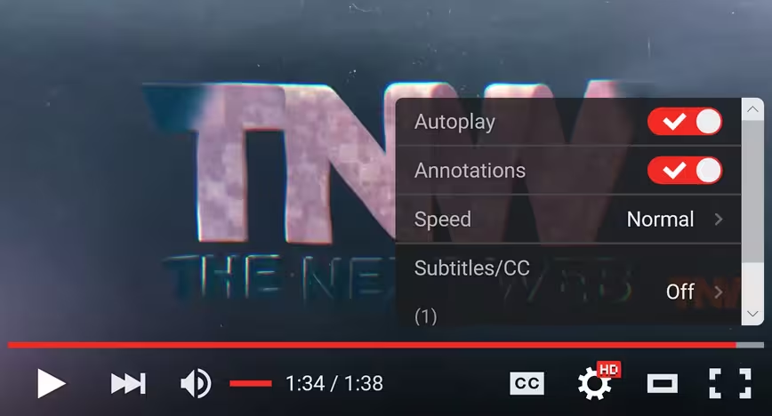
If you’ve been watching cat videos on YouTube today, you may have noticed things are looking a bit different. Google appears to be rolling out a transparent video player on its Web interface today.
The new video player is a lot sleeker, featuring controls floating on the video itself instead of planted underneath. Besides just looking nicer, the redesign also saves a few vertical pixels of screen real estate.
I like these new controls, a lot. pic.twitter.com/u2FCqrcorH
— Joe Caiati (@JoeCaiati) August 3, 2015
The controls disappear after a second or two of inactivity, and reappear once you point your mouse to the bottom of the video again. Playlists still appear to the right of videos, however.
Oh, and the new look applies to embedded content as well:
https://www.youtube.com/watch?v=iJAAb23_x1M
The change appears to have taken effect globally, and the new design shows up across a variety of browsers; Chrome, Firefox and Edge all feature the revamped look, even on mobile.
Google first trialed the transparent video player back in April but it was only available to select few users (unless you performed a little hack).
We’ve contacted Google to confirm the rollout and will update this post if we hear back.
Update 3:52 PM
It’s official now:
Ooh la la! Our new player design is slicker than a squirrel on waterskis! pic.twitter.com/9tS1pm3NiG
— YouTube (@YouTube) August 3, 2015
Read next: YouTube for iOS now lets you watch vertical videos in full-screen
Get the TNW newsletter
Get the most important tech news in your inbox each week.


