With the Galaxy S9 Samsung, set its sights straight on the Pixel 2 – or more specifically, its camera. Let’s cut to the chase then: the S9’s camera doesn’t definitely beat Google’s, but it is a major leap over the S8. Depending on what you’re looking for, it may very well be one of the best smartphone cameras you can buy.
There’s more to a phone than its camera of course though, and that’s where the S9 – especially the smaller model – becomes a tougher proposition. Lets looks at the specs, starting with the smaller model:
- Qualcomm Snapdragon 845 (US) / Exynos 9810 (everywhere else)
- 5.8-inch QHD Super AMOLED display
- 4 GB RAM
- 64 GB storage + microSD
- 3,000 mAh battery
- 12MP rear camera
- Variable aperture: F1.5/F2.4
- 960fps super slow-mo
- 8MP F1.7 front camera
- IP68 water resistant
- Stereo speakers (finally!) tuned by AKG, 40 percent louder
- Dolby Atmos support
- Bluetooth 5.0
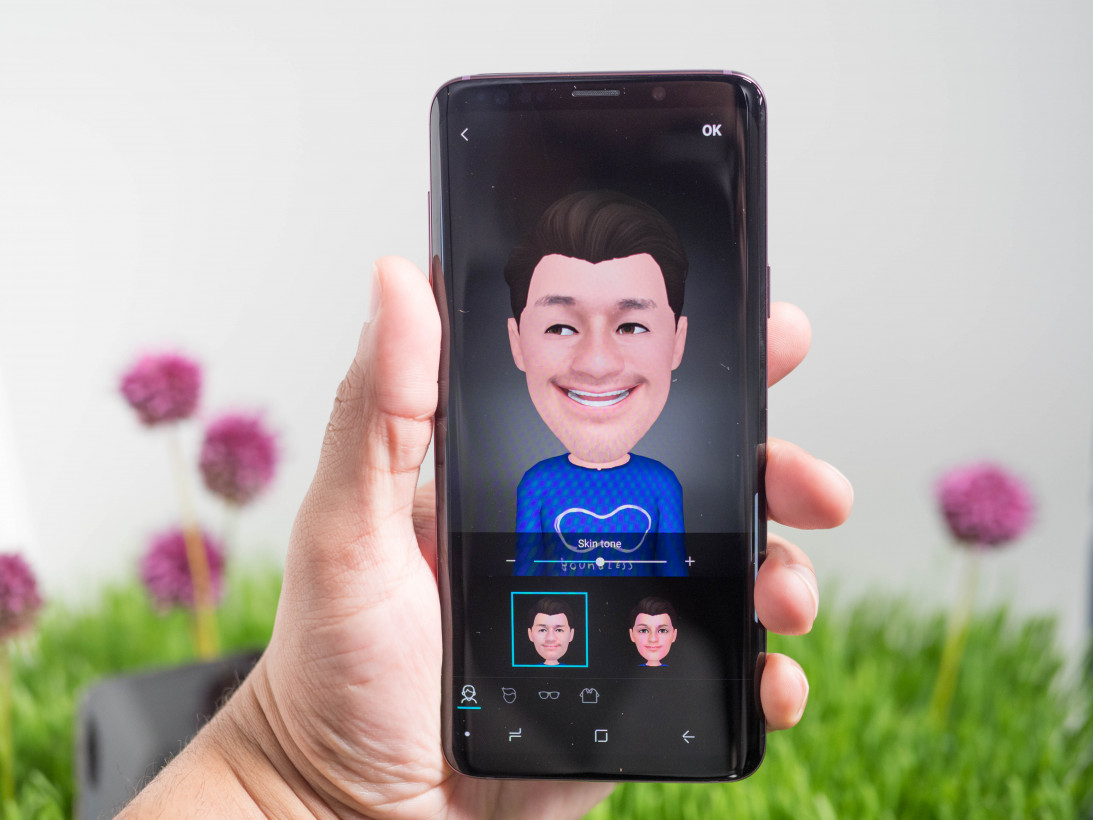
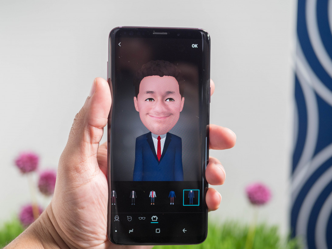
- AR Emoji – Samsung’s take on Apple’s Animoji
- Colors: Lilac Purple, Midnight Black, Coral Blue (US). Titanium Grey available as well in other markets.
- $719
The larger model has mostly the same features, with the following differences:
- 6GB RAM
- Secondary telephoto camera
- 6.2-inch QHD Super AMOLED
- 3,500 mAh battery
- $840
This year, Samsung is nerfing the smaller device. No longer are the Galaxy siblings differentiated solely by their screen size. If you want the best Samsung hardware you have to get the S9 Plus.
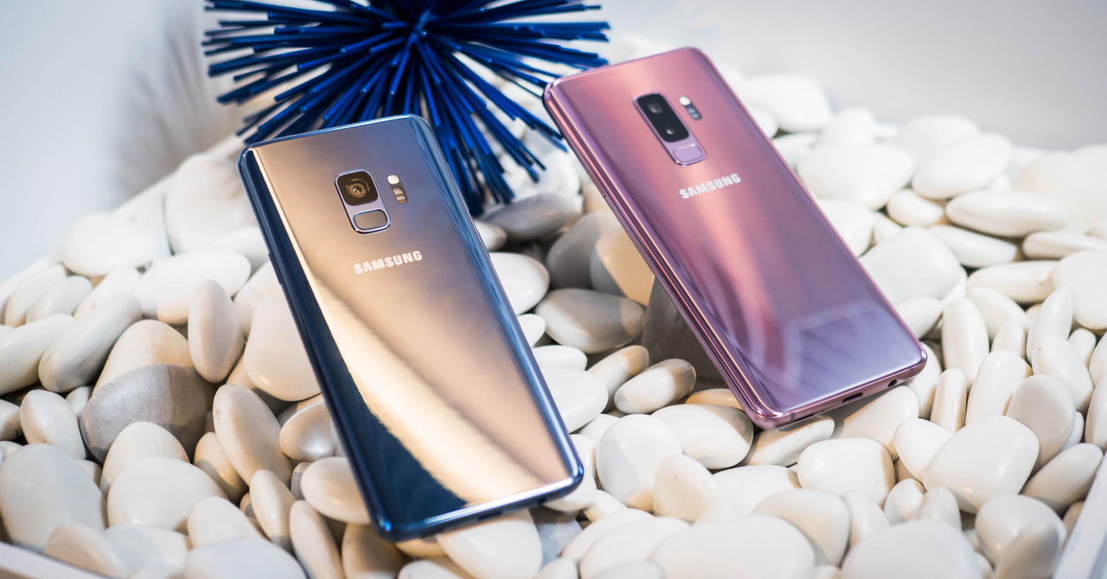
Samsung was pretty much the only Android manufacturer making a smallish flagship anymore with feature parity. Even the Pixel 2 misses out on the XL’s bezel-less design and longer battery life. I’ve ranted about this change at a greater length here.
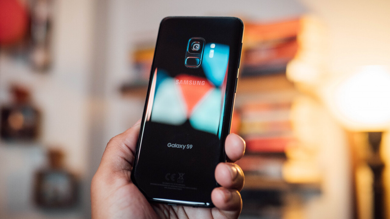
One thing Samsung hasn’t changed much is the design. It looks like, well, a Galaxy. Though there are some new colors on board and the bezels are a little smaller, the only difference you’ll really notice is the new fingerprint sensor placement; it’s now in a much more reasonable location below the camera. Thank god.
Samsung’s displays are as good as ever, and the S9 already has the the best smartphone screen according to DisplayMate. Most of the updates in the S9 were to improve color accuracy in different lighting conditions, though it also gets 20 percent brighter too.
I doubt someone used to an S8, Note 8, or iPhone X (which uses a Samsung screen) would notice a difference, but it’ll probably be a marked improvement if you’re coming from anything else. After using the Pixel 2 XL for so long, I’d almost forgotten how far ahead Samsung’s OLED technology is.
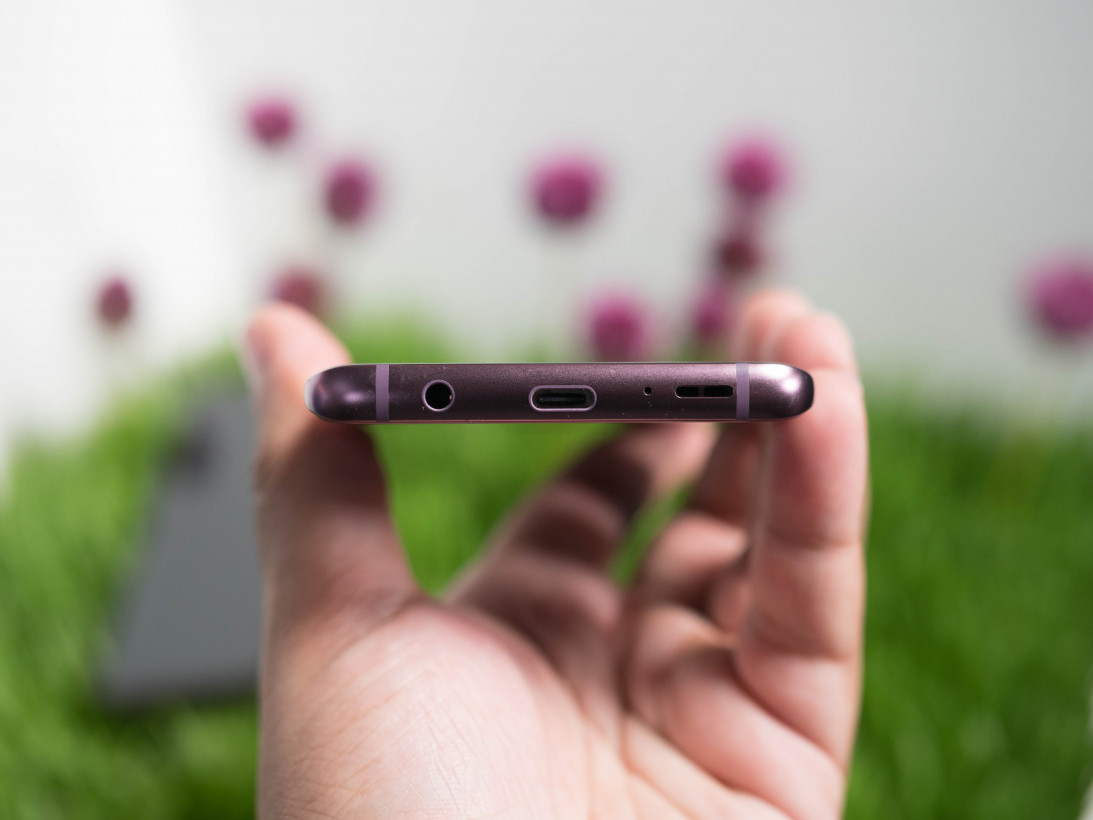
You’ll find a far more palpable improvement in the sound. The speakers are now stereo, and they sound surprisingly good. To my ear, they’re louder, clearer, and fuller than the Pixel 2, even though one speaker is bottom-firing. That’s no doubt aided by the Dolby Atmos tuning, which provides an impressively wide soundstage for a device this small. Oh, and Samsung managed to keep the headphone jack too.
But lets get back to the real reason to buy this phone: the camera. For all of Samsung is flaunting the new variable aperture and low light chops, I actually found the most significant improvements in daytime shooting.
Samsung’s made some major leaps with its HDR algorithm. I’ve always believed Google had the best photo processing algorithms since it introduced HDR+ with the original Pixel – it’s so good, it can rescue mediocre cameras. With the S9, Samsung’s HDR may have caught up.
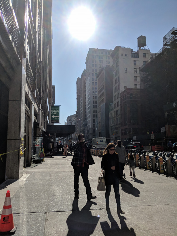
Take a look at this daytime scene. The sun is shining directly on the lens, creating heavy backlighting on the subjects.
First the Pixel 2 XL:
Then the Galaxy S9:
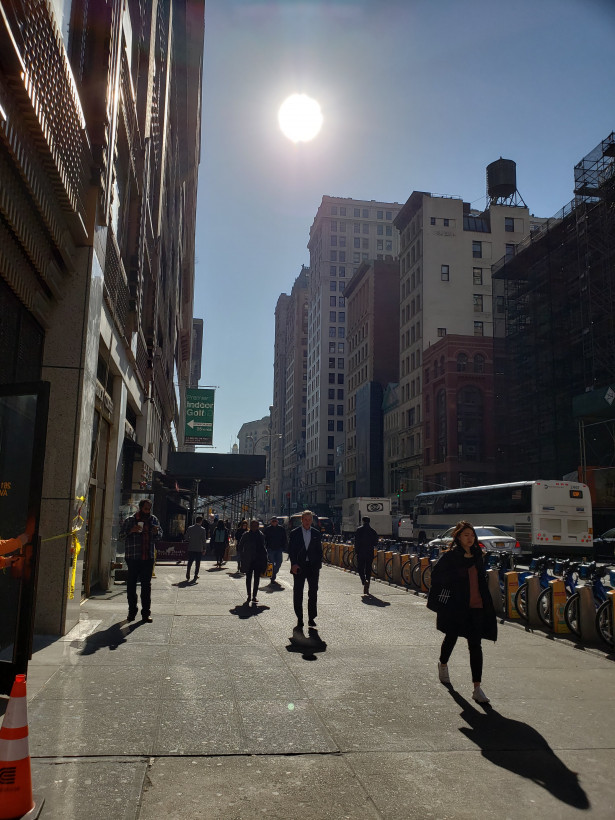
Note how on the S9, the sun doesn’t clip nearly as much as on the XL, but both phones maintain a similar amount of shadow detail.
Here’s another example of a scene with harsh contrast and direct sunlight:
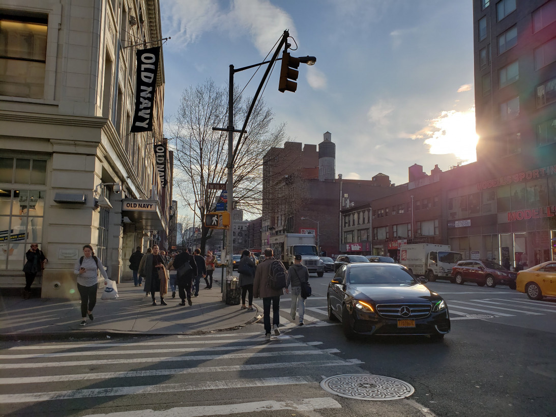
Often the Pixel 2 performed better, but the S9 performed consistently well enough that I’d give Samsung a slight edge when it comes to dynamic range and nailing exposure during harsh daytime light. Conversely, Google’s images tended to have more punchy contrast and better white balance. I still prefer Google’s rendering, but as far as I’m concerned the differences are small enough to be a matter of preference.
That is, during the daytime. In low light, I can’t help but feel Samsung’s strides aren’t as wide as I’d hoped.
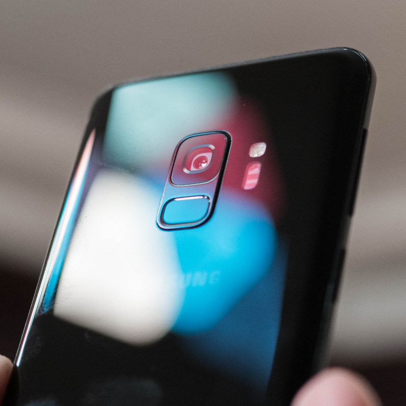
The headlining feature is the variable aperture, which opens up to F1.5 for low light images – the widest we’ve seen yet – and closes to F2.4 for sharper images in the daytime. You can even see the physical aperture changing if you look at the lens closely.
There’s a marked improvement over the last generation of Samsung phones, which was already pretty good. There’s way less noise, the images are sharper. That’s to be expected with the new hardware, but comparing to other devices makes it apparent Samsung is relying too heavily on noise reduction to try and completely eliminate grain.
In this scene, the S9 has basically smudged away all the detail from the brick, almost giving it a watercolor effect. I found this to be representative of several results in very low light.

Here’s the same scene with the Pixel 2.

Let’s look more closely. Here’s the S9 at a 100 percent crop:

And here’s the Pixel 2.
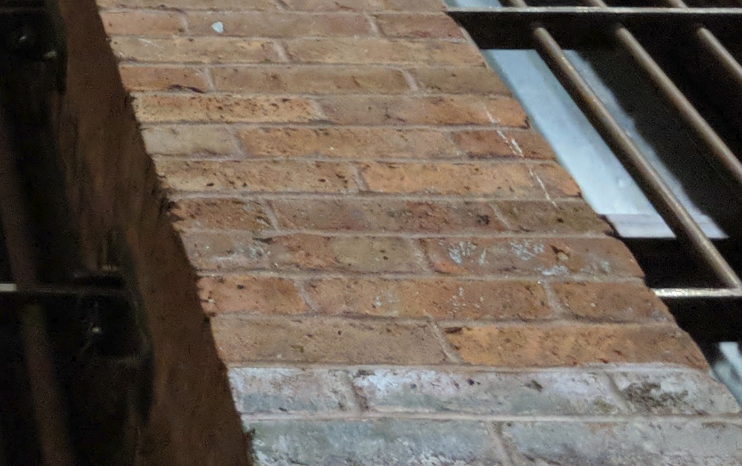
I realize most people won’t pixel peep, so aggressive noise reduction isn’t necessarily a bad thing. If your photos never leave a small Instagram square, it could actually look pretty good. Still, I wish Samsung had toned it down – it can be pretty gross when viewed on a desktop, let alone printed. A little grain never killed anyone.
Those reservations aside, it’s also worth noting just how powerful Samsung’s camera app is. There are a plethora of effects and shooting modes, now accessible via simple left and right swipes rather than buried in a menu. I’m particularly fond of the 960 fps super-slow-mo.
Speaking of extra features… AR emoji are a thing. My opinion hasn’t budged since I first wrote about them, so I’ll just quote myself:
On the software end, Samsung now has AR emoji – its take on Apple’s Animoji. Basically, Samsung takes a photo of your head, and creates a Nintendo Mii-like avatar, giant head and all.
It works… okay. The S9 kept making me look very white, even though I’m quite tan. Your skin tone is adjustable to a degree, but it still looked weird after multiple tries. Samsung also gave me Pantene sleek hair, when my hair’s extremely curly. Thankfully there are different hairstyles to choose from.
After some tweaking I found somewhat decent, but I still feel like Samsung would’ve been better off using more cartoonish avatars. This is a bit too uncanny-valley for my tastes.
Above you can see the animoji Samsung created for me, what I actually look like, and then my attempt to fix it. The uncanny valley remains for me, and it’s also clear the facial tracking isn’t up to Apple’s standard. And yet I have no doubt these are going to be super popular, especially once more familiar characters – Disney AR emoji are coming – enter the mix. You do you. *shrugs*
Note: We’ve only tested the smaller S9, which doesn’t have a proper portrait mode like the S9+. The S9 does have a ‘selective focus’ mode that can blur out backgrounds, but it’s clunky and slow compared to portrait effects on other devices. It’s a shame Samsung didn’t try to use a more AI-powered route like Google manages on the Pixel 2. Needless to say, if you care about portrait mode, go for the big model.
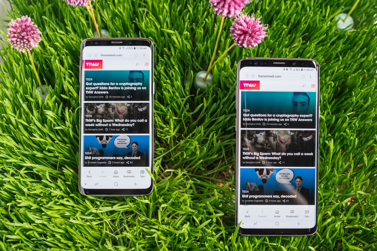
I left performance for last because, honestly, there just isn’t much to say about smartphone speed on a flagship in 2018. It’s fast, but so was the S8 fresh out the box – as well as everything else last year. Despite the new hardware, the S9 doesn’t feel particularly faster or smoother than most of last year’s flagships.
That’s not a knock against Samsung, but rather a comment on how fast modern phones are. Long term performance is a different story, but two weeks isn’t enough time to assess that. Still, my experience after using the Note 8 for several months suggests Samsung has finally gotten a handle on performance optimization. And battery life has been solid too, netting me about 6 hours of screen on time with my typical heavy use.
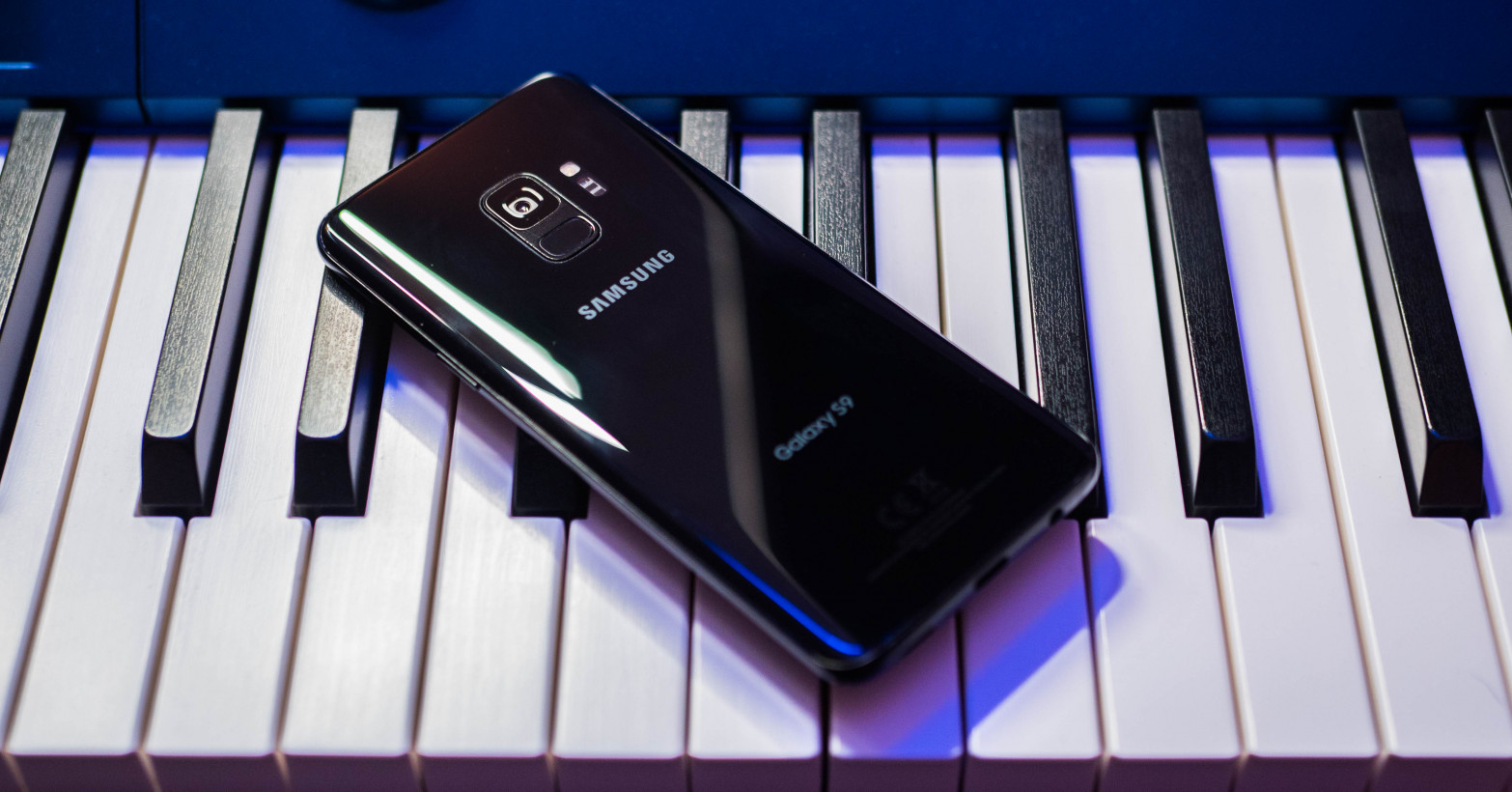
All things considered, I can’t help but feel Samsung is holding back this year. To put it in Apple terms, the S9 feels like an S8s.
To be clear, that’s fine. Not every phone can – or should – be a game-changer. Besides, Samsung has to save the real good stuff for the S10, as human nature dictates that things with a ’10’ in them are supposed to be the bees knees.
Though I’m disappointed Samsung crippled the smaller model and I’m not convinced the new features justify an upgrade, the S9 is hard to disparage. Stereo speakers, tiny bezels, expandable storage, and a headphone jack are a rare combination these days, especially in a relatively small body.
Add to that a noticeably improved camera and a lack of competition this spring – LG is withholding its flagship until the summer – and Samsung is entering 2018 strong. Just don’t rush out to replace your S8 or Pixel 2 day one.
The Next Web’s 2018 conference is just a few months away, and it’ll be ??. Find out all about our tracks here.
Get the TNW newsletter
Get the most important tech news in your inbox each week.

