Few things are more exciting than launching a new product. For e-commerce brands, the landing page is a big part of pushing sales, especially shortly after the initial launch.
Unfortunately, this is one area where I’ve seen far too many e-commerce sellers fall flat. It doesn’t matter how well you manage your multi-channel marketing. If your advertising efforts take potential customers to a landing page that fails to convert, even the best campaign in the world won’t do you much good.
The good news is that there are several actionable tips you can implement today to boost the conversion rate of your product landing page.
Here are some tried and tested pathways to success:
1) Focus on a single call to action
Typical e-commerce product pages will contain a wide variety of calls to action. In addition to adding a product to their cart, buyers are often encouraged to look at related products or check out additional sales or promotions.
While this is fine for a standard e-commerce product page, such invitations are an unnecessary distraction on a product landing page. On these pages, your focus should be getting the customer to buy the featured product.
This concept was illustrated by a study published in the Harvard Business Review. Grocery store shoppers were presented with displays featuring either six or 24 flavors of jam. The table with less flavors had a 30 percent conversion rate, compared to a three percent conversion rate when more choices were offered.
A similar rule applies with landing page CTAs. Too many distracting invitations will overwhelm visitors and keep them from buying the featured product. Eliminate unnecessary links and promotions to focus on the product.
2) Picture your product in the best light possible
It’s no secret that using attractive photography is vital for selling e-commerce products. However, many brands make the mistake of assuming that they have to use a certain type of product photography for their landing pages to have a market impact.
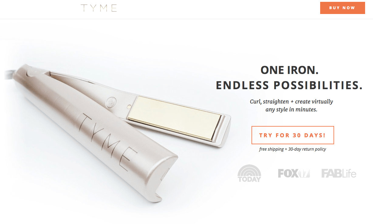
Research shows, however, that there isn’t always a “one size fits all” method to product photography. A case study from growth marketing company KlientBoost compared conversion rates for a specialty hair iron based on different product photography. One photo featured a close-up of the product, surrounded by ample white space. The other showed a woman using the iron.

Marketers are sometimes told that “product usage” photos are more engaging because it helps the customer imagine using the product themselves. In this case, however, the product usage photo actually decreased the conversion rate by 44 percent, in part because it didn’t clearly showcase the product. For new products, photos should provide as much visual detail as possible so customers know what they’re getting.
While you can incorporate product usage photos as part of your landing page, the first image your customers see should give them a clear visual of what they are about to buy.
3) Make an offer they won’t want to refuse
To further enhance the appeal of your call to action, you might consider offering a special discount as part of your landing page promotion. A discount that is tied with a limited-time offer can dramatically improve your conversion rates.
There is psychological backing for using discounts and special offers to increase conversion rates. The bigger the number you can use, the better. According to Alain Samson, Ph.D. of Psychology Today, eager buyers don’t view percentages and prices in a rational, linear fashion.
For example, most consumers view a 50 percent increase in quantity as a better deal than a 33 percent discount. The truth of the matter, though? The two offers are virtually the same thing.
Make the special offer the focus of your landing page headline. Headlines with numbers are consistently found to get higher clickthrough rates across the Web, and are sure to grab the attention of customers who visit your landing page.
4) Resolve concerns with live chat
Ideally, your landing page copy should provide a detailed description of your new product, giving customers a good overview of key features and benefits. However, there are many customers who will want to dig deeper before trying out a new, untested product (especially if your product is so new that you don’t yet have reviews).
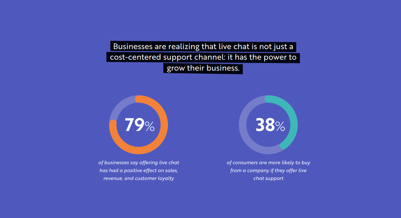
This is where integrating live chat with your landing page can make a difference. Research from Kayako reveals that live chat increases on-site conversions by an average of 20 percent. Even more impressive, the customers who use live chat are three times as likely to make a purchase.

Live chat is a great resource for answering technical questions or resolving customer concerns over issues like warranty or shipping. Providing this peace of mind in real time is key to resolving potential roadblocks to a purchase before a customer clicks away and forgets about your product entirely.
Using your landing page for a successful launch
An engaging, properly targeted marketing campaign is a good start for an e-commerce product launch. But you must always keep the end in mind. By optimizing your product landing page from the get-go and using data insights to A/B test different ideas, you will be able to determine the layout that yields the highest conversion rates for your customers.
Don’t let the landing page become an afterthought. By giving it the attention it deserves from the very start of your product campaign, you will be far more likely to reach your sales goals.
Get the TNW newsletter
Get the most important tech news in your inbox each week.


