I dig discovering new communities. For example, I knew that the Apple Watch was the world’s most popular smartwatch, but I had no idea there was a thriving community of people who loved its removable watch straps.
But now I do.
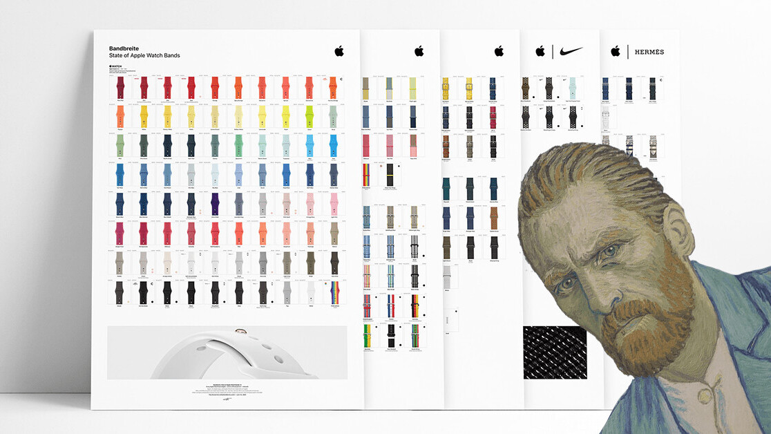
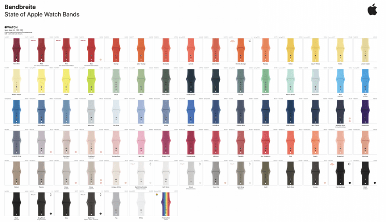
And this is all down to discovering this incredible chart of Apple Watch bands from the folks over at Bandbreite.

The Apple Watch band chart includes every official strap the company released since April 2015. It also includes Apple Watch bands from Nike and Hermès, both official partners of the wearable.
There are more than 350 straps on the chart and they’re organized by their type and color — which really makes the whole thing aesthetically pleasing. I just want to scroll and stare all day long.
Now, it’s not just a pretty picture. The Apple Watch band chart also includes information about the strap’s release date and model number, which is perfect for all the collectors (and data nerds) out there. Power to you.
There are two different versions of the chart that are available to download. You can get the single page version here, which — as the name suggests — shows all the Apple Watch bands as part of a single page.
The other available version is a multi-page chart. I’m not going to tell you what that is, I think you can work that out for yourself. You can find it here.
Both of those charts are hi-res, meaning that if you did want to get them printed out and hung on your wall, the quality would allow that. For more information on this project — and other Apple Watch-related initiatives — head in this direction. There’s even a link to buy the creators a coffee, just in case you decide to make use of the Apple Watch band chart. Or are feeling generous.
Anyway, all that’s left to do is salute the community: you’re doing god’s work.
Get the TNW newsletter
Get the most important tech news in your inbox each week.


