As planned, Google today announced it has rolled out the new YouTube “One Channel” design, which includes cover photos and trailers, to all users. The new look is meant to bring a unified look across all devices (desktop, TV, and mobile).
Google touts the following advantages to its One Channel design for YouTube:
- Gain more subscribers. Google says it has seen an increase in new subscribers for channels already using the new design.
- Get more channel visits. Channels with the One Channel design have seen a significant increase in visits to their channel page because clicks from the guide always go directly to the channel, again according to Google.
- Let your brand shine through in more places. With the One Channel design, you now have channel art visible on iOS & Android apps, mobile web and TV.
Google first launched One Channel as a limited trial back in February. The company then opened it up as an optional for YouTube channel users to switch to in March.
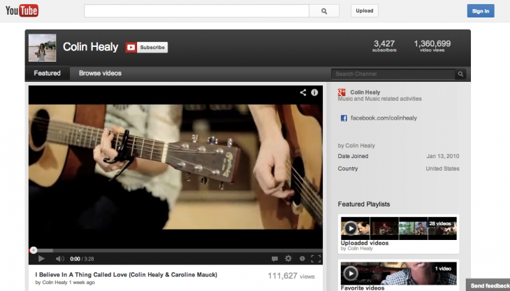
In case you’ve already switched your channel, or want to see what you’ll be losing, here’s the old design:
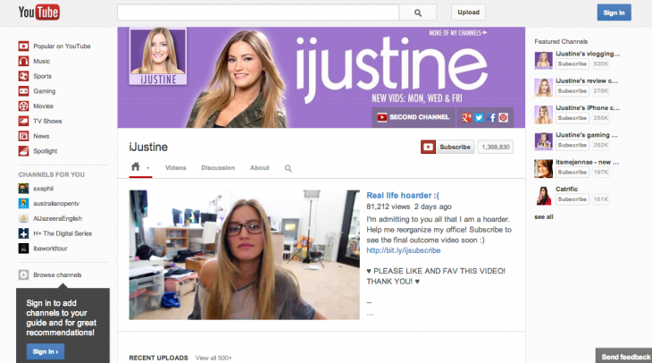
Here’s the new design (current as of today):
Google also offers the following “advice” for YouTube channel users that were switched over today:
- Select your channel art. Choose an image that represents your channel. The image should be 2560 px by 1440 px for the best results on all devices.
- Upload a trailer. Introduce new viewers to all the awesomeness they’ll see from your videos, and encourage them to subscribe to your channel.
- Create sections. Select which videos and playlists you want to showcase in the sections on your channel’s browse tab.
- Link your channel with a Google+ page or profile. Keeping your branding up-to-date will be even easier because your channel art will represent you across YouTube, Google+, and all Google properties.
YouTube is investing millions of dollars to bring original content to YouTube via its Channels program. This redesign is not only meant to unify the experience on multiple platforms, but it should also compliment the revenue-generating initiative by benefiting more independent and regular contributors.
As my colleague Jon Russell points out, these are exactly the kind of users that made the video site the popular service that it is today. YouTube is smart to keep them happy.
Top Image Credit: Eric Piermont/Getty Images
Get the TNW newsletter
Get the most important tech news in your inbox each week.
