Google launched its new ‘One Channel’ redesign for YouTube in a limited trial last month and now the new layout — which includes cover photos and trailers — is available for all users.
A post on the YouTube Creators blog explains the benefits that regular YouTube channel owners can enjoy, now that all the feedback and early experiences from the pilot are documented and on board:
The main focus of this update is to make your new channel look great on browsers across all screens and devices. It will also help you convert more visitors into subscribers with a slot for a channel trailer, and you can customize how you organize your videos and playlists so it fits your programming strategy.
This redesign doesn’t represent a huge aesthetic shift but Google has embraced a design which has much in common with the Google+ look and feel on the desktop. Smaller channels and new creators will enjoy the benefit of a more visual experience — thanks to channel cover images and trailers — but there is less freedom to tweak the layout, which could frustrate more established players.
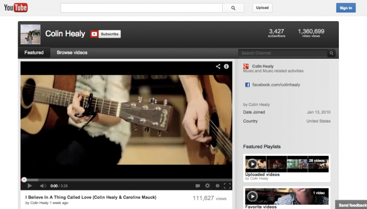
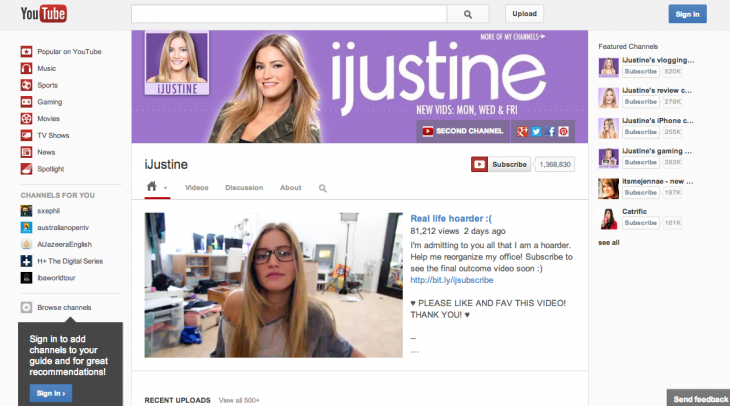
Here’s how the One Channel landing page compares to the previous version (video below for more info):
Current (soon to be outdated) version:
New version:
YouTube is investing millions of dollars to bring original content to YouTube — using its Channels program — but the redesign will compliment that by providing benefit to more independent and regular contributors — exactly the kind of users that made the video site the popular service that it is today.
Head to youtube.com/onechannel if you want to switch your channel account over.
Headline image via korosirego / Flickr
Get the TNW newsletter
Get the most important tech news in your inbox each week.
