As most of you know, a couple of weeks back we announced our new logo. Since then, we’ve been receiving alternative suggestions and proposals from our readers. In case you haven’t gone over the first batch of ideas, it’s definitely worth a look – those logos really do put ours to shame.
We thought that’s all there was to it, but let me tell you, that actually opened the door to even more submissions. We’ve received emails, tweets, comments and smoke signals with mock-ups of the TNW logo, so it was obvious we needed to once again select the most creative ones and display them here for your enjoyment.
The first one comes from Adrian, and it’s clear he actually put some thought behind it. We like how the N and the W use the same shape. Reminds us of ours a bit. Just a bit.
https://twitter.com/adriancostea/status/716270572980842498
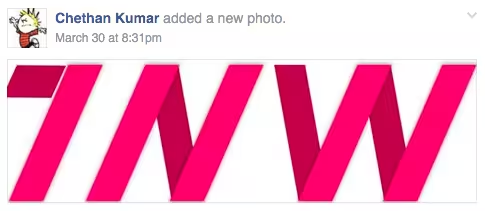
Chethan sent us his version and we’ll just say this: we totally would have used it to replace ours if it hadn’t been pink.
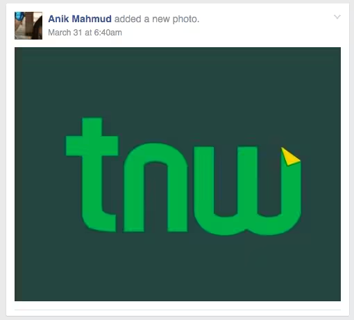
Next one is from Anik. Quite curvy for our tastes and the colours aren’t exactly our favourites, but hey, here’s an A for effort.
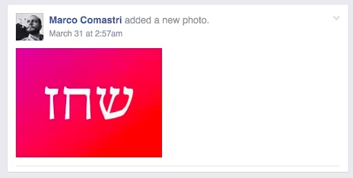
Marco says our new logo looks like it’s written in futuristic hebrew so he tried to illustrate it. That’s exactly what we were going for. Futuristic hieroglyphs.
Micha went all wireframe on us. Cool shit, but a bit too MC Escher for us.
@Boris Given your roots this new @TNW logo with a Dutch twist must appeal to you. It reflects a new #Perspective pic.twitter.com/mmpCeLw8lZ
— Mischa M. Runsink (@Runsink) April 2, 2016
Greg came up with some kick-ass gradients… but…
https://twitter.com/gregindeed/status/716294676978995203
…we challenged him to add even more gradients, and he delivered!!
https://twitter.com/gregindeed/status/716300540762845188
This is just one tweet out of a longer discussion about alignment:
https://twitter.com/PascalPencil/status/716165692878262272
This one by Doyin reminds us of playing Snake on our Nokia phones:
@Boris @TheNextWeb Now you have an icon! @Indigenius60 and @Brandup_NG and you can #brandupnigeria pic.twitter.com/eKrXaZmPHy
— Doyin Philip (@Doyin_PL) April 1, 2016
A very ‘less is more’ approach by Cregital Agency:
@Boris @TheNextWeb we really loved your previous logo. Here are our logo thoughts for TNW. pic.twitter.com/ALrsY84JOb
— Cregital (@cregital) April 1, 2016
Knut worked in a nice arrow. Yes, much better!
@MiklavzG @Boris Better? ;) pic.twitter.com/Du7PLmlasw
— PolyPixel (@Poly_pixel) March 31, 2016
…and even made some mock-ups of how it looks on our site. Thanks Knut!
Hi! @Boris Here is my try! Hope you like it. :) pic.twitter.com/vnPixRo3Dj
— PolyPixel (@Poly_pixel) March 31, 2016
A more ‘outlandish’ T by Koen Mok:
. Hi @Boris, here's a more outlandish 'T' to counterbalance the current 'W' in @TheNextWeb #logo pic.twitter.com/lKsbTqa3Z3
— Koen Mok (@koenmok) March 31, 2016
Thank you Joost, but we decided to look further…
https://twitter.com/JoostMQ/status/715483294981173248
Oh Isa, that’s so nice of you! Personal, clear, playful and human. We love it…
https://twitter.com/Isabelliee/status/715473532382105600
Kric put a spotlight on our W:
@Boris @TheNextWeb pic.twitter.com/SaSXn9Ad6w
— Bala (@13ala) March 31, 2016
Manuel put us in a frame…
@Boris @TheNextWeb pic.twitter.com/ngJ4FSTAN1
— manuel (@francisllado) March 31, 2016
I can see where the T and N come from, but that W? Help us out here Alexander?
@boris @thenextweb The #logo #design says it all! pic.twitter.com/uvTEb1h9za
— Alex @Bickov (@bickov) March 31, 2016
That W looks awesome and could be a logo all by itself, but I don’t know about that T here…
@Boris @TheNextWeb #TheNextWeb pic.twitter.com/QaM4o98wWY
— ASRYAN (@ASRYAN_Official) March 31, 2016
Hasan surprised us with this graphical work of art:
.@Boris @TheNextWeb saw the shades? pic.twitter.com/oEpH6NubNn
— Hasan (@rakibtg) March 31, 2016
The spacing looks a bit off on this design by Benjamin, but we do love the classic look and feel:
@Boris @TheNextWeb Fixed. pic.twitter.com/Yw9Pcu37XT
— Benjamin Dunphy (@Benghamine) March 31, 2016
Saminu is going to get us in trouble with Adidas, but apart from that, job well done.
@Boris @TheNextWeb #TheNextWeb pic.twitter.com/KSrXpZKmld
— Saminu | WebPress Bro (@HeySaminu) March 30, 2016
Andrea wins this round with the most original and creative design of all of them. It kinda looks like my signature as well. Yep, we like this one a lot.
Playing around with an idea #logodesign @TheNextWeb let me know your thoughts! @Boris pic.twitter.com/y6fy6pqciD
— Andrea Maillard (@andmaillard) March 30, 2016
That sums it up for now, but if you have even more ideas, don’t hesitate to send them our way. Just mention me (@boris) so I can collect your tweets for easy embedding in the next post. And if you’re looking for some more TNW inspiration, check out what our designers are doing.
If we receive 100 alternative TNW logos, we’ll use them for a coffee table book for our office.
Get the TNW newsletter
Get the most important tech news in your inbox each week.

