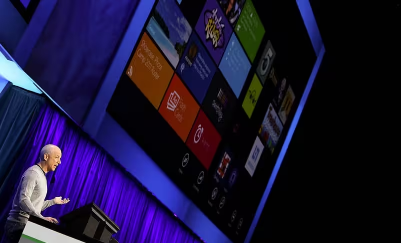
Microsoft is slowly tweaking the Windows 8 user interface to more and more fit the ‘Metro’ design aesthetic. The updating of Windows 8 from the look of Windows 7 has taken Microsoft quite some time, as the company works towards the operating system’s final builds.
The fact that the user interface is still shifting, as we move in the release candidate (RC) build, is a good reminder that often our first looks at the next Microsoft operating system are nothing more than placeholder views; the final bits don’t come out until much, much later.
Now, the headline of this post is only half joke. Yes, it’s a riff in Friedman’s book, but it’s also a fair explanation on the latest interface that Windows Explorer will take on in Windows 8. Here, check for yourself:
Consumer Preview:

Release Candidate:

The idea of calling that look ‘flat’ comes from Paul Thurrott. I think that it is exceptionally apt. Looking at that blue rectangle, I can’t help but be reminded of the new Windows 8 logo:

The color is off, but the blocky, Metro-cubism is very prevalent. I’m not positive yet, but I think that I like the new ‘flatness.’ Remember the horrible rounded edges and 3D-esque menus in late-XP and Vista? Those were terrible to look at. A simple square, on the other hand, doesn’t offend.
As always, we want to know what you think, so sound off in the comments.
Get the TNW newsletter
Get the most important tech news in your inbox each week.