Windows has a rocky history with widgets.
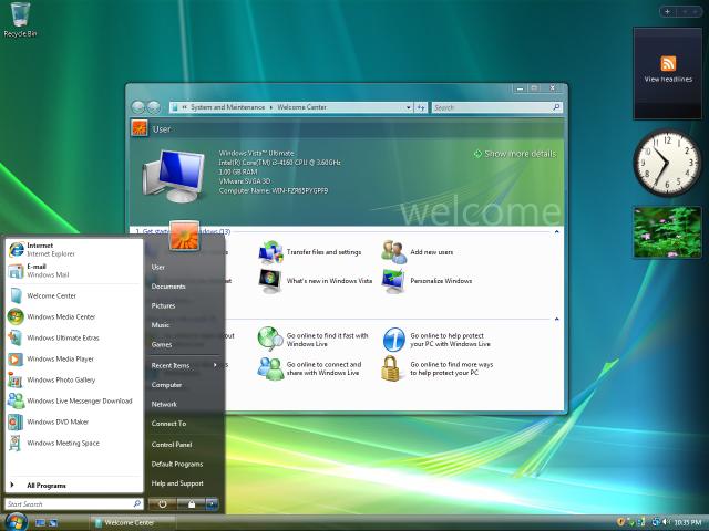
Vista had the Windows Sidebar, a collection of widgets (then called ‘gadgets’) that provided glanceable information on one side of your desktop. Windows 7 allowed you to place these gadgets wherever you wanted on your desktop, but these were eventually deemed a security hazard and eventually scrapped.
Then Windows 8 and Windows 10 abandoned traditional widgets in favor of Live Tiles. These were Start menu items that doubled as application launchers and sources of glanceable information.
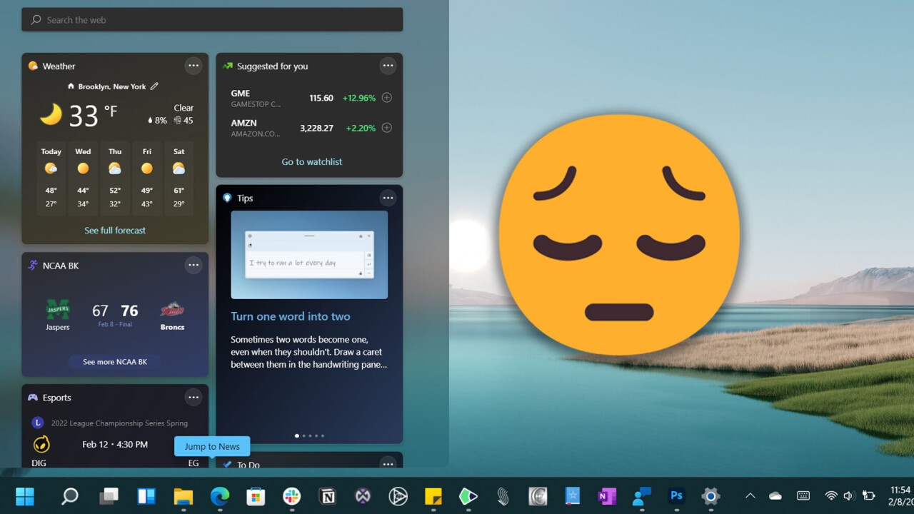
With Windows 11, Microsoft went back to traditional widgets and had a chance to make them as useful as they are on our smartphones. Instead, the company severely limited widgets by collecting them in a hidden side panel. Considering the widgets panel can only be accessed via a shortcut or taskbar button, it’s destined to be ignored by the majority of users.
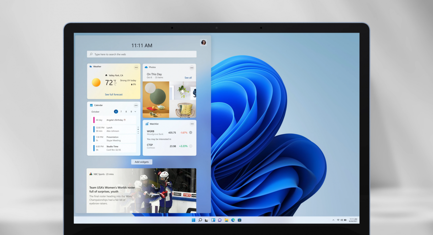
Granted, there are also very few widgets currently available in the first place. But with rumors that Microsoft is opening the feature to third-party developers soon, I’m hoping the company actually makes the feature altogether more practical. I’d love to be able to quickly glance at information from my to-do list, keep track of my fitness goals, or view the status of my smart devices anytime I visit my desktop.
As it stands, Windows 11’s widgets fail at what makes them most useful on other platforms: the ability to provide information without making you search for it.
Luckily, the solution is simple. Although I don’t think the widget panel should go away, Microsoft should give users the ability to pin widgets to the desktop (or the Start menu) as well.
It all comes down to one poor decision: in order to view widgets on Windows 11 right now, you have to either use the Win+W shortcut or press a button on the taskbar. I’d bet the majority of Windows 11 users don’t know this feature even exists; the only way most people would find out is if they’re a nerd who follows tech news or if they come across the feature by accident.
But even if you do know about widgets, the real problem is that Microsoft is asking users to change their behavior to use widgets. That’s just something most people won’t do, including many of us who actually would regularly use widgets.
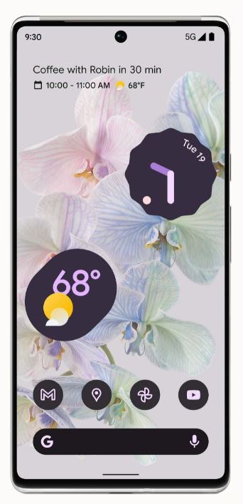
Compare that to widgets on Android: what makes them so useful is that they allow me to take in information without having to go out of my way to find it (and without resorting to obnoxious notifications).
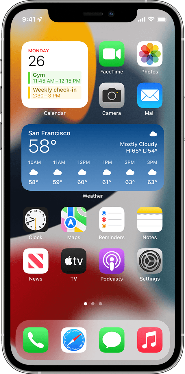
The simple act of visiting my home screen — something I do dozens of times a day — provides a reminder about the weather, today’s date, my remaining calories, and my to-do list. I literally don’t have to do anything to get information from Android widgets other than using my phone as I already do. And it’s a similar story with iOS, which added widgets in 2020.
There’s no reason I should be able to get more information at a glance on my tiny phone screen than on my 32-inch desktop monitor. It’s even more puzzling after learning Microsoft is considering introducing ‘stickers‘ that can be pinned to the desktop — which seemingly offer none of the functionality of widgets.
I get the concept behind storing the widgets in a panel. When the company announced Windows 11, there was a big emphasis on the new design promoting a sense of ‘calm.’ That’s part of the reason the Start menu was so dramatically simplified, with some of its functionality pared down. It’s why Live Tiles were removed. It’s also what informs Windows 11 overall aesthetic, with its softer edges and multitude of transparences.
But making something look simpler doesn’t necessarily make life easier for the user. As I wrote in my rant about the Start menu, reducing functionality for the sake of aesthetics is ultimately just annoying — especially for an operating system that prides itself on accommodating its power users.
Pressing a shortcut to access the widget panel may not sound like much of a hurdle, and I’m glad the widgets panel stuck around for those who would like to keep that information all in one place. But I suspect for most users, it’s the equivalent of buying a fancy kitchen appliance but keeping it tucked in a cabinet. You’ll never end up using it.
It’s as they say: out of sight, out of mind. Except in this case, that’s not a good thing.
Get the TNW newsletter
Get the most important tech news in your inbox each week.

