The Windows 8 Release Candidate is out, and I can report that it is a treat. The operating system is coming along nicely, and once Microsoft stomps all its bugs, for tablets Windows 8 is going to be a great product.
However, I presume, most Windows 8 machines will be desktops and laptops, perhaps with touch-enabled displays. Thus, the screens that run Windows 8 the majority of the time will be larger than what you find in the average tablet. This is an issue.
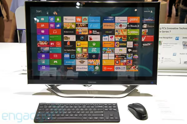
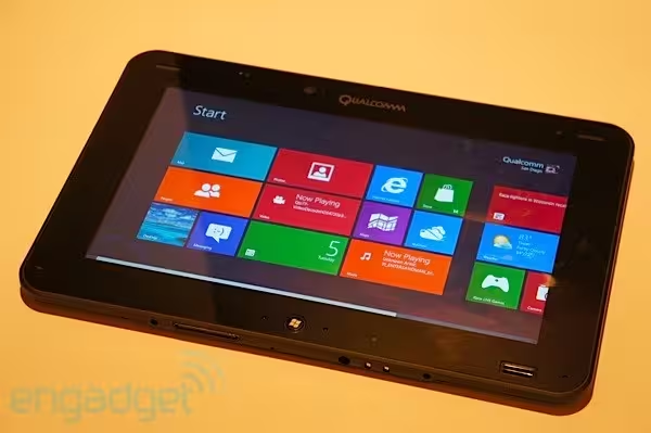
Today, Engadget snagged images of a large-screened Windows 8 all-in-one, and took pictures of a Qualcomm tablet running the code. Windows 8 looks great on one and terrible on the other. Here, I’ll let you check Engadget’s images, and see for yourself:
Obviously, the second device is the better looking; Windows 8 fits it. The top machine, a Samsung unit, looks more like the TV from Idiocracy than something that I think I could parse. I’m not kidding, check this:
The issue is that Live Tiles, the updating app icons that display information, need space to breathe. This is why the little tablet is so clean looking, and the all-in-one machine is hard to follow.
This isn’t a small problem, and frankly it’s not one that is immediately obvious until you see Windows 8 on an ample monitor. I intend to run the code on my larger screens, and I worry that I’ll be forced to use fewer apps to ensure that the Start Screen of my version of Windows 8 is usable. But then I won’t be using my entire screen, wasting space. It would seem that if Microsoft released another size of Live Tile, there appear to be two at the moment, allowing for apps to be ‘bigger’ on larger screens, the issue would be resolved.
Sound off in the comments: What is your view on how Windows 8 looks on large screens?
Get the TNW newsletter
Get the most important tech news in your inbox each week.
