Today, whether you’re scrolling through your tunes or looking through the contact lists it’s not very aesthetically pleasing, it’s simply just text in list-form. But, based on a patent discovered by AppleInsider it was revealed it’s possible that new graphical elements are on their way.
Apple may be revamping both contact lists and the way we navigate music on iOS devices by updating its graphic user interface.
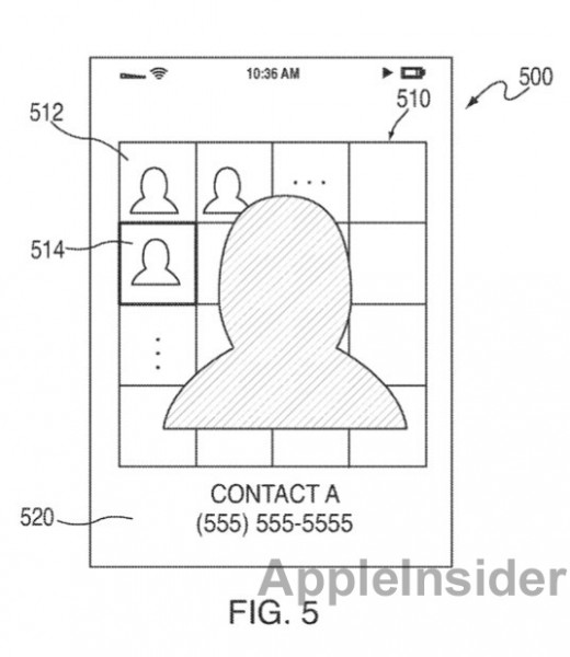
The patent images below suggest some changes to the contact list depicting a grid-like speed-dial screen for previewing contacts. We’re guessing that Apple may also enable users to arrange their friends on various contact screens.
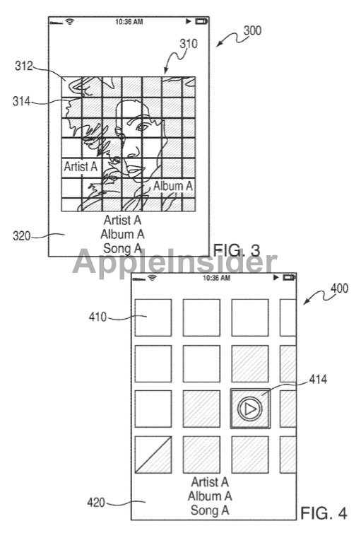
In music, the last patent shows that album previews are displayed as thumbnails across the screen, which appear to allow users to swipe through screens. Coupled with the new look, the patent submitted by Apple may support enhanced gestures for contacts and music browsing.
While we’ve seen numerous iOS apps that offer cool-looking contacts lists and music navigation, it would be great to see Apple build this into iOS.. These new patents were found recently however Apple first filed it back in 2009. Who wouldn’t want to have have multiple viewing options for contact lists and music?
Get the TNW newsletter
Get the most important tech news in your inbox each week.

