There are two things that are completely clear at this point. First, Apple wants as few buttons as possible on the iPhone. Second, Apple is trying to position the iPhone as your primary point-and-shoot camera.
These two principles are working enough in counter-purpose now that one of them has to suffer. This is why Apple needs to add a dedicated physical shutter button to the next iPhone.
The one that’s with you
With the iPhone 4S, Apple introduced improvements to the camera that make it among the best available on any smartphone. A backlit CMOS sensor, a custom image processing chip and a huge increase in shutter release speed demonstrated a concerted effort on the company’s part to make this happen.
A large part of the iPhone 4S presentation was also given over to describing the camera and photography experience of the phone.
Smartphones continue to replace casual point-and-shoot compacts, proving the adage coined by photographer Chase Jarvis: The best camera is the one that’s with you. Apple knows this and wants to make sure that the absolute best photography experience on a smartphone happens on the iPhone. I think that they’re very close to this, despite a few missing features like white balance and burst mode (which are offered by third-party apps now and will likely come to Camera.app at some point).
But it is missing the boat by not having a dedicated button specifically for releasing the iPhone’s shutter.
The volume button and the crab claw
In another life I sold digital cameras and gave classes about how to use them. One of the first things that I always sought to teach new owners of ‘sub-compact’ point-and-shoot cameras (the ones that are the size of a deck of cards, or smaller) was how to grip it properly to provide the most stable platform for shooting. It involved a pretty specific grip called ‘the crab claw’.
The crab claw was a grip that used two hands, one on either side of the camera, with the forefinger on the shutter button and both thumbs underneath the body. The middle fingers of each hand were used as support for the body, stabilizing and providing counter-pressure.
I obviously didn’t invent this grip, it actually happens almost naturally once you realize how many things you need to keep your finger off of on a tiny little camera. But some folks needed help to realize this, especially after cropping their finger out of 200 birthday pictures.
The crab claw was designed to do several things. It ensured that people kept a tight grip on these tiny cameras, allowing them to aim without fear of dropping. It kept fingers out-of-the-way of the lens, as well as the flash, which is normally positioned in an upper corner of the camera (opposite the shutter button). It also made it possible to press the shutter button without shaking the camera overmuch.
It’s not the only way to hold a point-and-shoot, but I found that it was the most reliable and use it myself to this day.
The iPhone and the crab
Before iOS 5, shooting a picture with the iPhone relied largely on the awkward ‘hold with two hands with the finger of one hand tapping the button to shoot’ method.
But now you can use the ‘volume up’ button to shoot images. It’s a physical button, right there on the side, and Apple didn’t have to add any extras! A great improvement, right?
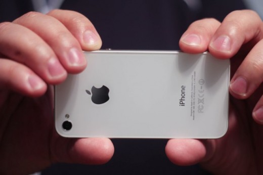
Well, not so much. It turns out that repurposing the volume button has several major issues. This is what shooting a picture with the volume button looks like:
You’ll notice a couple of problems right off the bat. First of all, the lens and flash are in the completely wrong position, the lower right corner of the phone. This is a bad position as it puts the lens below ‘eye level’ when shooting an image. This means that the flash hits the face of a subject at a slightly up angle, a technique which produces a similar effect to the ‘flashlight under the face’ gag you use when telling spooky stories. It’s one of the cardinal ‘no no’s’ when lighting a subject.
Out beyond a couple of feet, it’s not as big of a deal, but as the flash normally only lights up the first couple of feet, that’s where you’ll be taking the majority of these images.
A side effect of the placement is that there is also a parallax-like effect at work here that makes it awkward to shoot macro images (using the fantastic Olloclip, for instance) while shoving the lower corner of the camera towards the subject.
Third, it’s pretty unstable. Just having your thumbs underneath gives the phone the ability to slip forward or backwards, flipping out of your hands and onto the pavement. The volume button (as it was not designed to be a shutter button) has a relatively stiff action, forcing you to press significantly harder than is wise with this grip. Not to mention the fact that your pinky finger often sits low enough to show up in the corner of the frame.
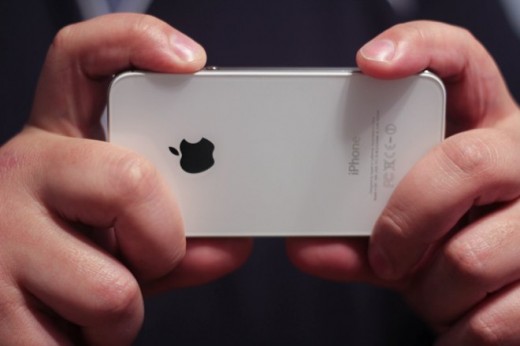
So, to improve the grip, you should really switch to ‘the crab claw’, this will improve the stability and comfort (it’s annoying having to hold those other fingers ‘up and away’) of shooting with a physical button. But here’s what happens when you try to use a comfortable grip:
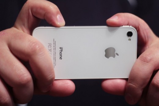
The lens is obscured completely behind the supporting fingers. By repurposing the volume up button as a shutter, Apple has placed the lens in the worst possible place to execute a stable, comfortable grip. Instead, there needs to be a physical button (with the appropriate pressure sensitivity) placed on the opposite side of the phone below the SIM slot. This will allow you to comfortably grip the iPhone as you would any other point-and-shoot camera:
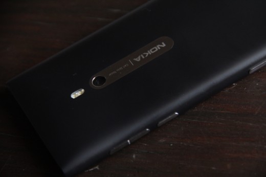
Other phone makers have already come to this conclusion. The Nokia Lumia 800, which I’m a big fan of, one-ups the iPhone in two ways by centering the camera so it is free of obscuring fingers and placing a shutter button on the lower right third of the device, allowing for a comfortable grip.
As an addendum:
Forgot to mention in the article, but the iPhone shutter button should also be two-stage (half way down to auto-focus, all the way to fire)
— Matthew Panzarino (@mpanzarino) January 22, 2012
Why should Apple care?
If Apple were taking the position that ‘hey, there’s a camera on the iPhone, go ahead and use it if you want’, then this wouldn’t be such a big deal. But it’s not. It’s effectively positioning the iPhone as a replacement for any camera that doesn’t allow manual exposure. In other words, it wants it to be the camera that you grab when you take a quick shot of your family, your food, your vacation view.
If it wants to truly make the iPhone a useful and comfortable camera, as well as a phone, it needs to add a dedicated hardware shutter button, period.
There are other ways that it could fix the issue, like moving the camera to the center of the phone, but don’t expect that to happen. If there’s one thing that Jony Ive likes more than having as few buttons as possible, it’s putting logos in the center of Apple products.
Get the TNW newsletter
Get the most important tech news in your inbox each week.

