If you’ve been a mobile phone user for more than a decade, then you remember a time when Nokia made the best cell phones in the world. The landscape was smaller then, with Motorola and Nokia dominating most of the 1990’s.
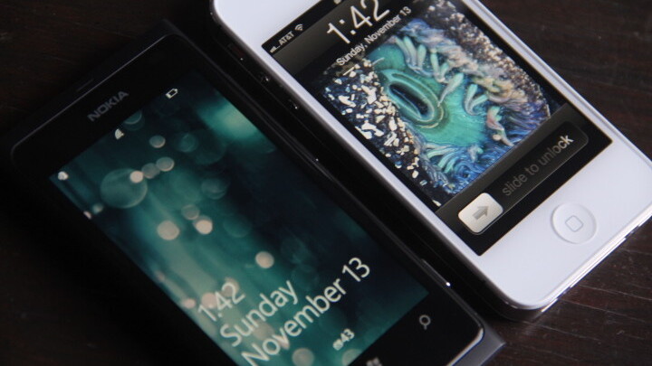
Now, with its sidelining of the custom-built MeeGo OS, Nokia has joined forces with Microsoft to create the Lumia 800 in an effort to defibrillate its flatlining smartphone business.
In the process, Nokia has created something that is somehow greater than the sum of its parts, a feat that I have only seen matched by one other smartphone recently, the iPhone.
A brief history
Out of the makers in the game at that time Nokia hit its stride with a vengeance. The 6160, with its signature bar shape, topped with a short antenna, followed by the 8260, which internalized it, were hands down some of the most popular devices on the planet.
But then something happened at the fringes. Companies like Kyocera and Ericsson, along with smaller, more maneuverable companies, started to see the desire for something more than just calls and text.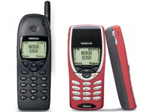
As the decade clicked over to 2000 and 2001, the tide began to turn away from the small candybar style phones into something different, heralded by the Treo 180 from Handspring and the Danger Hiptop (later SideKick).
The market wasn’t really ripe for smartphones as we know them now, so most of the 2000’s was dominated by beefed up feature phones. But the undercurrent was there, and the buildout of extensive cellular data networks was the only thing holding the tide back.
Unfortunately, Nokia was heavily invested in the Symbian alliance by the time that the iPhone rolled around and continued to back it for years before making the jump to MeeGo, a Linux-based OS that it continues to develop in conjunction with Samsung.
But Symbian just never matured into a world-class OS, and never garnered the support from developers it would need to match the quantity and quality of apps available for devices like the iPhone.
Now, Nokia has decided to put its eggs into the Windows Phone 7 basket, giving up complete control of the system software for the first time in years. So how does the collaboration look so far?
Lumia 800
The Lumia 800, the top of Nokia’s two new devices running WP7, is actually not brand new hardware. It’s a modified version of the Nokia N9, a device announced in June of this year, running MeeGo Harmattan.
In fact, it has had several items removed from it, including the front-facing camera and full pentaband support.
This should make it a weaker offering, and in fact it does in the eyes of many spec nerds. But the Lumia 800 manages to transcend specs in a way that very few devices have been able to. It really is a great phone.
Nokia and Microsoft have gone to great lengths to emphasize how much they have worked together to make the Lumia 800 the ‘first real Windows Phone’ and, for the most part, it lives up to that reputation. I’ve used a variety of WP devices since the OS was released and none have felt as cohesive and representative of the way that Windows Phone works as the Lumia.
http://www.youtube.com/watch?v=QvnDunLJSPE&feature=player_embedded
The design of the Lumia 800 raises some chicken-or-egg questions with the N9 coming well before it. Did Nokia design the N9 and then wedge Windows Phone onto the device, or was it designed from the ground up as a WP7 vehicle, and get a MeeGo release to address that market and use Nokia’s home-grown fanbase to test the design?
In the end, it doesn’t matter. What matters is that Windows Phone feels like it was meant to be used on the Lumia, period.
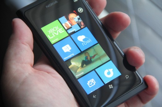
The Lumia was clearly designed to be used in a vertical orientation, which matches Windows Phone’s vertically scrolling column design. The edges of the Lumia’s screen are slightly curved, melding into the polycarbonate body. This invites the standard side-to-side thumb swipe that governs the majority of Windows Phone 7’s interaction.
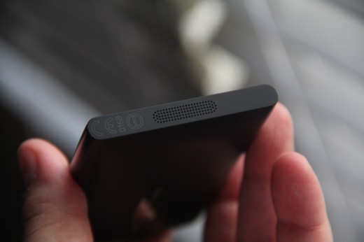
It feels incredible in the hand*. The body is perfectly sized and easy to hold, with its one-piece construction eliminating a lot of the angles and seams that a lot of devices, even the iPhone 4S, seem obsessed with. The slightly amorphous shape to the whole thing feels more organic and more natural than most phones.
* = important update from June 2020.
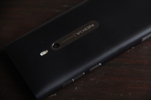
There are only a few items that break the exterior: the headphone jack, camera, buttons and subtly perforated speaker grille. This helps it maintain a sleekness and simplicity that shift the screen forward in your perception.
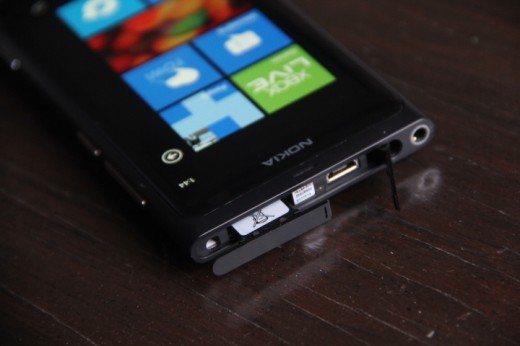
The design of the USB cover and SIM tray assembly is insanely delightful. A small nodule on the top of the device invites a press, which wings the hatch up, revealing the standard micro-USB port. You can optionally slide the SIM cover towards the port to eject the tray.
The whole operation is incredibly satisfying and far better than the ‘pin to eject’ system of normal trays. And you end up with the added bonus of hiding an ugly input/charging port that is displayed prominently on just about every other smartphone.
The lack of pentaband support doesn’t bother me much, although it makes the current version of the Lumia decidedly un-US-friendly. The lack of a front-facing camera is slightly confusing, but in the end, I’ve only used the front-facing camera on my iPhone a handful of times, so once again, not a deal breaker.
And then, software
This device’s brilliance isn’t limited to the hardware either. Windows Phone Mango is really, really good. Nearly nothing about Microsoft’s OS works anything like iOS, while still feeling very fresh and accessible. It’s exactly the opposite of the way that Android normally feels, which is an uglier and slower version of iOS.
Speed is one of the biggest pitfalls that befall Apple’s rival operating systems. Time after time, touch is proven the biggest reason that iOS feels better to use.
At first, people blamed it on specs, or types of touchscreen. But now that phones are all coming with dual-core processors saddled with blazing GPU’s powering mutitouch tech that is potentially just as good as what Apple is running, it’s a different story.
There is simply no excuse for any mobile device not to scroll, zoom and navigate smoothly any more. Period.
It’s crazy to me how many Android devices still fail this simple test, dramatically. The Lumia 800 is a different beast. With a 1.4GHz CPU, underpowered by most modern standards, the scrolling and zooming experience is absolutely flawless.
Menus scroll and flow with well-timed inertia, pinch-to-zoom is brilliant in the browser as well as in apps like Bing Maps. It really is a first class interaction experience that is matched only by the iPhone in terms of smoothness.
The built-in apps from Microsoft are, for the most part, pretty great. Even the mobile version of Internet Explorer works and feels nothing like desktop IE.
And, miracle of all miracles, the pre-installed Nokia software is actually really good. Normally apps provided by a phone maker are an irritating byproduct of a licensing deal and are best deleted or moved to some out-of-the-way corner of the OS.
Not so with Nokia’s contributions. The Nokia Drive app is solid, but it still falls short of Google’s excellent Navigator app that comes with most Android phones. But it is still very decent, and there are some other great surprises.
The Nokia Maps app actually feels aesthetically more in tune with the WP7 experience, and is pleasant to use. The Nokia Music app is brilliant, far better than the standard WP7 music app, and features cool touches like upcoming performances by artists in your area.
One of the prime examples of how well this collaboration between Microsoft and Nokia turned out is a tool that you’ll only use once. It’s called Contacts Transfer and it does exactly that, and beautifully. Just open the app, pair it with another device over Bluetooth and bam, it sucks down all of your contacts and automatically fills out all of the fields.
It’s everything that the process of transferring contacts from one kind of device to another normally is not: simple, efficient and delightful.
A different philosophy
Windows Phone 7 employs a completely different philosophy to delivering you information. It’s one that is likely to be polarizing for someone coming from an iPhone or other device that feels more static.
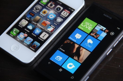
The home screen of a WP7 device feels more alive than one on iOS, and manages to do so in a way that keeps it from looking like strip mall signage, the way it can on Android.
As you enter your information and logins into the device, your tiles come alive with your information. Status updates, Xbox Live messages, your photos. These all populate the home screen of your phone, making it a more personal and more informative experience to just glance at or scroll through your home screen.
The Windows Phone home screen is a weird hybrid of iOS 5’s Notification Center and your first page of apps that somehow works incredibly well.
It may take some time to get used to the fact that there is always ‘stuff’ happening on your home screen, but once you do, you’ll start to get the genius of how the WP7 team managed to translate the ‘windows’ analogy into something new and fresh that works on a mobile device.
After using Mango, I can tell you that it’s not surprising that this vision managed to usurp the standard Windows paradigm as much as it has in Windows 8, and I can only hope that it continues to do so.
So close
Unfortunately, when I said ‘would’ in the title of this article, I meant it very literally. I would switch from the iPhone to the Lumia 800, if only it wasn’t for the apps.
The sad fact is that Windows Phone 7 will not become a major contender in the OS space until it gains massive developer support.
iOS and Android have an insane amount of apps available for users. Granted, Android’s selection is riddled with crapware and poorly designed options, but it still offers a giant selection of stuff that is at least serviceable.
That’s not to say that the Marketplace is completely bare. I have perhaps a couple dozen apps on my iPhone that I use with enough regularity that I would miss them if they were gone, and Windows Phone offers equivalents for a lot of the major stuff. Not only that, but there is a trial version of every app Can we adopt this as an industry standard already?
Frankly, most of the major brands are going to be there, so you can still shop on Amazon, listen to Rdio and play Angry Birds. The standard Twitter app has been neglected but Rovi is a very good alternative.
If you only use a dozen or so core apps, and those apps aren’t iOS-only gems like Instagram, you’re going to be just fine moving to Windows Phone.
But prepare to be a lot more bored with your choices when it comes to beautiful indie games like Mage Gauntlet or beautifully crafted utilities like Tweet Speaker and Verbs. There just isn’t that undercurrent of enthusiasm and joy when it comes to smaller Windows Phone developers as there is on iOS.
There are a lot of reasons for this that are too involved to get into here, and I’m hoping that Windows 8 will help to bolster the popularity of developing for the platform, but the fact of the matter is that Windows Phone 7 just isn’t the best platform for users that love trying out new apps. At least not right now.
Conclusions
The Nokia Lumia 800 is a fantastic device. I highly recommend that it be added to the list of anyone shopping for a new smartphone. US customers will have to wait for a while, but since we may end up with an LTE version, I’m not all that sad about it.
It shows that even if you don’t ‘build the whole widget’ from software through hardware, you can still manage to collaborate with another company and produce something that feels cohesive and organic.
In a lot of ways, the Lumia 800 delivers on the promise of Google’s Nexus series of devices, which have always been the best Android phones to use. An OS maker and a device manufacturer, working together to make something really great.
I would love to see the philosophy and artistry at evidence in the Lumia 800 continue to guide Nokia’s partnership with Microsoft. Hopefully long enough to see a surge in developer support of Windows Phone 7, which is really the best OS alternative to iOS at the moment.
If, and it’s a very big if, the Marketplace begins to come alive with the same sense of joy and kind of innovation that iOS users are used to seeing, I could easily see my “would” become a “will”.
Read about Nokia’s next steps with Windows Phone.
Get the TNW newsletter
Get the most important tech news in your inbox each week.

