
It’s likely that you started your day with a micro-interaction. By turning off the alarm on your mobile phone, you engaged with a user interface in a single moment.
You will continue to engage throughout the day in these moments with your digital devices. Each one is a micro-interaction. Each one is probably so small you don’t think about it. And each one works because of that simple fact.
As a designer, recognizing the invisibility of micro-interactions is just as important as designing them. You have to create something that feels human and accomplishes a task, making the life of a user easier. You also have to focus on a design that can work in a variety of environments and does not need any instruction or explanation.
Like I described in Web Design Trends 2015 & 2016, all great designers must learn how to design the perfect moment. In this post, we’ll take a look at how to do just that.
What is a Micro-Interaction Anyway?

The 💜 of EU tech
The latest rumblings from the EU tech scene, a story from our wise ol' founder Boris, and some questionable AI art. It's free, every week, in your inbox. Sign up now!
A micro-interaction is any single task-based engagement with a device.
Micro-interactions happen all around you, from the toggle of an on-off switch to skipping from one song to the next on a music player to liking a social media post to replying to a text message. Most of these engagements are things users rarely think about when it comes to how they work or look (as long as they are working properly).
Photo credit: Slack
Micro-interactions tend to do, or help you do, several different things:
- Communicate a status or bit of feedback
- See the result of an action
- Help the user manipulate something
So in practice, micro-interactions include moments or actions for elements. Stop and think about all the times you come in contact with a micro-interaction every day.
For example, I created the animated prototype quickly in UXPin to imagine what a fashion model selection app might look like. As you hover over the model, notice how their measurements are reiterated and an option to download their resume appears.
Microinteractions impact things like:
- Turning things off or on
- Commenting in any digital medium
- Changing a setting or process
- Viewing a notification or message
- Sliding down the “screen” on a mobile device to refresh content
- Interacting with a data element, such as checking the weather
- Accomplishing any single task
- Connecting devices, such as those for multi-player games, or printing from your laptop
- Sharing or liking a photo or video on a website
Each of these interaction types lead users to a path of more human-centered design. This concept of making devices more human-like in their moments is a key to adoption and usability.
Four Parts of Micro-Interactions
One of the most famous proponents of micro-interactions is Dan Saffer, who wrote the book – quite literally – on this topic. Saffer, director of interaction design at Smart Design, focuses on a four-part structure for micro-interactions.
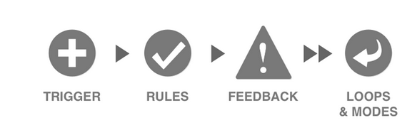
Photo Credit: Smart Design
- Trigger: Initiates an action
- Rules: What happens in the interaction
- Feedback: How you know what’s happening
- Loops and Modes: What happens next
Every interaction includes these parts to create a cycle for how things work. According to Saffer, most people don’t even know or think about micro-interaction contact unless something goes wrong.
Details With a Purpose
When it comes to the design of micro-interactions, it can be tricky or even considered boring by some. The design elements are so small and can happen so quickly that designers might easily forget the details. Don’t make that mistake.
The importance of micro-interactions can’t be over-emphasized. These are the details that make users love or hate an app or website. This simple, wonderful usability is why you choose one alarm clock or weather app over another. And someone had to design that.
When you get down to the visual design of these elements, keep a few things in mind:
- Micro-interactions must live on through repeated use. What’s fun and quirky on first use might become annoying after 100 uses. Be cautious of gimmicks or odd design cues.
- Simplicity rules. Simple type, simple language, simple colors, and simple design. Don’t make the design any more complicated than the action.
- Give each micro-interaction a human voice. Text should read like people talk, not like a machine.
- Add a fun divot with animation, but don’t go crazy. Consider the bouncing icon in the dock of your MacBook as a program loads. It lets you know the program is responding with a simple animation but does not get in the way of what you are doing.
- Create a visual harmony with other elements. If your app has a blue color scheme, micro-interactions should use the same hues so that the visual connection to the parent design or app is there for users.
- Don’t overthink it. Overdesigning a micro-interaction can be lethal. Let’s go back to the simplicity of the text message notification. Just a simple, singular display on the screen with enough information to be effective – who the message is from, what the message contains and a way to respond.
- Consider each detail with care. Because micro-interactions are so small, every element of the design matters. Ensure that every detail, down to the last pixel, is perfected before launch.
- Think about further adaptations or how subsequent micro-interactions will work. Does the exact same thing happen every time for every user? Or are there changes to the micro-interaction over time? (Consider the alarm that gets louder each time after the snooze button is hit.) These smart details will set the best micro-interactions apart from everything else.
As we describe in the free e-book Web Design Trends 2015 & 2016, these interactions can also push a user to make finalize decisions or abandon it all together. If they’re done poorly, users will flee out of your app and may never come back again.
Micro-Interactions in Practice
While micro-interactions are everywhere, Google is really beginning to lead the charge with ideas of how to design them effectively. In its material design documentation, micro-interactions are explained like this:
“Responsive interaction encourages deeper exploration of an app by creating timely, logical, and delightful screen reactions to user input. Each interaction is thoughtful, perhaps whimsical, but never distracting. What will happen if I touch this screen? And then this icon?”
What it all boils down to is user appeal. The guidelines – specifically in the authentic motion section – help you visualize and create animations that feel lifelike. While all micro-interactions are animations, it is becoming increasingly so. Try to pinpoint a device micro-interaction that does not contain an animated element. (It will be a challenge for sure.)
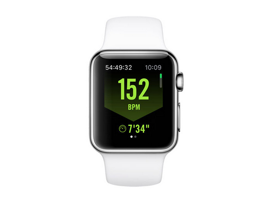
Photo credit: Apple – Nike Running App
The Apple Watch is another device where pretty much every interaction is an example of a micro-interaction because the device is designed for singular notifications. Although, as LukeW points out, the interactions don’t always work out the best for that and could be better.
However, each app features a design that gives the user one bit of information on the screen and provides one opportunity to engage. This is not true of only the Apple device, but all super-small screen devices, including watches, music players and even fitness trackers.
Conclusion
Micro-interactions are an important part of almost every digital design project. You’ll be hard-pressed to design a website or mobile app that does not include some element, or moment, that a user needs to interact with.
The key to making these moments almost invisible and completely functional to the user is in the details. Design with care. Think about how people work with and use their devices and mirror common patterns of thought as you design these small bits. Don’t overthink the aesthetics, and focus on direct action with the principles of micro-interactions in mind as you go.
If you’d like to play around with some microinteractions, feel free to use UXPin’s animations editor to create some quick prototypes. No coding knowledge is required since it runs off a step-by-step interface. I’d recommend starting with something simple like an easing animation, then working your way up to more advanced mobile interactions.
Read Next: The future of color in Web design
Image credit: Shutterstock
Get the TNW newsletter
Get the most important tech news in your inbox each week.