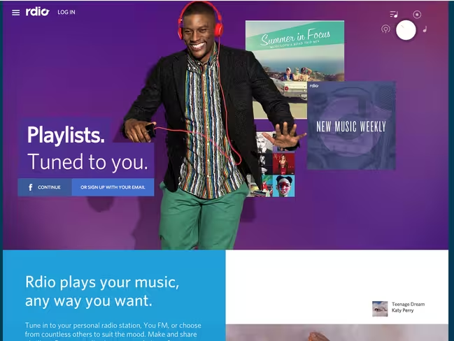
While many trends and techniques in web design come and go, one that remains constant is color. It is one of the basic principles of all design theory and a tool that contributes to an overall aesthetic and provides user interaction cues.
Photo credits: Rdio
Color trends change, but vibrant color choices are a design element that stand the test of time. Bright color choices contribute to and work with the design itself to help provide valuable user experiences.
In this article, we’ll dive into some of the most timeless design techniques described in the free e-book Flat Design & Colors.
Color Blocking and Hover
Two vibrant color patterns that emerged thanks to other trends (particularly flat design and card-style interfaces) are color blocking and colored hover states.
As the names suggest, color blocks refers to dividing content into a grid and applying different colors to create a card-like mosaic. Colored hover states are also quite straight forward – as you move your cursor over each block of content, the color changes to provide visual feedback to users.
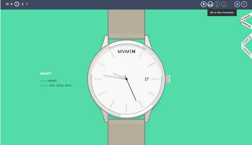
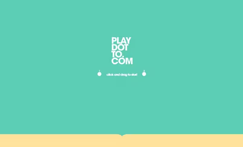
While you can apply the techniques independently (shown below in the great color blocking in the sites for Wrist and Play Dot To), you’ll actually see the techniques used together quite often.
Photo credit: http://www.wrist.im/
Photo credit: http://play-dot-to.com
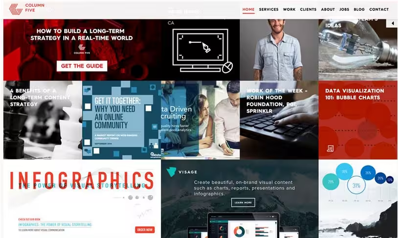
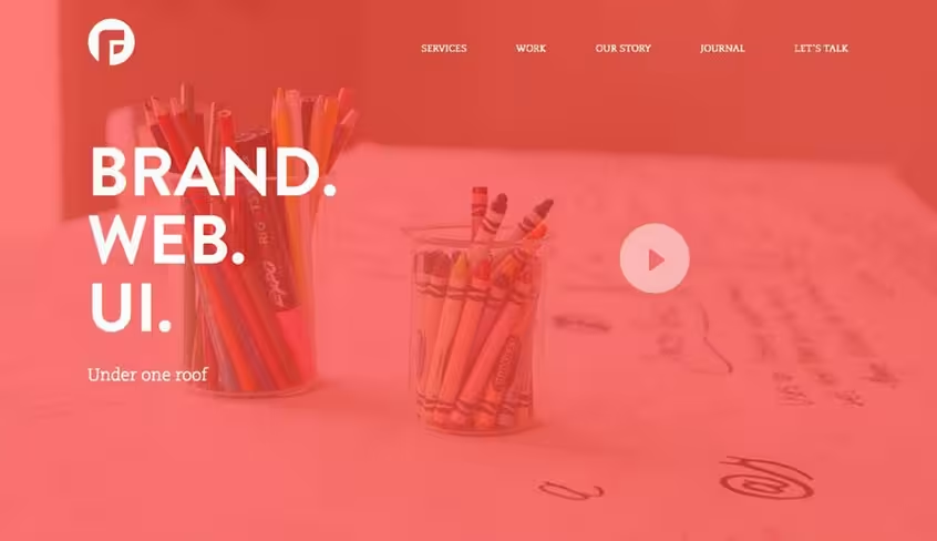
Column Five Media and PFD (below) are excellent examples of how bold color pairs well with user interface tools, such as hover states, linking and animated effects. Each site features a card-style design with hover effects as the user moves from block to block. While Column Five uses color primarily for hover, PFD also uses color blocking to highlight individual blocks within the design that also include hover animation.
Photo credit: http://www.columnfivemedia.com/
Photo credit: http://madebypfd.com/
As you can probably tell, user interaction is the primary motivation behind combining color blocks with colored hover states.
Color doesn’t just help users visually distinguish different types of content.
When used as a tool for interaction design, animated color is one of the fastest ways to give users a simultaneous feeling of control and delight when engaging with content. Considering Maslow’s hierarchy of design needs, any visual treatment that instantly improves usability and adds personality is a powerful tool in your arsenal.
Pairing Color and Texture
Textures were once reserved for more neutral backgrounds, but designers are pairing bold hues with subtle effects for stunning experiences. As other trends begin to circle back to the use of more subtle effects – like what is happening with Flat Design 2.0 – color will also evolve.
There are two ways to think about vibrant color and texture:
- As part of an overall background or image
- As a subtle accent to a background or image
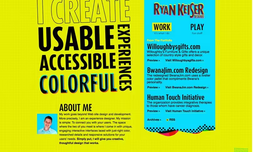
Photo credit: http://ryankeiser.net/
Ryan Keiser’s website uses texture and vibrant color together as a dominant background effect.
The grid pattern in the yellow-green canvas offsets what could have ended up as a chaotic color choice. The texture adds more interest and a certain softness to the color that makes it easier to read. Bright blue and pink accents (including hover states for links) strengthens the overall message – this designer will bring your vision to life with boldness and color.
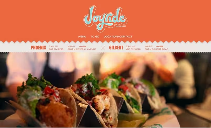
Photo credit: http://joyridetacohouse.com/
Joyride Taco House combines bold and engaging color with subtle textures.
Between the main header and the contact information, a shadow creates a bit of depth and separation – but what really stands out is the blue-green line art texture in the lettering. The logo texture is engaging, light and fun. The combination of colors (orange and the blue-green) are certainly unexpected, but they perfectly reflect the hip yet casual vibe of the restaurant.
How to Use Vibrant Color
Vibrant color is a design technique that complements many different design styles. If nothing else, this trend has certainly expanded the creative ex businesses and website owners who may have previously preferred the safe templated look of most plug-and-play site themes.
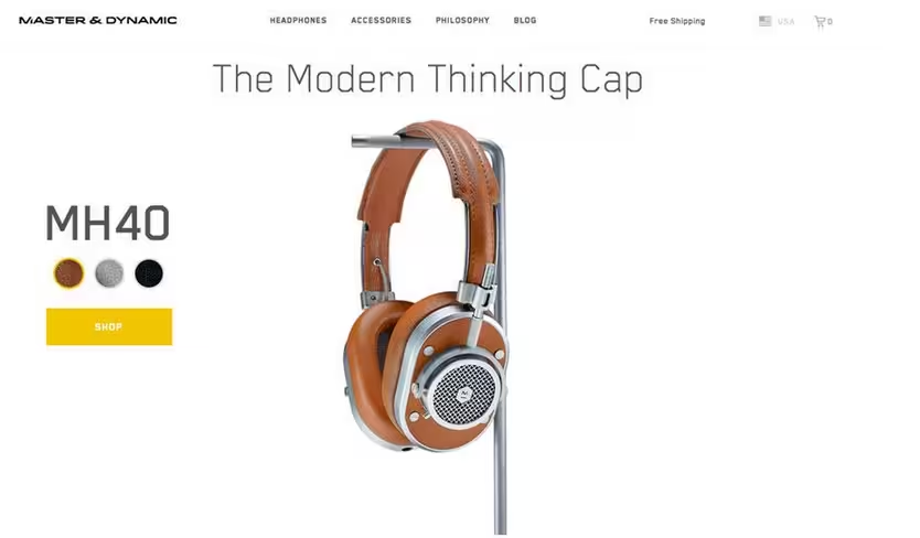
The trend started with websites for more creative fields and groups – designers, agencies, music and art – but is gaining popularity for news, weather and health sites as well. Bright color is also finding a place in e-commerce, where black and white was the standard for a long time.
Photo credit: http://www.masterdynamic.com/
What’s different about the vibrant color trend of 2015 is in its ability to balance fun and professionalism.
Brands now use colors in a strategic way that is lighthearted yet still reliable and trustworthy. Brands are not forgoing their identities to just create a trendy website because designers are using dramatic color in concert with existing elements.
Like we described in Flat Design & Colors, here are three ways to make it work:
Backgrounds and text
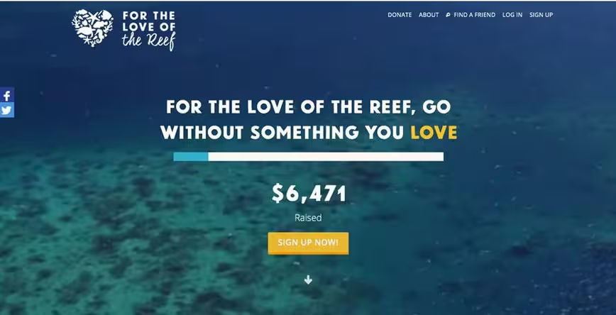
Vibrant color is a great tool for helping important or key words stand out from the background.
Bright colors, especially against dark backgrounds, provide just the right amount of contrast to draw in the eye. For the Love of the Reef, below, uses color only for “LOVE” and the call to action button, which creates a clever yet subtle association between the two (no doubt intended to improve conversions).
Photo credit: https://fortheloveof.org.au/#/
Buttons and UI elements
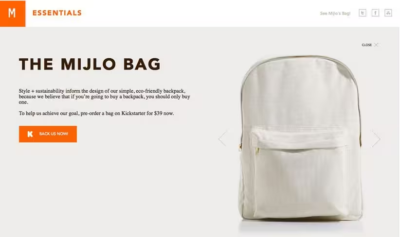
Bright color is a fun way to bring attention to buttons and calls to action.
Consider a color that contrasts dramatically with everything else on your site for the most impact. Mijlo, below, does a great job by pairing buttons in bright orange against the product being sold, a cream-colored bag. Everything on the site is muted in color except action elements, making it easy for users to know what they are supposed to do on the site.
Photo credit: http://essentials.mijlo.com/
Navigation and menus
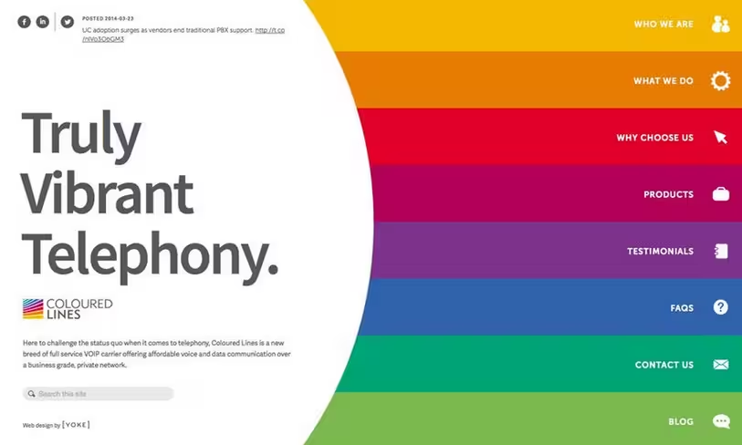
Color is a great tool when it comes to helping users navigate information-heavy websites. Colored Lines, below, uses rainbow-like colors to highlight navigation through a site which contains a large number of content sections.
Photo credit: http://colouredlines.com.au/
Bright color cues are also popular in parallax-scrolling effects to create clearly defined sections of content in an otherwise uninterrupted top-down linear flow.
With each color scheme representing a different section, these color guides allow designers to adapt pure-storytelling parallax sites to support more structured content (which is helpful in presenting different calls-to-action without distracting from the narrative power).
Thinking Beyond 2015
Color can be used in a number of ways, from thinking about colors in images, in buttons of user interface tools or as a background. What’s nice about bold color is that it adds an extra dimension to almost any project. The use of bold and vibrant color will continue to evolve as more designers play with it.
Photo credit: http://focuslabllc.com/
Bright color layered over images or video backgrounds is a bold way to have the best of both worlds. Bright color is interesting and creates an emotional connection, while an image or video helps further engage the user.
More sites are using this technique, such as Focus Lab, above, and this will only rise in popularity as hi resolution images and vibrant color continue to dominate the Web design landscape.
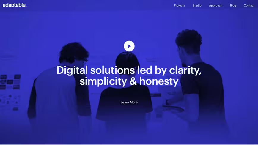
Photo credit: http://weareadaptable.com/
Interesting colors will continue to find their way into website projects. Designers will branch out from more traditional and primary hues to colors with deeper, bolder and even brighter designs. Digital Agency Birmingham is doing this with the deep bluish purple color overlay on the home page. As you scroll through the color is used for other accents as well, and the color is so distinct that it serves as a focal point on its own.
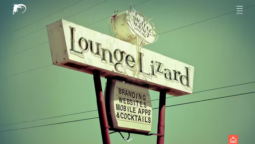
Photo credit: http://www.loungelizard.com/
Instead of only focusing on single hues, more projects will take on a styled color palette that mirrors popular culture. Examples include color styles that look like popular filters from the social media sharing site Instagram or colors that when combined have a vintage or period look and feel.
Lounge Lizard does this with the green tones in the main image as well as an orangish accent. The site uses bold color choices will creating an “old school” feel.
Using vibrant color is a great way to add visual emphasis and user interaction cues in website design projects. Color ties together the design story and usability, giving a project complete user appeal.
If you’d like to learn more about how to use color and flat design techinques to create elegant websites, check out the free e-book Flat Design & Colors. You’ll find over 40 examples inside.
5 Free Resources and Tools
- How to Use CSS Hover Effect in Color: Create your own nifty hover state with a color change option with a simple tutorial.
- Tint UI: This color picker provides color codes for a variety of hues based on trends, including flat, material and by brand such as Twitter or Microsoft.
- Text on Background: Compare background and text color combinations before you plan your website color palette.
- How to Add a Hue Filter in Photoshop: This tutorial helps you create a great color overlay that you can use on images, like some of the ones seen in the examples above.
- Color Website Design Gallery from Awwwards: Using a lot of color can be intimidating. Find some inspiration from this gallery of websites doing it well.
Read Next: The future of flat design
Image credit: Shutterstock
Get the TNW newsletter
Get the most important tech news in your inbox each week.
