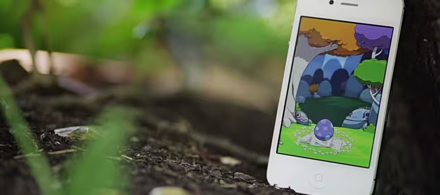
Transforming your iPhone into a living, breathing creature. That’s the task that Clear creators Impending and Realmac have set out for themselves with the new app Hatch.
Hatch is a new venture for the team, which crafted Clear, a clever app praised by both reviewers and Apple as pushing touch interfaces forward. With folks like project director Phill Ryu, designer David Lanham, producer Dan Counsell and lead engineer Ted Bradley, the app is stacked with talent. And it’s going to need it if it wants to pull off what they say it is.
The premise of the app is essentially a ‘pet creature’ that’s similar to the Tamagotchi craze, but utilizing tons of the iPhone’s sensors and input mechanisms, along with its powerful processing and graphics capabilities.
I’ve been playing with the app for several months, watching the creature — which is called a Fugu — evolve. I think they really do have a shot, it’s pretty lovely.
Today, a teaser site went up for the app with a video and the ability to ‘reserve’ limited edition Fugu eggs. I spoke a bit with Ryu about the idea behind the app, and how they planned to execute on their vision.
He’s been fairly disappointed with the fact that apps aimed at kids aren’t utilizing as much of the iPhone’s technical capabilities as they should be.
“If you start thinking of your iPhone as a pet, the sensors become its vision, its hearing, its sense of touch and so forth. Its way of interacting with you,” says Ryu. “Hatch isn’t all about that, but I do find it a shame how little most existing pet apps on iPhone play with this idea.”
As we approach this first generation of touch-natives, the fact is that there is very little we’re going to be able to teach them about basic mechanics. They’re moving well beyond that, even now.
“I definitely think kids are the most interesting user demographic among iOS users. What these kids are doing are simply unprecedented. I regularly hear stories of 2 year olds grabbing at their parents iPads to play their favorite games,” Ryu tells me. “I couldn’t hope to figure out a mouse and keyboard until I was 5 or 6! These are the kids growing up and iOS and multitouch is normal to them, and the stuff without it is broken.”
That sentiment is shared by many of the developers that I speak with. I’ve made the argument in the past that Apple is in fact pushing the paradigms of touch interfaces forward with agressive apps like iPhoto. Sometimes, the reception to these isn’t exactly a consensus of praise, but that’s the pain of progress.
Ryu says that Hatch is “definitely designed natively for this platform, and that means you’re dragging things around, touching things, there’s very little abstraction in our app’s interface.” As far as he’s concerned, “the less the better, because that stuff puts distance between you and your pet. So I’m sure kids will be able to pick it up and ‘get it’ right away.”
The kind of resistance that some developers have to giving up conventional button-oriented interfaces is exactly why it takes projects like Hatch, built by a small team of talented believers, to make big changes happen. Ostensibly, Hatch is an app made for children, a cypher that buries its new conventions behind what is ‘a toy’. An accusation that was actually leveled at Clear when it was introduced as well.
But raw interface invention isn’t the whole and heart of an app like Hatch.
“You’ll have to believe me though when I say it’s not something designed for kids, we’ve really been designing Hatch for ourselves,” says Ryu. “I grew up loving virtual pets, and just became sick of waiting for the one I wanted to materialize in the App Store, and Dan and David shared these feelings, so it’s been a real personal itch to scratch of a project.”
The Fugu is a creature that lives in, or on, your iPhone’s screen. Things like the battery’s charge can affect its level of tiredness. It reacts well to petting and food and will wither with inattention It follows a normal circadian rhythm aided by the sensors in the app and the time of your clock, rising and waking with you. It’s very cleverly done, the spark of life is here.
As with may of Lanham’s creations, the style of the app and the creature itself are slightly off and not-so-slightly gorgeous.
“The style is something that organically developed over time,” says Ryu. It’s become our happy place to check into through the day. I like to think happy doesn’t have an upper age limit!”
Clear was an app that pushed forward touch interfaces in a material way. But as the touch-natives commandeer our devices and purchase ones of their own, we have to start thinking about the next frontier. A camera, a motion sensor, a microphone, a gyro. These are all mechanical components of your iPhone, but they’re also the way that those devices experience the world.
Now the trick is to complete the loop. To use the sensors, touch screens and a sense of fun to connect a device that welcomes interaction to a person that wants to interact. That’s what Hatch is all about, and we’ll know how successful it is soon.
Get the TNW newsletter
Get the most important tech news in your inbox each week.


