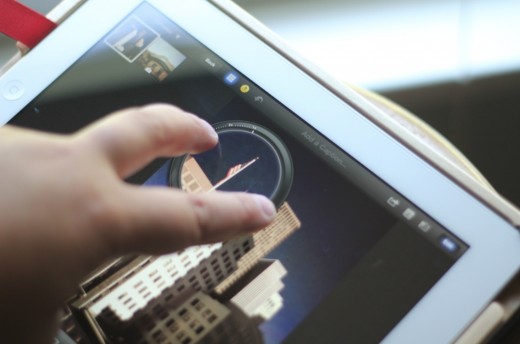
iPhoto for iOS has some issues. Everyone seems to agree on this topic, even those who feel that it’s a pretty decent photo editing app. Its use of non-standard gestures, inconsistent buttons and heavy-handed visual elements has engendered confusion in many as to what exactly Apple was thinking when it decided to release the app.
After having played with it for a few weeks, I’ve come to the conclusion that iPhoto, especially on iPad, is actually a sign that the iPad is about to grow up.
The hardware of the iPad has matured to the point where it is almost transparent. This means that the most interesting signs of its growth and maturity as a platform come in the apps that we’re seeing for it. And those apps are largely boring slaves to the standard touch gestures and interface conventions that Apple released with the iPhone back in 2007. It’s now 5 years after multitouch and it’s time for the iPad to move beyond those basic interface tricks into uncharted interface territories. iPhoto for iOS is here to help us realize that there is more to touch than pinch, swipe and tap, and that we’re just seeing the tip of the iceberg in touch control.
Releasing an app in order to push the boundaries and move the platform forward is nothing new for Apple. Just look at Garage Band and iMovie from last year. They’re still arguably some of the best and most feature-rich apps on the App Store and they proved that there was room for serious creative apps on the tablet.
This trend will likely continue, as Erica Ogg points out at GigaOM in an excellent piece about the next wave of iPad apps aimed at creatives. She profiles Snapguide and Paper, saying that both of these apps are ‘deceptively simple’ to use and aimed at creation. “I think it’s these qualities that are going to provide a roadmap for more iOS apps to come that will appeal to the artsy, creative side of people,” Ogg writes, “rather than the traditional consumption-oriented theme of what have so far been the most popular types of apps on Apple’s platform.”
This is probably true, but it’s just a continuation of the trend that Apple itself started with iMovie and Garageband. Those apps were pioneers that demonstrated the level of effort and polish developers would need in order to transmute the iPad into a creative platform. We’re just seeing some of these apps appear from third parties now and I agree with Ogg that it will continue.
But, for all of the creative spark that Garage Band and iMovie had, they are still fairly ‘traditional’ in their execution. They used standard conventions in buttons, UI design and gestures. Those apps were about legitimizing the iPad as a creative platform, not slicing open the envelope of touch interaction.
This is where iPhoto for iOS comes in. Actually, lets narrow this down a bit further and talk about iPhoto for iPad specifically. There are enough differences and UI inconsistencies between iPhoto for iPhone and iPhoto for iPad that make them impossible to treat identically. It seems that a lot of concessions were made to fit iPhoto onto iPhone and it’s very much an ‘iPad app’. Regardless, we’ll leave the discussion of the iPhone version’s issues for another day and talk about the iPad edition for now.
Software engineer Lukas Mathis had an interesting take on iPhoto for iPad in which he dissects its “mystery meat gestures”. Mathis argues that the app over-uses gestures that offer no feedback and aren’t discoverable for the user. I agree on some of those fronts. Many of the gestures in the app offer no immediate feedback when you begin them, this makes it difficult to determine the action that you are initiating.
Imagine a book page in iBooks. When you begin pulling at the page, the corner follows the tip of your finger until you let it go and, provided that it has passed a certain threshold, it flips once you’ve released it. The feedback, however, begins right away as the page curves away under your finger. This is important in gestural interfaces because it provides two-way communication between the app and the user.
So iPhoto could absolutely be better in this respect, but I’m not surprised with the fact that it uses so many gestures in its interface instead of triggering those actions more traditionally with buttons. Mathis points out that the gestures that you are familiarized with over the course of using iPhoto are like nothing else on the iPad, even the stock Photos app. “Almost nothing you learn in iPhoto can be applied to Photos, or to any other iOS app,” says Mathis. “In fact, being proficient at using iPhoto will probably make you worse at using Photos.”
This is an interesting observation, but I draw different conclusions than Mathis does from it. I think that iPhoto for iPad intentionally pushes the bounds of ‘acceptible’ use of gestures purposefully, in order to prepare tablet users for the next generation of gesture-heavy apps.
The next decade or more of personal computing will be defined by its use of touch and gestures as the primary way we interact with apps.
Apps for the iPad up until now have largely been a training exercise. The next generation of apps will push those boundaries, opening up a new, more complex gestural language that will expand the horizons of what these apps are capable of doing and how we, as users, interact with them. iPhoto for iPad is about pushing those boundaries, perhaps a bit too far, in the name of opening up the language of touch for the next few years.
To illustrate, give a toddler an iPad to play with and watch them discover the gestures. At first, they paw and slap, but eventually they touch, tap, swipe and pinch their way into the standard interactions. Once they discover one gesture, they work their way outwards in complexity, finding others.
To a new generation, growing up used to touching their computers, rather than typing and pointing with a mouse, iPhoto for iPad will feel natural and comfortable.
This next era of apps with complex touch interactions isn’t made for users of ‘traditional’ computers, it’s made for the generation that is coming. We, as users of computers now, are actually at a disadvantage when it comes to touch interfaces, as we have to break with those old conventions.
And it’s not just gestures and touch, the interfaces of these new apps will reflect the fact that they are less beholden to emulation of older paradigms. Expect to see apps that are less about making people feel comfortable with the transition from, say, a book to a tablet. the recent Wonders of the Universe app is a great example of this.
Wonders uses a new engine called Glide Publishers, created by the developers behind the app, to present the content in an extremely simple and fluid fashion. You navigate through a series of thumbnails that, when swiped, expand into text, videos and more in one simple stream. The entire book can be navigated with the upward swipe of a finger.
It looks nothing like an iBook, or even one of Apple’s new fancier textbooks, but it provides an interactive learning experience that is stunningly good. It breaks with both the traditional textbook structure, but also with the entire textbook metaphor, allowing it to deliver a more effective experience on a touch-based tablet. I think that apps like this will become more common as developers and designers are able to leverage more of the gestural language in their apps, unfettered by the UI conventions of the past.
The Wonders app also holds a lesson when it comes to using touch interfaces to create. I spoke to Other Media’s Chris Harris about how they developed it and he shared an anecdote that I found interesting. Because they wanted to get a realtime look at exactly how the universe was shaping up, they actually built the engine so that the planets could be modeled and placed right on the iPad itself in a special developer mode. ”The next time someone tells you that the iPad isn’t for creating,” Harris told me, “just point them at Wonders, because we made pretty much everything right within the app.”
But, despite the success of Wonders, there is a way to go. iPhoto for iPad flies in the face of the prevailing wisdom, which Daring Fireball’s John Gruber summed up well by saying that Apple’s highest priority is obviousness. “That’s why I like the analogy that gestures are to iOS what keyboard shortcuts are to Mac OS,” Gruber writes, “an alternative way to do something as a convenience for advanced users.”
This is absolutely true for much of what Apple does, but it’s definitely not true for iPhoto. Many of its gestures often don’t have any button analogue and don’t act as shortcuts, but instead as the only way to access a feature, like the loupe.
There are some serious problems with the user experience of iPhoto for iPad. It’s awkward in a lot of ways. There are a ton of buttons, for one, and they’re not very well labeled. While the gestures are often cool once you’ve found them, they can be hard to discover. That’s why I think that an app like iPhoto for iPad represents the ‘puberty’ phase of gesture interface maturity. Apple is figuring this thing out along with the rest of us. But I feel that, as an official app, it does show some of that “skating to where the puck will be, not where it is” mentality that we’ve come to expect from them.
Gesture-only or gesture-primary interfaces are a rarity now, a curiosity. But at some point they will be the de-facto standard. Apple knows this, and toddlers prove it. It’s just a matter of time.
I stand by the statements that I made in an article last week about the iPad’s need for a home button. But after thinking about iPhoto for iOS a bit more, I find myself being more friendly to Nick Bilton’s thoughts on Apple’s multitasking gestures taking a larger role in the future. I also saw my two-year-old nephew use the ‘close’ gesture on his dad’s iPad, without having been taught it.
The transformative period, when touch and gestures were new and novel, is coming to an end. We’re beginning to turn the corner in the maturity of touch interfaces and their users both. The language needs to be pushed along, advanced to take full advantage of the familiarity that future generations will have with touch. iPhoto and other apps like it that push the boundaries of how far we can take touch control are a part of that.
Get the TNW newsletter
Get the most important tech news in your inbox each week.


