Update: For more on Clear, be sure to check out our interview with creator Phill Ryu here.
Some apps do a really good job of selling you what they have. They wrap features in beautiful graphics and lead you through the process of how they work with gorgeously descriptive text and images that conform perfectly to the way we all think an app should work.
Then there are apps that make you re-think the way that you’ve been using apps altogether, breaking the mold and re-forming it with just a few minutes of use. Clear is that kind of app.
Clear is the first app from fresh development studio Impending, founded by tap tap tap partner Phill Ryu and David Lanham of the Iconfactory, in partnership with Milen Dzhumerov, and the hugely talented folks at Realmac Software, who made the lovely Analog.
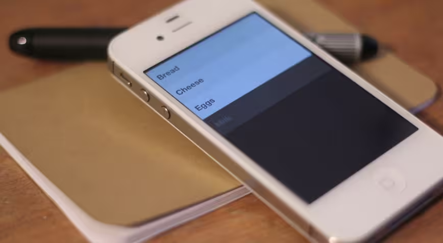
To be completely honest, Clear [App Store, $0.99] is a simple and relatively limited list app. It’s probably not going to make your ‘getting things done’ workflow crumble and reform around it, and it lacks a ton of must-have features for any big GTD fan. But it is a very good basic scratchpad for items that you’d like to remember on a short-term basis.
More importantly, it has an intensely clever user interface that has the potential to be a harbinger of things to come on multitouch devices.
Since the introduction of the iPhone OS on the very first iPhone, Apple’s design conventions have called for having on-screen buttons that emulate, via software, the behavior of traditional physical buttons. Back, next, new and many other commands are primarily activated via icon or word-emblazoned buttons.
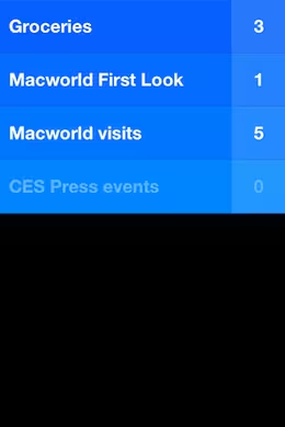
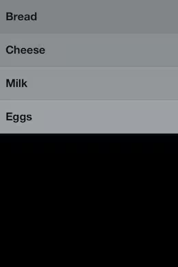
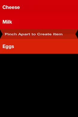
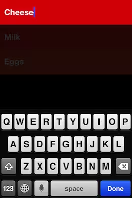
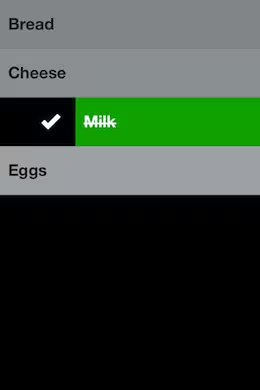
Clear takes a different tack, as its interface lacks any standard buttons and operates completely through gestures, taps or direct manipulation of the list items on the screen. To create new list items, you drag down. To reorder them, you tap and hold, then slide. To insert a new item between two others you pinch apart and to go ‘back’ a level, you pinch inwards. Swiping left or right will check an item off or delete it.
There are some simple options, like determining what theme the app is skinned in and how it notifies you, but just the basics. The ‘heatmap’ shows you priority of devices in color tone as well as vertical orientation on the list, simple but effective.
Frankly it’s so different from how apps normally work and offers so little assistance to thos unfamiliar with gestures that the guys at Realmac and Impending, the two studios responsible for Clear, had a tough time deciding how to introduce new users to using the app.
But once a user is familiar with just the basic operation of the app, they take off like a rocket using them with ease. This quick adoption is something that I have had the chance to observe quite a bit since I began using the app early in January and showing it off to people in person. I was interested in seeing if its operation translated well to others, and it did.
I actually used the app heavily throughout CES and Macworld in order to keep a scratch list of booths that I wanted to visit and products that I wanted to try. It provided a nice counterpart to my note app of choice, Notefile.
The gesture-based interface of Clear held up well in the sweat and crowds of a trade show floor, all while I was holding a heavy bag and stabbing at it with tired fingers. In fact, it felt even easier to use in a lot of those scenarios because I wasn’t hunting for tiny buttons to hit. To me, this demonstrates that there is worth in this gesture-focused UI concept and that it is worth exploring further in other products.
Some interesting gestures to try out while using the app:
- Pull down on a list to add an item
- Swipe an item right to complete it
- Swipe an item or list left to delete it
- Pinch apart two items to insert a new one between them
- Pinch vertically together to close the current list and show all the lists
- While adding an item, you can pull down while the keyboard is still active, adding another item
A couple of nice easter eggs are also built into the app. If you don’t have any active tasks, or you’ve completed the ones in a list, you will get a random inspirational quote. There are also some hidden themes, three of them to be exact, to be unlocked in the app as you explore it and share the news about it. There are also some apps that will unlock new themes if you have them installed along with Clear, we’ll let you figure those out on your own.
Clear is hands-down worth picking up if you’re interested in good design and have any need for a simple list-making-and-completing app. But even beyond its immediate worth, I think that it could signal the next level of interaction with our multitouch devices.
It’s roughly five years into the multitouch revolution and users have become familiarized with the tapping, swiping and gestures involved in the daily use of tablets and smartphones. Watch any two-year old interact with an iPad for any length of time and you’ll see the power of a natural UI at work.
I think that we’re ready to leave buttons behind and enter the next level of smartphone interfaces. Interfaces dominated by natural interaction instincts and not slavish conformity to the conventions of physical buttons. And I welcome it with open arms as I’ve experienced first hand how fast and enjoyable to use this kind of interface can be.
If you’re interested in trying out the future of multitouch user interfaces — admittedly in a relatively limited, if beautiful and useful, app — then you’ll definitely want to try out Clear for yourself.
➤ Clear
Read about the latest apps right now at TNW Apps.
Get the TNW newsletter
Get the most important tech news in your inbox each week.
