Despite all the flak it caught for its revamped look, I tried giving Twitter‘s new design a fair shake. The updated layout is supposedly faster, more intuitive, and easier to customize – and for the most part, it is. But as much as I wanted to dig the redesign, there’s one aspect that truly ruffles my feathers: the new tweet embed UI.
It’s unnecessarily complicated, significantly less convenient to use, and, quite frankly, the antithesis of intuitive.
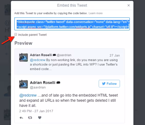
For those unfamiliar with the embed UI, the feature is particularly useful if you want to include Twitter replies in a blog post, but without the parent tweet (or without media files included in the tweets). It makes it possible to remove unnecessary and repetitive bits, and to give some order to a series of tweets.
I use it all the time for tweet-heavy stories like this one – and it has legitimately become one of the Twitter features I use the most.
Unlike the old implementation, which showed up as a pop-up when you click the “Embed Tweet” option from the drop-down menu, Twitter now opens the embed customization settings in an entirely new page.
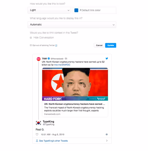
Once you load the page, you have to click one more button to get to the actual embed options (which were readily available in the old implementation).
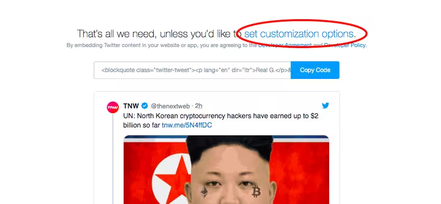
How annoying is that?
Here’s a comparison between the new embed UI and the old one:
New
Old
True, the new implementation offers more options to customize tweets (including settings to show embedded tweets in dark mode, in different colors, and in various languages).
But when it comes to actually using it, it’s undeniably a huge downgrade – no matter how you rationalize its UI.
In contrast to the current UI, the old implementation was quick to get around and entirely self-contained. There was no need to open extra pages and to click further for customization options. It just worked.
But with the new version, that’s all gone.
For what it’s worth, I realize this is a feature most users don’t rely on regularly. Its application is limited at best, unless you’re a blogger or a writer like myself – in which case, you probably use it all the time.
Still, I wish Twitter had thought about it a little more. At the very least, I hope its design team considers making the current implementation a bit more like the old one – easy to use and entirely self-contained.
Until then, all I can do is to reluctantly learn to live with it – as much as I despise it.
Get the TNW newsletter
Get the most important tech news in your inbox each week.