Welcome to TNW Basics, a collection of tips, guides, and advice on how to easily get the most out of your gadgets, apps, and other stuff.
It’s been less than a month since Twitter refreshed its design, promising to make the platform faster, more intuitive, and easier to personalize. Unfortunately, people absolutely hate it.
But don’t ditch it just yet: we’ve got some tips to help you make the new design more welcoming and easy on the eyes.
“The new Twitter is too big”
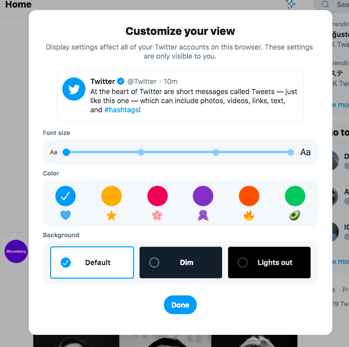
Some of my colleagues have been complaining the new design makes tweets, uh, too big. The good thing is there’s an easy way to fix that — scaling the size down.
The difference is pretty minor obviously, but I do prefer scrolling through Twitter when it’s been scaled down to 90 percent of its original size. I initially did that directly from my browser, but I later discovered Twitter has a built-in setting to scale down the font of tweets.
Here’s how it works:
- Click the ‘More’ option in the sidebar on the left.
- Head to ‘Display.’
- You should see this menu

- Adjust the font setting until you’re comfortable with it.
- Boom! that’s it.
In case you still think the design feels too big, play around with the resize options in your browser.
Try Dark Mode
For ages, people have been begging the company to roll out a dark mode — and the new design finally delivered.
I’m personally cool with the standard mode, but some of my colleagues have happily switched to dark mode. Indeed, there are two different dark modes to choose from.
Here’s how to do it:
- Click ‘More’ in the sidebar on the left.
- Head to ‘Display’
- At the bottom, you’ll find three different background options — Default, Dim, and Lights out
- Select Dim or Lights out — they’re both variations of dark mode
- That’s it!
By the way, if your reason for switching to dark mode is to protect your eyes,think twice. It turns out it’s not as helpful as people make it out to be.
Switch back to the old design
If you still hate the new design after customizing it to your own taste, there’s always the option to bring the old look back — and it’s actually pretty simple.
Click here to find out how it’s done.
Really though, that should be your last resort: the new design isn’t all that bad, give it a fair shake.
Get the TNW newsletter
Get the most important tech news in your inbox each week.


